This is “Usability”, section 13.2 from the book Online Marketing Essentials (v. 1.0). For details on it (including licensing), click here.
For more information on the source of this book, or why it is available for free, please see the project's home page. You can browse or download additional books there. To download a .zip file containing this book to use offline, simply click here.


13.2 Usability
Learning Objective
- Understand the fundamental concepts of usability.
When Steve Krug wrote his excellent Web usabilityThe measure of a Web site’s ability to accomplish the goals of the user. book, he aptly called it Don’t Make Me Think!Steve Krug, Don’t Make Me Think! A Common Sense Approach to Web Usability, 2nd ed. (Berkeley, CA: New Riders, 2005). Designing a site for best usability means that users don’t have to figure out what to do; they are just able to do it.
Use standard conventionsElements such as links, menus, colors, and layout that are distinct and can be recognized easily by users., such as links that are distinct (blue and underlined is standard), menus top or left, and the logo in the top left-hand corner. Search boxes are usually on the top of the page and should use standard wording such as “search” on buttons. Following standards for important elements that are familiar to Web users means that they know immediately where to look for or how to use them. Important elements (such as menus, logos, colors, and layout) should be distinct, easy to find, and consistent throughout the Web site.
Note
Common page elementsItems that appear on every page of a Web site. are those elements that are on every page of the Web site. These can include main navigation, a search box, a link to the home page, and sign-up forms.
The information architectureThe layout and structure of a Web site, which should be according to information hierarchy and categories. of a site is crucial to usability. Topics and categorization should flow from broad to narrow and should be built around users’ needs and not company structure. An intuitively designed structure will guide users to their goals.
The site mapOn a Web site, a page that links to every other page in the Web site and displays these links organized according to the information hierarchy. should be available from every page and should clearly show the information architecture of the Web site. Dynamic site maps can be employed so that the site map is updated automatically as information is added to the Web site.
As well as carefully thought-out information architecture, the navigationHow a Web user moves through a Web site and the elements that assist the user. should guide users easily through both top-level and deeper pages. Navigation should also let users know where they are in the site (especially since not all users arrive via the home page). Breadcrumb linksLinks, usually on the top of the page, that indicate where a page is in the hierarchy of the Web site., clear page titles, URLs (uniform resource locators)The Web address that is unique to every page on the Internet., and menu changes all help show the user where she is.
Figure 13.2
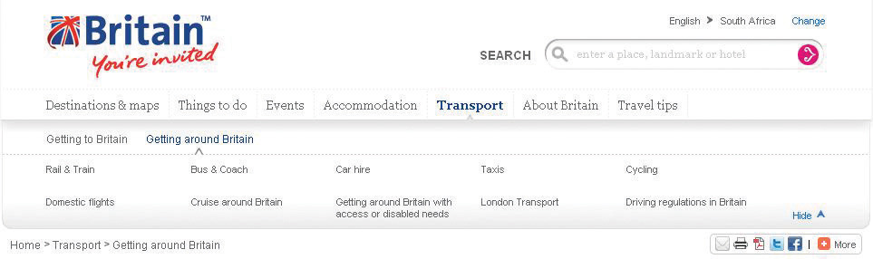
VisitBritain.com uses breadcrumb links and menu changes so that the users know where they are in the Web site.
AccessibilityThe degree to which a Web site is available to users with disabilities or technical limitations. makes Web sites easy to use and easy to scale. In some countries, accessibility is a legal requirement of government Web sites. Some key points of accessibility include the following:
- Ensuring that the Web site and all its functions are compatible across a range of browsers, including text-only and mobile browsers
- Making sure that the Web site is functional to users who might have a disability. Some ways of doing so include the easy increasing or decreasing of text size and using meaningful descriptive tags in the code for when the site is accessed through a screen reader.
- Not designing for high-bandwidth users only but instead making sure that low-bandwidth users do not have to wait for heavy page loads to access your Web site (unless you have a good marketing reason for keeping those users out)
- Having a search box (that works) available
Note
Just like in Hansel and Gretel, breadcrumb links help show users the path they have taken in the Web site. Unlike the fairy story, these breadcrumbs shouldn’t disappear as you navigate through the Web site.
Discussion
Scaling and scalability—why is it important that Web sites can scale?
Content needs to be written so that users can grab the information they need in as little time as possible. Text can be made more easily readable by doing the following:
- Highlighting or making bold key phrases and words
- Using bulleted lists
- Using paragraphs to break up information
- Using descriptive and distinct headings
On the page, use an inverted pyramid style, or newspaper style, for your copy. The bulk of the information should be at the top of the page to make for easy scanning.
There are some key “don’ts” when it comes to building a user-friendly Web site:
- Never resize windows or launch the site in a pop-up.
- Don’t use splash pages. These are pages at the entry to a site that are usually animated and contain some variation of the phrase “click here to enter this site.”
- Never build a site entirely in FlashA proprietary technology used to show video and animation; can be bandwidth heavy and unfriendly to search engine spiders.—most search engine spiders cannot even crawl Flash sites.
- Don’t distract users with “Christmas trees” (blinking images, flashing lights, automatic sound, scrolling text, unusual fonts, etc.).
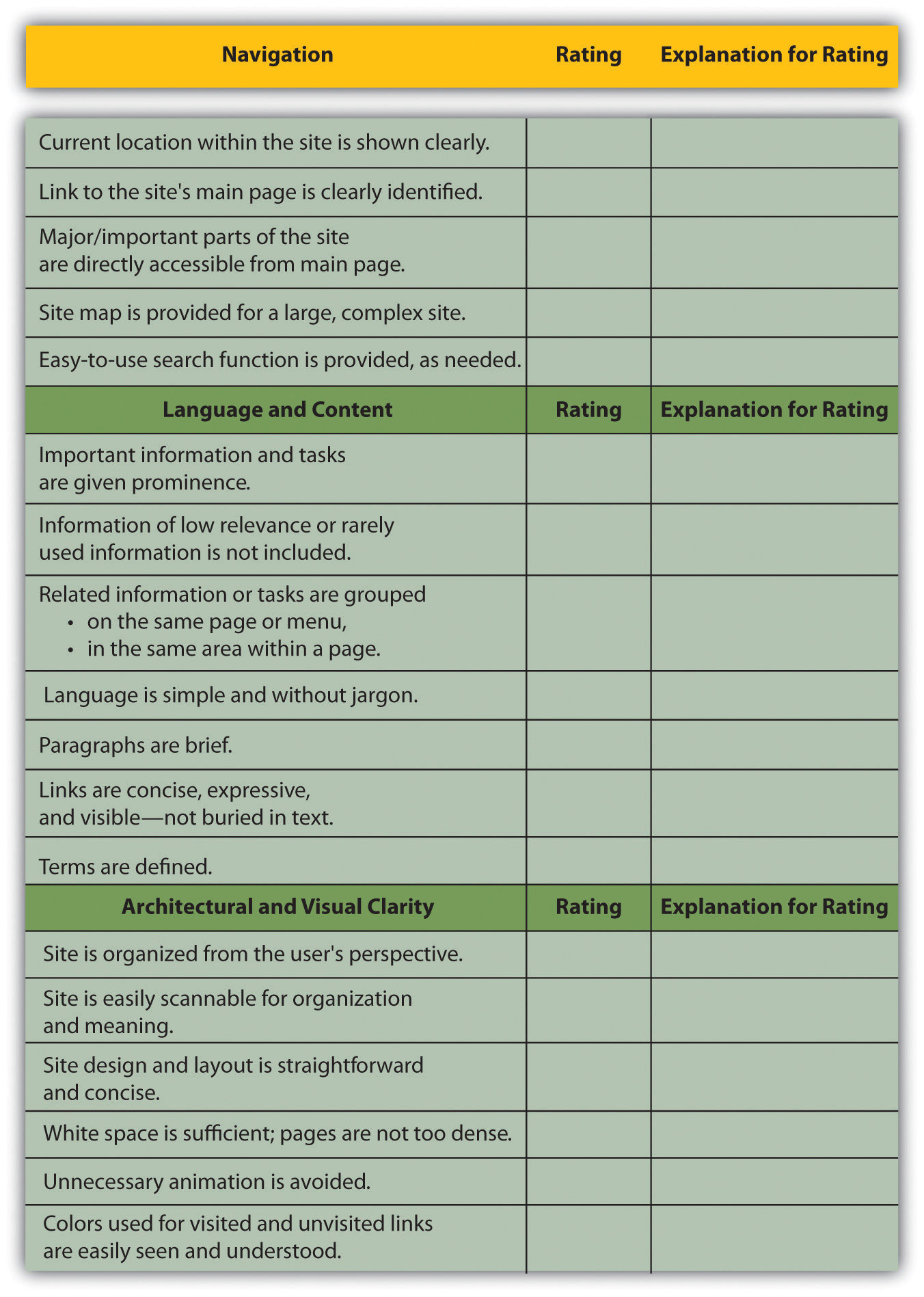
Usability and accessibility guidelines are useful for checking that all elements have been dealt with. Massachusetts Institute of Technology (MIT) Information Services and Technology provides a usability checklist online at http://ist.mit.edu/services/consulting/usability/guidelines.
The following is a copy of some of the items on the MIT checklist. Use it to see how your favorite Web site measures up.
Figure 13.3 Some of the Usability Guidelines from the MIT Checklist
Key Takeaways
- The foundations of a successful site are usability and accessibility.
- Sites should feature the standard conventions.
- Informational architecture is essential to variety.
- A site map should be available from each page.
- The navigation should guide users easily through top-level and deeper pages.
- Accessibility makes sites easy to use and easy to scale.
- Content needs to be written so that users can grab information in as little time as possible.
Exercise
- Why is it fundamental to build Web sites for users’ needs first? What are some ways that user requirements inform the Web development and design process?