This is “Chapter Assignments and Tests”, section 4.5 from the book Using Microsoft Excel (v. 1.1). For details on it (including licensing), click here.
For more information on the source of this book, or why it is available for free, please see the project's home page. You can browse or download additional books there. To download a .zip file containing this book to use offline, simply click here.


4.5 Chapter Assignments and Tests
To assess your understanding of the material covered in the chapter, please complete the following assignments.
Careers in Practice (Skills Review)
Fashion Industry Size Analysis (Comprehensive Review Part A)
Starter File: Chapter 4 CiP Exercise 1
Difficulty: Level 1 Easy
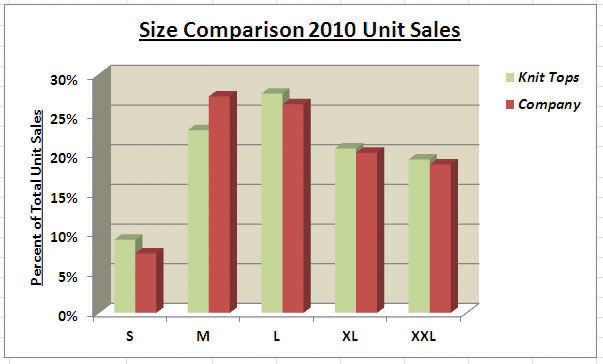
If you are contemplating a career in the fashion industry, you will likely be working with an apparel size analysis report. Understanding the most commonly purchased sizes is critical for any company in the fashion industry. For example, in the apparel manufacturing industry, you have to know how many units to manufacture in each size for a particular garment. In addition, you have to know the exact garment specifications for the sizes small, medium, large, and so on. If you are pursuing a career on the retail side of the fashion industry, your job may be a little more complicated. You have to know how many units of each size of a particular garment to ship to each store. There is nothing more devastating to a fashion company’s sales than luring customers into a store with a great-looking garment and not having their sizes available. The charts presented in this chapter can be valuable tools in analyzing size information for garments. This exercise uses the concept of the frequency distribution and frequency comparison to analyze demand by garment size for the knit tops department of an apparel manufacturing company. The information displayed on these charts can be used to establish the production plan for manufacturing the garments for this department. Begin this exercise by opening the file named Chapter 4 CiP Exercise 1.
- Highlight the range A4:A8 on the Size Analysis worksheet.
- Hold down the CTRL key on your keyboard and highlight the range C4:C8.
- Click the Column button in the Insert tab of the Ribbon. Select the 2-D Clustered Column format option from the drop-down list.
- Move the column chart to a new chart sheet by clicking the Move Chart button in the Design tab of the Ribbon. The sheet tab label should read Tops Size Chart.
- Remove the legend by clicking it once and pressing the DELETE key on your keyboard.
- Click the Chart Title button in the Layout tab of the Chart Tools section of the Ribbon. Select the Above Chart option from the drop-down list.
- Format the chart title by selecting Subtle Effect - Red, Accent 2 from the preset shape style formats in the Format tab of the Ribbon. Change the font style of the chart title to Arial and change the font size to 24 points.
- Click in the chart title and delete text. Type Knit Tops Unit Sales by Size.
- Click any of the bars in the plot area of the chart. Click the down arrow on the Shape Fill button in the Format tab of the Ribbon. Select the Tan, Background 2, Darker 25% color from the drop-down palette.
- Click the Data Labels button in the Layout tab of the Ribbon. Select the Inside End option from the drop-down list.
- Click any data label on the bars of the chart one time. Use the formatting commands in the Home tab of the Ribbon to change the font style to Arial, change the font size to 14 points, and bold the font.
- Use the formatting commands in the Home tab of the Ribbon to format the X and Y axes. Click anywhere on the axis to activate it. Then change the font style to Arial, change the font size to 14 points, and bold the font.
- Click anywhere on the plot area of the chart to activate it. Click and drag down the top center sizing handle approximately one inch. There should be about one inch of space between the bottom of the chart title and the top of the plot area.
- Click the Text Box button in the Insert tab of the Ribbon. Starting from the far upper left side of the chart area, approximately one-half inch below the top, click and drag a box that is approximately two and a half inches wide and one-half inch high.
- Format the text box using the commands in the Home tab of the Ribbon. Change the font style to Arial, change the font size to 12 points, and select the bold and italics commands.
- Type the following in the text box: Based on 2010 Unit Sales.
- Click cell G4 on the Size Analysis worksheet.
- Click the Column button in the Insert tab of the Ribbon and select the 3-D Clustered Column format from the drop-down list.
- Move the chart so the upper left corner is in the center of cell G2.
- Resize the chart so the left side is locked to the left side of Column G, the right side is locked to the right side of Column N, the top is locked to the top of Row 2, and the bottom is locked to the bottom of Row 18.
- Click the Select Data button in the Design tab of the Ribbon.
- Click the Add button on the Select Data Source dialog box.
- Type Knit Tops in the Series name input box. Then press the TAB key on your keyboard, highlight the range C4:C8, and click the OK button on the Edit Series dialog box.
- Click the Add button again on the Select Data Source dialog box.
- Type the word Company in the Series name input box. Then press the TAB key on your keyboard, highlight the range E4:E8, and click the OK button on the Edit Series dialog box.
- Click the Edit button on the right side of the Select Data Source dialog box.
- Highlight the range A4:A8 and click the OK button on the Axis Labels dialog box. Then click the OK button on the Select Data Source dialog box.
- Add a chart title above the plot area of the chart. The title should state the following: Size Comparison 2010 Unit Sales. Select the Underline command in the Home tab of the Ribbon.
- Add a title to the Y axis. Select the Rotated Title format from the drop-down list under the Primary Vertical Axis Title option in the Axis Titles button on the Layout tab of the Ribbon. The title should state: Percent of Total Unit Sales. Change the font size of the title to 12 points and select the Underline command in the Home tab of the Ribbon.
- Click anywhere on the Y axis to activate it. Then click the Format Selection button in the Layout tab of the Ribbon.
- Click the Number option on the left side of the Format Axis dialog box. Click in the Decimal Places input box and change the value to zero. Then click the Close button at the bottom of the Format Axis dialog box.
- Use the formatting commands in the Home tab of the Ribbon to format the X and Y axes. Click anywhere on the axis to activate it. Then change the font size to 12 points and bold the font.
- Click and drag the legend so the top border of the legend aligns with the top line of the chart plot area. Use the formatting commands in the Home tab of the Ribbon to increase the font size of the legend to 12 points and select the bold and italics commands.
- Click anywhere on the plot area to activate it. Then click the down arrow on the Shape Fill button in the Format tab of the Ribbon. Select the Tan, Background 2, Darker 10% option from the color palette.
- Click any of the bars representing the Knit Tops data series. Then click the down arrow on the Shape Fill button in the Format tab of the Ribbon. Select the Olive Green, Accent 3, Lighter 40% option from the color palette.
- Save the workbook by adding your name in front of the current workbook name (i.e., “your name Chapter 4 CiP Exercise 1”).
- Close the workbook and Excel.
Figure 4.64 Completed 2-D Column Chart CiP Exercise 1
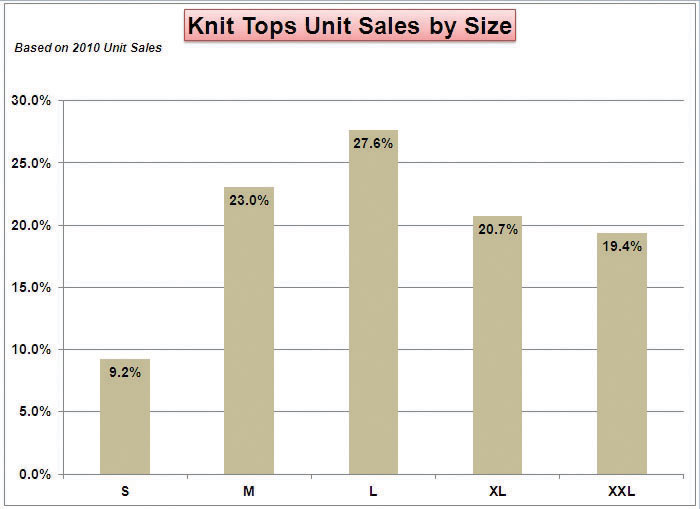
Figure 4.65 Completed 3-D Column Chart CiP Exercise 1
Careers in Practice (Skills Review)
Fashion Retail Markdown Analysis (Comprehensive Review Part B)
Starter File: Chapter 4 CiP Exercise 1 (Continued from Comprehensive Review Part A)
Difficulty: Level 2 Moderate
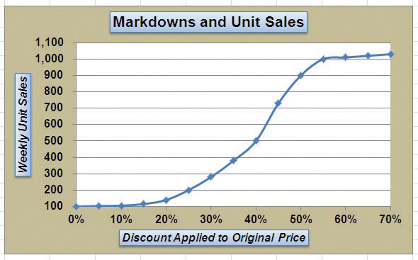
The following exercise continues the fashion industry theme that was presented in part A of this exercise. In this exercise, we focus on the retail side of the fashion industry. Markdowns are a critical component for operating a successful fashion retail business. When an item is marked down, the price is reduced by a certain amount with the expectation that it will increase the number of units sold. This is also known as putting an item on sale. You have probably seen, and perhaps taken advantage of, these sales during a visit to your local mall. A surplus of inventory can present considerable losses for a fashion retailer. Therefore, the timing and the amount of discount taken on an item is critical in managing the inventory for these companies. The increase in the number of units sold will depend on the size of the discount offered on a particular item. The scatter chart demonstrated in this chapter is a valuable tool in analyzing the rate at which unit sales increase when discounts are offered on an item. Begin this exercise by opening the file named Chapter 4 CiP Exercise 1 or continue with this file if you completed Comprehensive Review Part A.
- Click cell E2 on the Markdown Analysis worksheet.
- Click the Scatter button on the Insert tab of the Ribbon. Select the Scatter with Smooth Lines and Markers format option.
- Move the chart so the upper left corner is in the center of cell E2.
- Resize the chart so the left side is locked to the left side of Column E, the right side is locked to the right side of Column M, the top is locked to the top of Row 2, and the bottom is locked to the bottom of Row 18.
- Click the Select Data button in the Design tab of the Ribbon. Then click the Add button on the Select Data Source dialog box.
-
Complete the inputs for the Edit Series dialog box as follows:
- Series Name: Markdowns and Unit Sales
- Series X Values: A3:A17
- Series Y Values: C3:C17
- Click the OK button on the Edit Series and Select Data Source dialog boxes.
- Remove the legend from the chart.
- Click anywhere on the Y axis to activate it. Click the Format Selection button in the Format tab of the Ribbon.
- Change the scale of the Y axis so the minimum value is set to 100 units. Then click the Close button at the bottom of the Format Axis dialog box.
- Change the scale of the X axis so the maximum value is set to 70%.
- Format the X and Y axes to an Arial font style, bold, and font size of 12 points.
- Add an X axis title that reads Discount Applied to Original Price. Format the title with the Subtle Effect - Blue, Accent 1 preset shape style. Change the font style to Arial, bold, italics, and font size of 12 points.
- Add a Y axis title that reads Weekly Unit Sales. Use the Rotated Title alignment. Format the title with the Subtle Effect - Blue, Accent 1 preset shape style. Change the font style to Arial, bold, italics, and font size of 12 points.
- Format the chart title with the Subtle Effect - Blue, Accent 1 preset shape style. Change the font style to Arial and change the font size to 16 points.
- Change the color of the chart area to Tan, Background 2, Darker 25%. Notice that when a discount is offered up to 20% off the original price, there is very little change in the number of units sold. This is typical in the fashion industry. If customers are not willing to pay full price for a particular style or color, it usually takes a substantial discount to convince them to buy.
- Save the workbook.
- Close the workbook and Excel.
Figure 4.66 Completed Scatter Chart CiP Exercise 1
Careers in Practice (Skills Review)
Personal Spending and Savings Plan
Starter File: Chapter 4 CiP Exercise 2
Difficulty: Level 2 Moderate
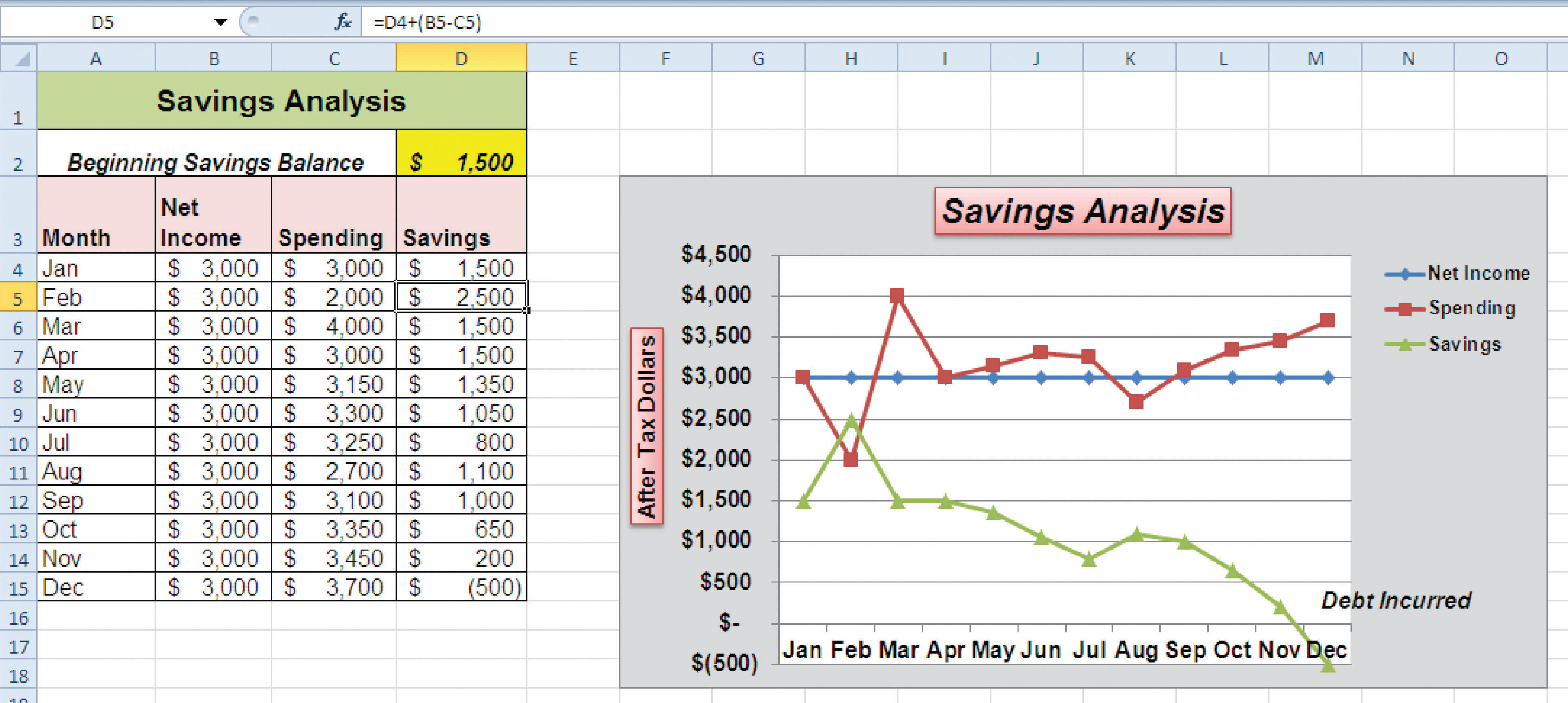
Excel can be a valuable tool for constructing a personal budget. As mentioned in Chapter 2 "Mathematical Computations", developing a personal budget is an important exercise for establishing a path to financial security. One of the benefits of developing and maintaining a personal budget is that it allows you to maintain a healthy level of savings. Money that you save can be used to buy personal items. However, it can also be used to sustain your everyday expenses in the event you lose a job or source of income. Without a reasonable level of savings, you may be forced to borrow money, which could come at very high interest expenses in the form of credit cards. Once you accumulate large debt balances at high interest rates, it can take years to pay off that debt, and the interest expense that you pay reduces savings for more important purposes such as college or retirement. What most people do not realize is that even what appears to be the most trivial overage in spending can rapidly eliminate any savings and quickly turn into debt. The purpose of this exercise is to use the charts in this chapter to evaluate a personal expense plan and to analyze the relationship that spending and net income have on your ability to save money. Begin this exercise by opening the file named Chapter 4 CiP Exercise 2.
- Create a pie chart using the data in the Expense Plan worksheet. The chart should show the percent of total for the categories in the range A3:A10 based on the Annual Spend values in the range D3:D10. Use the Exploded Pie in 3-D format.
- Move the pie chart to a separate chart sheet. The tab name for the chart sheet should read Expense Chart.
- Remove the legend from the chart.
- Edit the title of the chart to read Personal Expenses. Format the chart title with an Arial font style, bold, italics, and font size of 20 points.
- Add data labels to each section of the pie chart. Show only the category name and the percentage. Format the percentage to show one decimal place.
- Format the data labels with an Arial font style, bold, and font size of 14 points. Notice that the mortgage and tax categories make up over 50% of total expenses.
- Enter a formula into cell D4 on the Savings worksheet. Your formula should add to the savings balance in cell D2 the result of subtracting the spending value in cell C4 from the net income value in cell B4.
- Enter a formula into cell D5 on the Savings worksheet. Your formula should add to the output in cell D4 the result of subtracting the spending value in cell C5 from the net income value in cell B5. Copy this formula and paste it into the range D6:D15 using the Paste Formulas command.
- Create a line chart using the data in the Savings worksheet. The chart should show the months in the range A4:A15 along the X axis. The Y axis should show the dollar amounts in the range B4:D15. There should be three data series displayed on the chart: Net Income, Spending, and Savings. Use the Line with Markers format option.
- Move the chart so the upper left corner is in the center of cell F3.
- Resize the chart so the left side is locked to the left side of Column F, the right side is locked to the right side of Column O, the top is locked to the top of Row 3, and the bottom is locked to the bottom of Row 18.
- Add a chart title above the plot area that reads Savings Analysis. Format the title with the Subtle Effect - Red, Accent 2 preset shape style. Then change the font style to Arial, bold, and italics.
- Add a title to the Y axis that reads After Tax Dollars. Use the Rotated Title alignment option. Format the title with the Subtle Effect - Red, Accent 2 preset shape style. Then, change the font style to Arial and change the font size to 12 points. Move the title if needed so it is on the far left of the chart area and centered along the Y axis.
- Format the X and Y axes by changing the font style to Arial, making the font bold, and changing the font size to 12 points.
- Change the scale of the Y axis so the minimum value is set to −500.
- Move the legend up so it is aligned with the $4,500 line of the plot area. Expand the width of the legend so it extends to the far right side of the chart area. Then format the legend by changing the font style to Arial and making the font bold.
- Change the color of the chart area to White, Background 1, Darker 15%, which is a shade of gray.
- Add an annotation that begins approximately one inch above the Dec label on the X axis. The annotation should extend approximately one and one-quarter inches wide and approximately one-quarter inch in height. The annotation should read Debt Incurred. Format the annotation by changing the font style to Arial, bold, italics, and font size of 12 points.
- Save the workbook by adding your name in front of the current workbook name (i.e., “your name Chapter 4 CiP Exercise 2”).
- Close the workbook and Excel.
Figure 4.67 Completed Pie Chart CiP Exercise 2
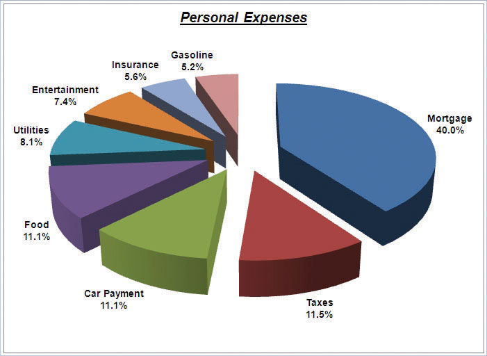
Figure 4.68 Completed Line Chart CiP Exercise 2
Integrity Check
Starter File: Chapter 4 IC Exercise 3
Difficulty: Level 3 Difficult
The purpose of this exercise is to analyze a worksheet to determine if there are any integrity flaws. Read the following scenario, then open the Excel workbook related to this exercise. You will find a worksheet in the workbook named AnswerSheet. This worksheet is to be used for any written responses required for this exercise.
Scenario
You are working as the director of investment research for a small wealth management firm. Your firm helps people make investment decisions and establish plans for key life events such as saving for college, retirement, and so on. An intern who is working for the firm is evaluating the profit trends for two companies: Big Company and Goode Company. He sends you an Excel workbook and explains the following with respect to his analysis:
- I put a chart together to compare the earnings for the two companies. There is really nothing to look at. Big Company’s profits are so much larger than those for the Goode Company. Based on this chart, I don’t see how we would advise our clients to invest in the Goode Company. We should probably stick with the Big Company.
- Just so you know, the profit numbers on the chart are in thousands. Otherwise, it is a pretty straightforward column chart. I put the profits the companies earned for each quarter on the Y axis and the quarters are shown on the X axis.
Assignment
- How many points of data is the analyst using on the chart? Does it make sense to use a column chart for this analysis? If not, what would be a better choice? Place your answer in the AnswerSheet worksheet.
- Look at the profit values for the two companies. Does it make sense to compare these values? If not, explain why and what alternatives you could pursue. Place your answer in the AnswerSheet worksheet.
- The analyst mentioned that the profit numbers are in terms of thousands. Would this be apparent by looking at the chart? If not, why? Place your answer in the AnswerSheet worksheet.
- Looking at the X axis of the column chart, you will see that the quarters keep repeating 1 through 4 for each year in Column A. Can anything be done to show the year that each set of four quarters represents? Place your answer in the AnswerSheet worksheet.
- Move the chart created by the analyst to a separate chart sheet and label the sheet tab Analyst’s Chart. Make any necessary modifications to the Profit Analysis worksheet to create a chart that presents an appropriate comparison between the Big Company and the Goode Company. Create a new chart comparing the profits of the Big Company and the Goode Company. Pay careful attention to formatting details.
- Do you agree with the analyst’s conclusion that the firm should advise clients to invest in the Big Company over the Goode Company? Place your answer in the AnswerSheet worksheet.
Applying Excel Skills
Hotel Occupancy and Cleaning Expenses
Starter File: Chapter 4 AES Assignment 1
Difficulty: Level 3 Difficult
The purpose of this exercise is to analyze the activity and cost data for a hotel using a scatter chart. The data provided in the Hotel Costs worksheet can be used to establish a trendline on a scatter chart. The equation for the trendline can then be used to determine what the hotel may incur with regard to cleaning costs at different levels of occupancy. This is an alternative to the High Low method presented in Chapter 2 "Mathematical Computations". Your assignment is to create the scatter chart and construct a formula that can be used for planning cleaning costs at different levels of occupancy based on the following requirements:
- Columns B and C in the Hotel Costs worksheet contain occupancy and cleaning cost data for 12 months. Create a scatter chart that shows just the plot points (Scatter with only Markers) for the occupancy and cleaning costs for each month on this worksheet. The chart should be embedded in the Hotel Costs worksheet and should include the appropriate formatting techniques covered in this chapter.
- Adjust the scale of the X and Y axes so the minimum value is 2000.
- Add a linear trendline to the chart and show the equation.
- Use the trendline equation to enter a formula in cell C19 that calculates the estimated cleaning costs based on the occupancy level that is typed into cell C18.
Quality Control Analysis
Starter File: Chapter 4 AES Assignment 2
Difficulty: Level 3 Difficult
The purpose of this exercise is to analyze how cost changes in the operations of a quality control department impact the overall cost of quality for a manufacturing company. The Quality Control worksheet contains two years of cost data for four components of a quality control department: prevention, inspection, internal failure, and external failure. You will see that total quality costs decreased from year 1 to year 2. Create a chart that you believe is most appropriate to present the change in costs from one year to the next. The requirements are as follows:
- The chart should show which components are increasing or decreasing from year 1 to year 2. In addition, the dollar value for each component should appear on the chart for each year.
- The total quality control costs for each year should be specified on the chart.
- The chart should appear in a separate chart sheet.
- You should include appropriate formatting techniques covered in this chapter.
Chapter Skills Test
Starter File: Chapter 4 Skills Test
Difficulty: Level 2 Moderate
Answer the following questions by executing the skills on the starter file required for this test. Answer each question in the order in which it appears. If you do not know the answer, skip to the next question. Open the starter file listed above before you begin this test.
- Create a pie chart using the data in the Market Share worksheet. The pie chart should show the percent of total for only the year 2000. Use the Exploded Pie in 3-D format.
- Move the chart so the upper left corner is in the center of cell E2.
- Resize the chart so the left side is locked to the left side of Column E, the right side is locked to the right side of Column M, the top is locked to the top of Row 2, and the bottom is locked to the bottom of Row 17.
- Remove the legend.
- Change the chart title to the following: Market Share for the Year 2000.
- Add the Category Name and Percentage data labels to the outside end of each section of the pie chart.
- Bold the data labels and change the font style to Arial.
- Create a 100% stacked column chart using the data in the Market Share worksheet. The stacked column chart should show the percentages 0% to 100% along the Y axis. The X axis should show stacks for the year 2000 and 2010. There should only be two stacks, or columns, in the plot area showing the percent of total for each company.
- Move the 100% stacked column chart to a separate chart sheet. The tab name for the chart sheet should read Market Share Chart.
- Remove the legend on the stacked column chart and add a data table with legend keys below the X axis.
- Add a title above the chart that reads 10-Year Change in Market Share.
- Format the chart title using the Subtle Effect - Red, Accent 2 preset shape style. Change the font style to Arial and the font size to 20 points.
- Add a Y axis title that reads Market Share. Use the Rotated Title alignment.
- Format the Y axis title using the Subtle Effect - Red, Accent 2 preset shape style. Change the font style to Arial and the font size to 16 points.
- Format the X and Y axes by changing the font style to Arial, making the font bold, and changing the font size to 14 points.
- Change the fill color of the chart area to Tan, Background 2, Darker 10%.
- Add series lines that connect each section of the two stacks in the plot area.
- Create a column chart showing just the Company Sales in the Sales Data worksheet. The chart should show the Company Sales in the range B3:B13 along the Y axis. The years in the range A3:A13 should appear on the X axis. Use the basic 2-D Clustered Column format. The series name should be Gross Sales.
- Move the column chart to a separate chart sheet. The tab name for the chart sheet should read Company Sales Chart.
- Remove the legend on the column chart. Then format the X and Y axes by changing the font style to Arial, making the font bold, and changing the font size to 16 points.
- Reduce the height of the plot area by approximately one inch. There should be about one inch of space between the bottom of the chart title and the top of the plot area.
- Add an annotation above the Y axis that reads Sales in Millions. Format the annotation with an Arial font style, bold font, italics font, and font size of 14 points.
- Change the color of the bars in the plot area to dark red.
-
Create a line chart comparing the change in sales for the company and overall industry in the Sales Data worksheet. Construct the chart as follows:
- The Y axis should show the growth percentages for the company in the range C3:C13 and the growth percentages for the industry in the range E3:E13.
- The series name for the company growth percentages should be Company.
- The series name for the industry growth percentages should be Industry.
- The years in the range A3:A13 should appear on the X axis.
- Use the Line with Markers format.
- Move the chart so the upper left corner is in the center of cell G2.
- Resize the chart so the left side is locked to the left side of Column G, the right side is locked to the right side of Column P, the top is locked to the top of Row 2, and the bottom is locked to the bottom of Row 18.
- Adjust the scale of the Y axis so the maximum value is set to .20.
- Format the values on the Y axis so there are zero decimal places.
- Save the workbook by adding your name in front of the current workbook name (i.e., “your name Chapter 4 Skills Test”).
- Close the workbook and Excel.