This is “The Scatter Chart”, section 4.3 from the book Using Microsoft Excel (v. 1.1). For details on it (including licensing), click here.
For more information on the source of this book, or why it is available for free, please see the project's home page. You can browse or download additional books there. To download a .zip file containing this book to use offline, simply click here.


4.3 The Scatter Chart
Learning Objectives
- Construct a scatter chart to show the supply and demand curves for a market.
- Learn how to adjust the scale of the X and Y axes of a scatter chart.
- Add a trendline and line equation to a data series on a scatter chart.
This section focuses on the scatter chartChart used when quantitative or numeric values are required for both the X and Y axes. type. What makes this chart different from the other charts demonstrated in this chapter is that values are used on both the X and Y axes. So far, the charts we have demonstrated in this chapter use categories or qualitative labels for the X axis. This means that the distance between each category on the X axis will always be the same, even if numbers are used. In a scatter chart, the X axis operates just like the Y axis. In other words, the distance between the values on the X axis will vary depending on the value of the number. Depending on the format, we can create the scatter chart to look just like a line chart. Since both the X and Y axes contain quantitative values, the scatter chart is a valuable tool for studying various shapes or functional forms for a line chart. In fact, a common feature used with the scatter chart is the trendline and equation. Excel can evaluate the line that is produced on a scatter chart and produce a mathematical equation. We will demonstrate these features in this section.
Supply and Demand: The Scatter Chart
Follow-along file: Continue with Excel Objective 4.00. (Use file Excel Objective 4.14 if starting here.)
Lesson Video: Supply and Demand (Scatter Chart)
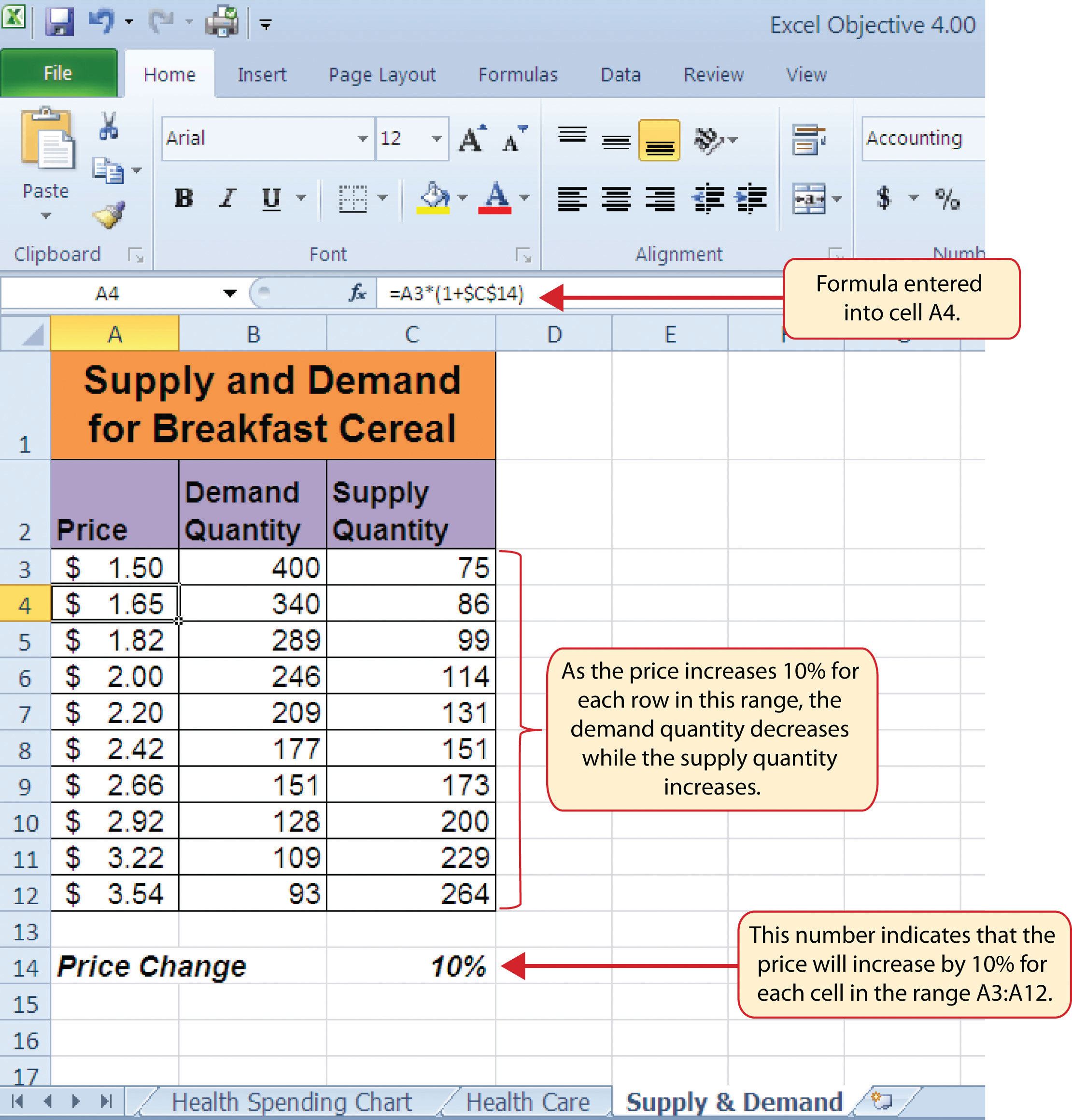
A common use for a scatter chart is the study of supply and demand curves. This is because the data points for both the supply and demand lines require quantitative values on both the X and Y axes. The Y axis contains the price of a certain good or item; the X axis contains the quantity sold for that good or item. Fundamental economic laws state that as prices rise, sellers are willing to increase supply and sell more goods. However, the reverse is true for consumers. As prices rise, consumers purchase fewer goods. The Supply & Demand worksheet contains hypothetical data for the supply and demand of breakfast cereal. There are ten data points to show the change in supply and demand as the price changes in Column A. The values you see in Columns A through C are formula outputs that are driven by the percentage in cell C14. For example, if the percentage in cell C14 is changed to 10, each price listed in Column A will increase, as shown in Figure 4.45 "Hypothetical Supply and Demand Data".
Figure 4.45 Hypothetical Supply and Demand Data
We will use the scatter chart to study the change in quantity supplied and demanded as the price increases over ten data points, as shown in Figure 4.45 "Hypothetical Supply and Demand Data". For many of the charts demonstrated in this chapter, we were able to highlight a range of cells and insert the chart type we needed. This was especially the case when the data was in a contiguous range of cells. However, this method rarely works when creating a scatter chart, even if the data are in a contiguous range. As a result, the method we present here starts with a blank chart and demonstrates how each data series is added to the chart individually. The following steps explain how we create this chart:
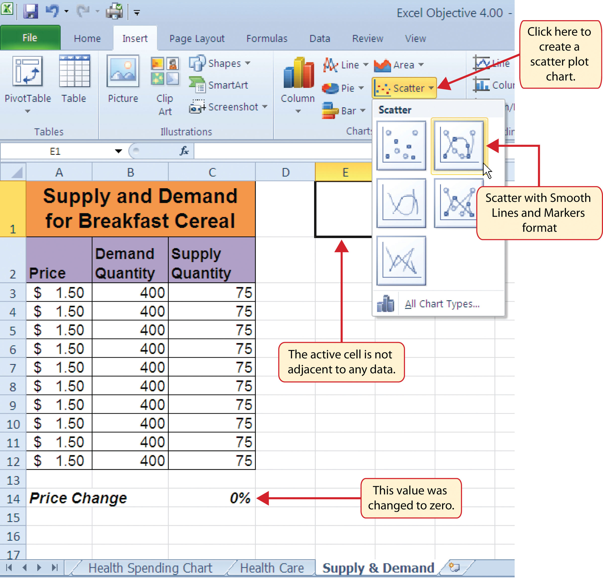
- Change the value in cell C14 on the Supply & Demand worksheet to zero.
- Activate cell E1 on the Supply & Demand worksheet. It is important to note that this cell location is not adjacent to any data on the worksheet.
- Click the Scatter button from the Charts group of commands on the Insert tab of the Ribbon.
-
Select the Scatter with Smooth Lines and Markers format from the drop-down list of options (see Figure 4.46 "Selecting a Scatter Chart Format"). This adds a blank chart to the worksheet.
Figure 4.46 Selecting a Scatter Chart Format
- Click and drag the chart so the upper left corner is in the center of cell E2.
- Resize the chart so the left side is locked to the left side of Column E, the right side is locked to the right side of Column M, the top is locked to the top of Row 2, and the bottom is locked to the bottom of Row 17.
- Click the Design tab in the Chart Tools section of the Ribbon. Then click the Select Data button in the Data group of commands. This opens the Select Data Source dialog box.
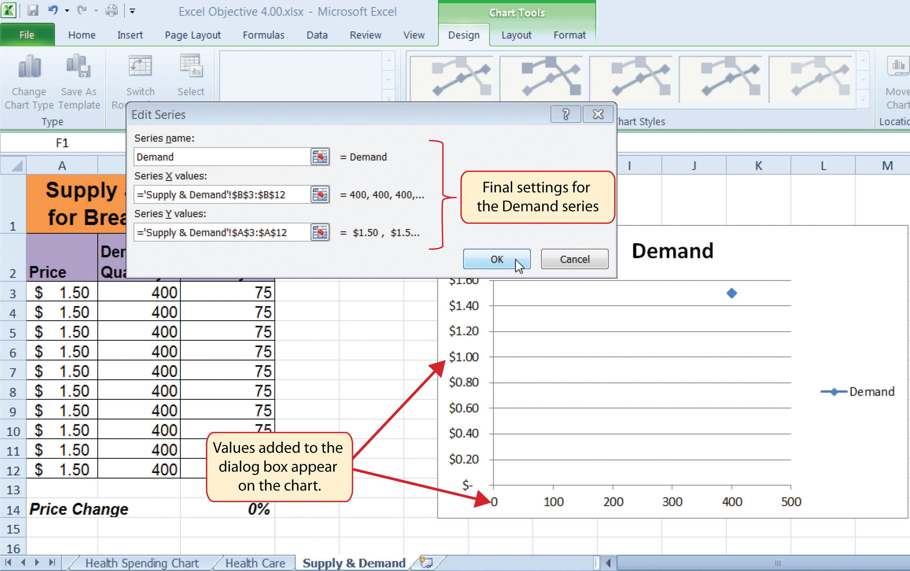
- Click the Add button on the left side of the Select Data Source dialog box. This opens the Edit Series dialog box. Notice on this dialog box there are inputs for defining values for both the X and Y axes. Charts that we previously created using this method only had an input for putting values on the Y axis.
- Type the series name Demand. This should appear in the Series name input box.
- Press the TAB key on your keyboard to advance to the Series X values input box on the Edit Series dialog box.
- Highlight the range B3:B12 on the Supply & Demand worksheet. You will see this range appear in the Series X values input box after it is highlighted.
- Press the TAB key on your keyboard to advance to the Series Y values input box on the Edit Series dialog box.
-
Highlight the range A3:A12 on the Supply & Demand worksheet.
Figure 4.47 "Defining the Demand Data Series" shows the final settings in the Edit Series dialog box for the Demand data series. You will see that as the X and Y axis values are defined in the dialog box, they appear on the chart. The chart in this figure shows the price along the Y axis and quantity along the X axis.
Figure 4.47 Defining the Demand Data Series
- Click the OK button at the bottom of the Edit Series dialog box.
- Click the Add button on the left side of the Select Data Source dialog box.
- Type the series name Supply. This should appear in the Series name input box.
- Press the TAB key on your keyboard to advance to the Series X values input box on the Edit Series dialog box.
- Highlight the range C3:C12 on the Supply & Demand worksheet. This range appears in the Series X values input box after it is highlighted.
- Press the TAB key on your keyboard to advance to the Series Y values input box on the Edit Series dialog box.
- Highlight the range A3:A12 on the Supply & Demand worksheet.
- Click the OK button at the bottom of the Edit Series dialog box.
- Click the OK button at the bottom of the Select Data Source dialog box.
Why?
For Scatter Charts, Start with a Blank Chart
When creating a scatter chart, it is best to start with a blank chart and add each data series individually. This is because Excel will not always guess correctly which values belong on the X and Y axes since both contain numbers. For other chart types, such as column or line charts, the X axis contains nonnumeric data so it’s easy for Excel to configure the chart you need.
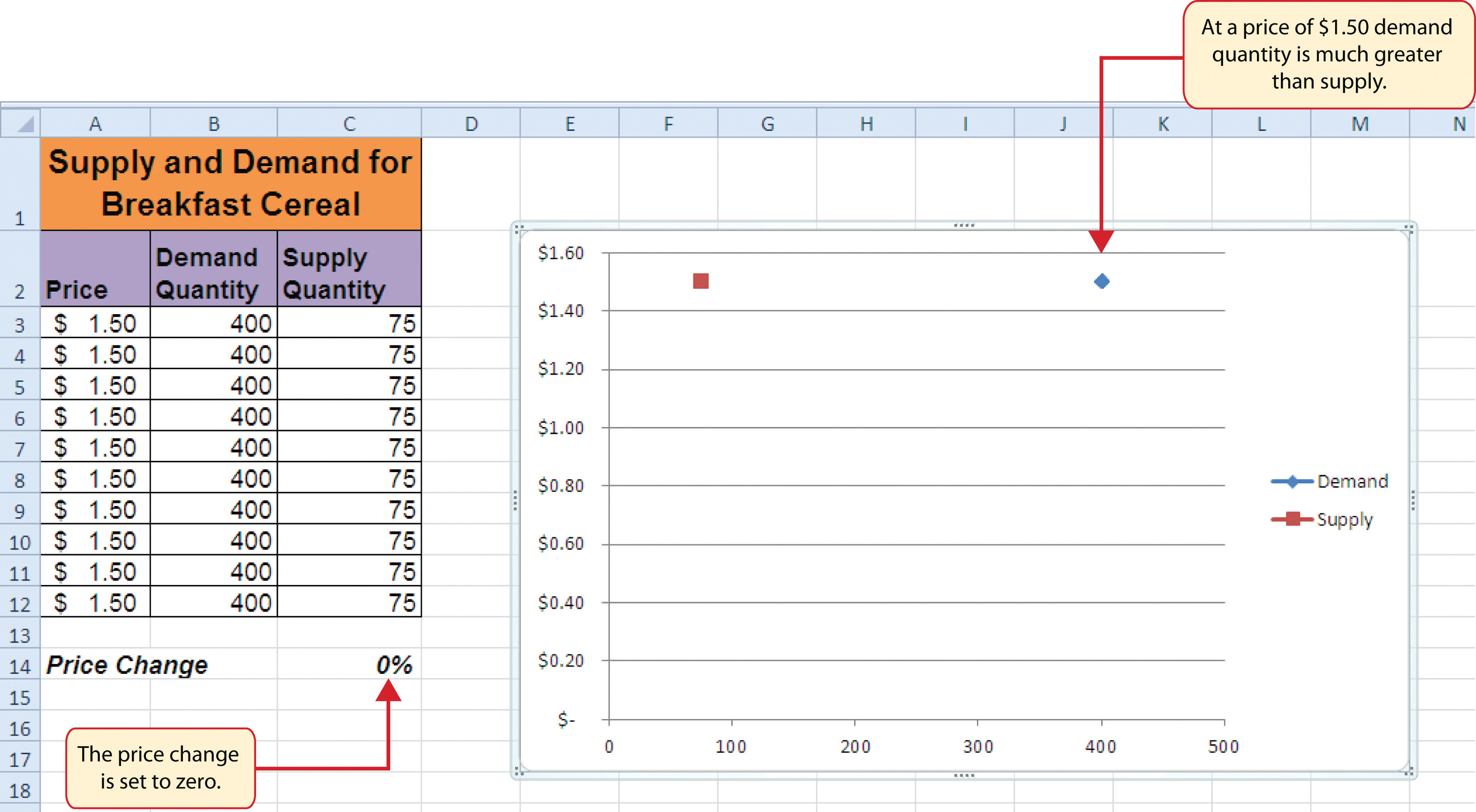
Figure 4.48 "Scatter Chart Showing One Price" shows the appearance of the scatter chart before any formatting enhancements are applied. Notice only two plot points are located on the chart. This is because the price change value in cell C14 is still zero. Therefore, the data are not reflecting any change in price, quantity demanded, or quantity supplied. The chart shows that at the current price of $1.50, suppliers are willing to provide fewer units compared with the number of units consumers are willing to buy.
Figure 4.48 Scatter Chart Showing One Price
The following steps explain the formatting enhancements we will apply to the scatter chart shown in Figure 4.48 "Scatter Chart Showing One Price":
- Add a title to the chart by clicking the Chart Title button in the Layout tab of the Chart Tools section of the Ribbon. Use the Above Chart option from the drop-down list.
- Select Subtle Effect - Orange, Accent 6 from the preset style list in the Shape Styles group of commands on the Format tab of the Ribbon.
- Change the font style of the chart title to Arial and the font size to 14 points.
- Change the wording of the chart title as follows: Supply and Demand for Breakfast Cereal.
- Add a title to the Y axis. Use the Rotated Title option from the Primary Vertical Axis Title drop-down list after clicking the Axis Titles button in the Layout tab of the Ribbon.
- Repeat steps 2 and 3 to format the Y axis title. However, change the font size to 12 points.
- Change the wording of the Y axis title as follows: Price per Unit.
- Add a title to the X axis.
- Repeat steps 2 and 3 to format the X axis title. However, change the font size to 12 points.
- Change the wording of the X axis title as follows: Quantity in Units.
- Make the following format changes to the X and Y axis values: font style Arial, font size 11 points, and bold.
-
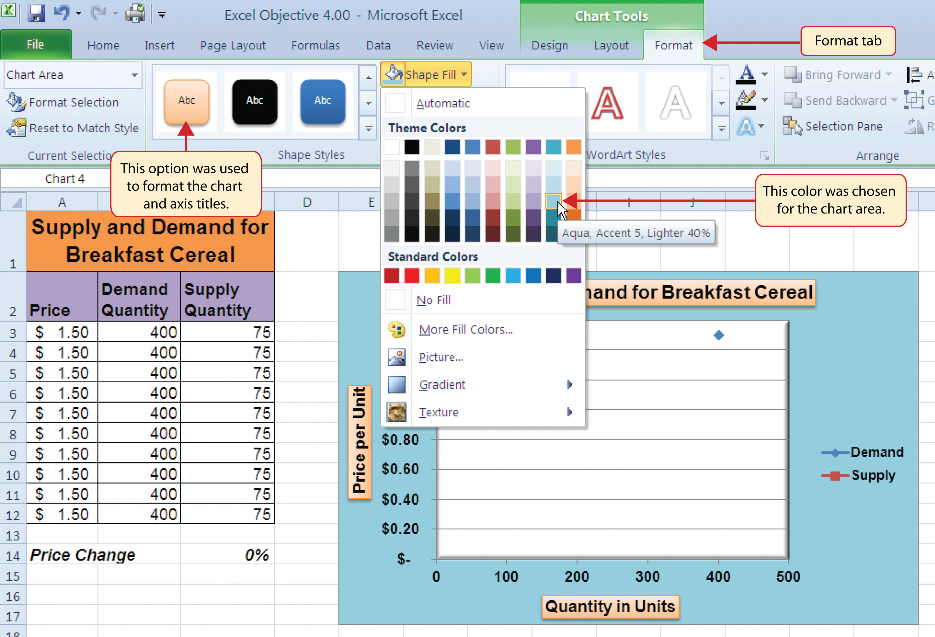
Change the color of the chart area to Aqua, Accent 5, Lighter 40% (see Figure 4.49 "Formatting Enhancements Added to the Scatter Chart").
Figure 4.49 Formatting Enhancements Added to the Scatter Chart
- Apply a bevel effect to the plot area. Use the Circle format option from the Bevel drop-down list of options.
- Change the font style of the legend to Arial and bold the font.
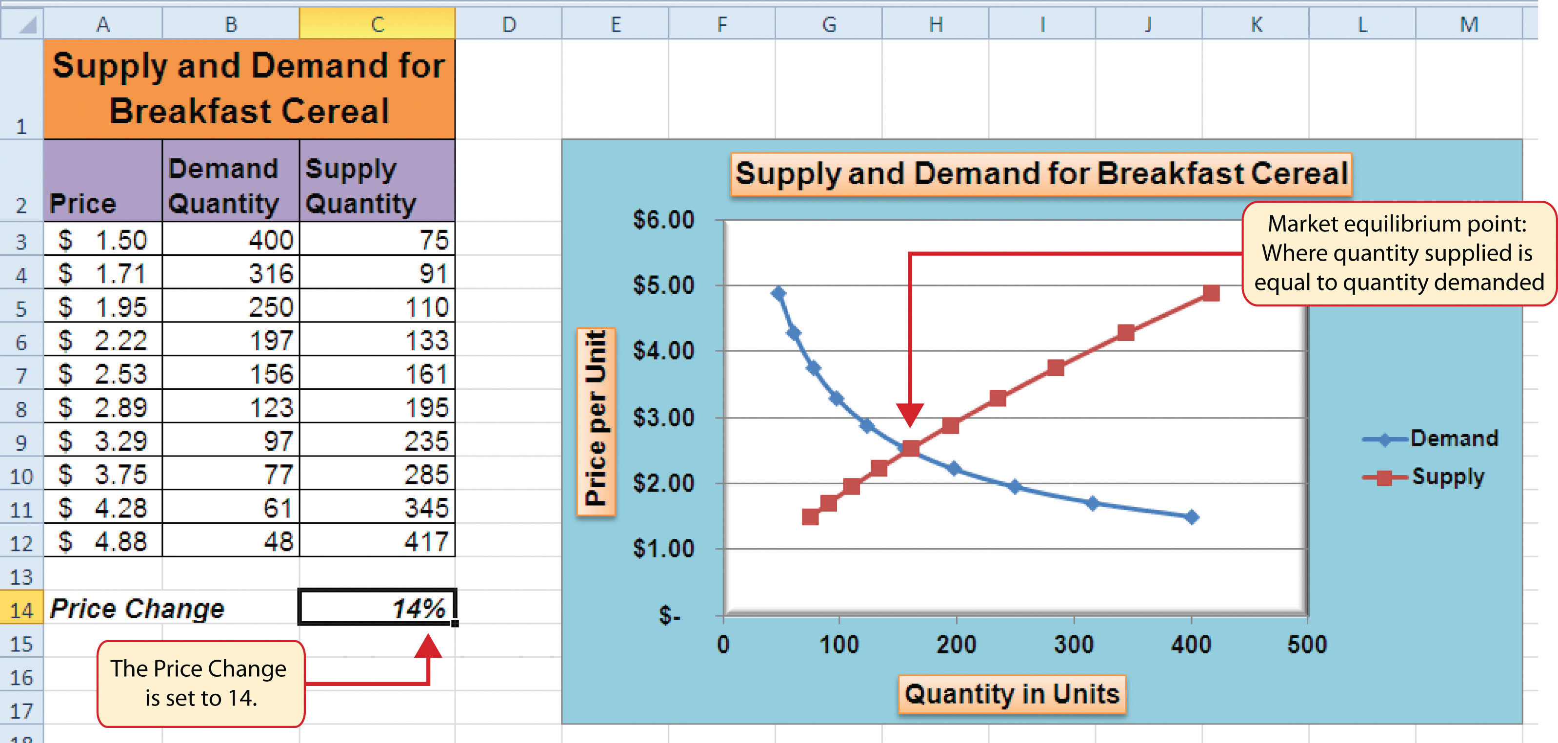
- Change the value in cell C14 to 2. Then change it to 4 and then to 8. Change the value one more time to 14. As you change the values in cell C14, you will see the lines change on the chart.
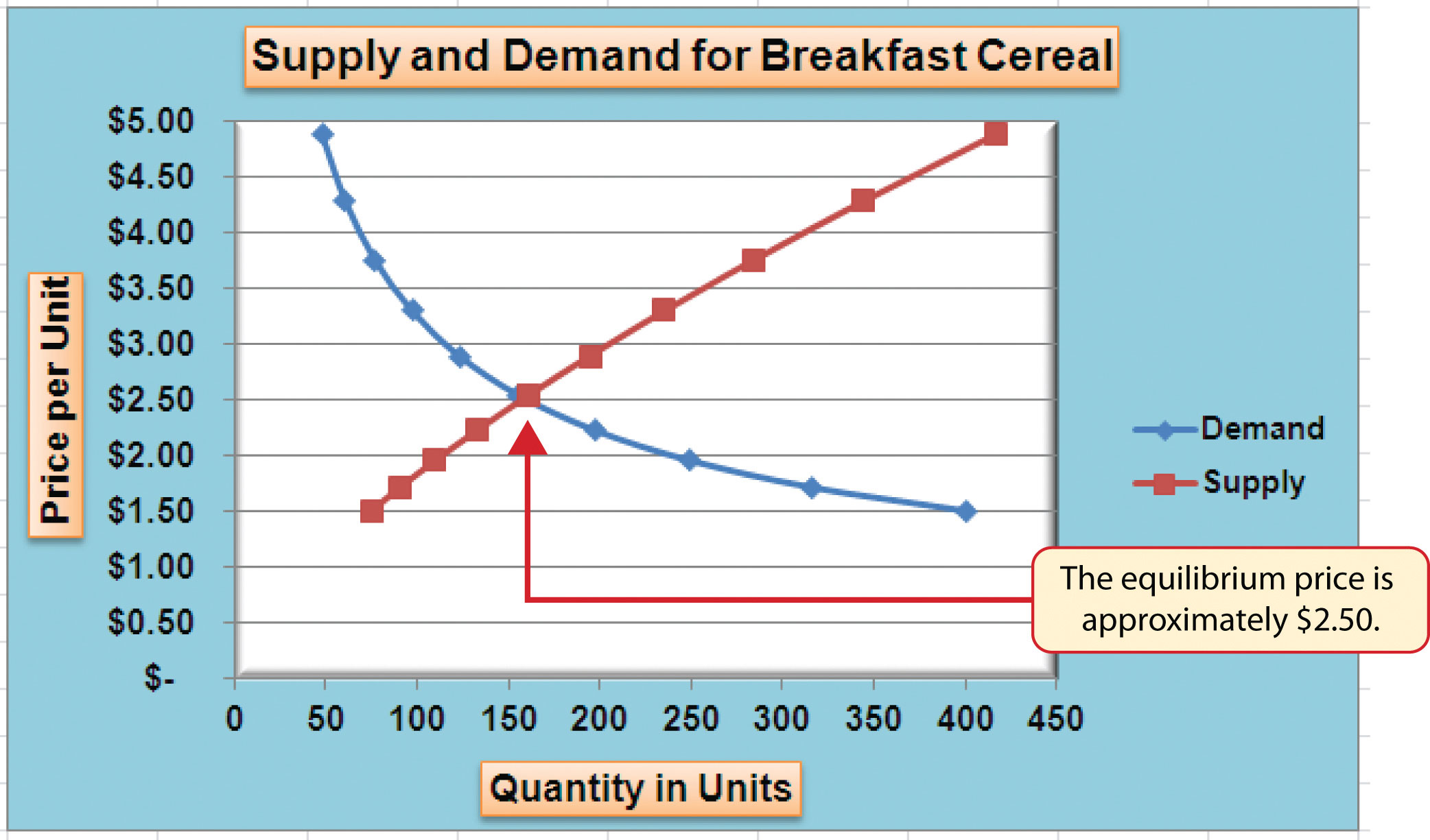
Figure 4.50 "Scatter Chart with Price Change at 2%" shows the completed scatter chart when the Price Change is set to 2%, and Figure 4.51 "Scatter Chart with Price Change at 14%" shows the same chart when the Price Change is set to 14%. The point at which the demand and supply lines intersect on Figure 4.51 "Scatter Chart with Price Change at 14%" is known as the market equilibrium point. The market equilibriumA state in which the quantity demanded equals the quantity supplied at a specific price. is where the quantity demanded equals the quantity supplied at a specific price. The price where quantity demanded equals quantity supplied is referred to as the equilibrium priceThe price where quantity demanded equals quantity supplied..
Figure 4.50 Scatter Chart with Price Change at 2%
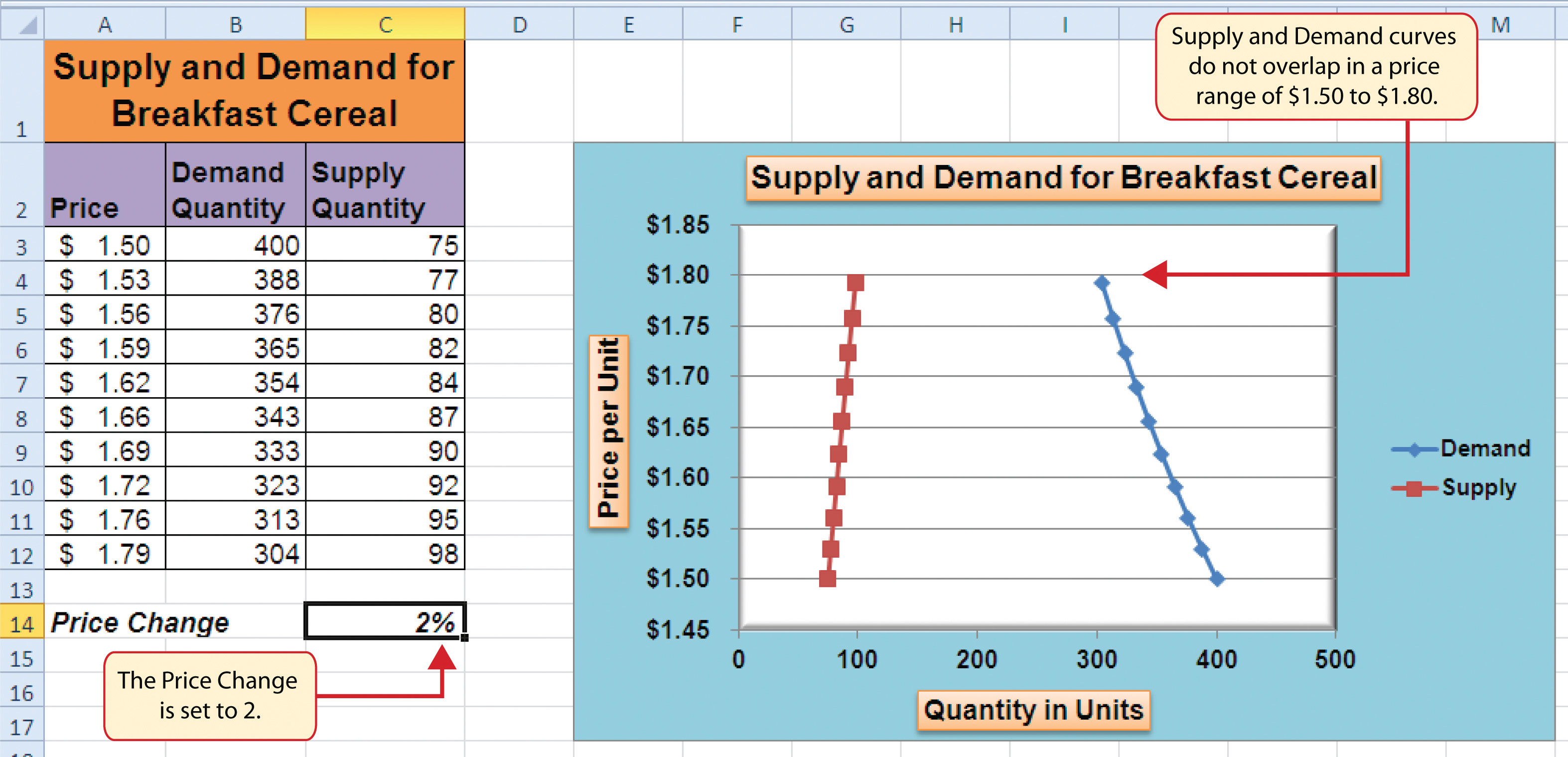
Figure 4.51 Scatter Chart with Price Change at 14%
Skill Refresher: Creating a Scatter Plot Chart
- Click a blank cell that is not adjacent to any data on the worksheet.
- Click the Insert tab of the Ribbon.
- Click the Scatter button in the Charts group of commands.
- Select a format option from the drop-down list.
- Move the blank chart off any cell locations containing data that will be used to create the chart.
- Click the Select Data button in the Design tab of the Chart Tools section of the Ribbon.
- Click the Add button on the Select Data Source dialog box.
- Type a name for the data series in the Series name input box in the Edit Series dialog box.
- Press the TAB key on your keyboard to advance to the Series X values input box.
- Highlight the range of cells on your worksheet that contain values to be plotted on the X axis.
- Press the TAB key on your keyboard to advance to the Series Y values input box.
- Highlight the range of cells on your worksheet that contain values to be plotted on the Y axis.
- Click the OK button in the Edit Series dialog box.
- Repeat steps 7 through 13 for each data series you want to add to the chart.
- Click the OK button at the bottom of the Select Data Source dialog box.
Changing the Scale of the X and Y Axes
Follow-along file: Continue with Excel Objective 4.00. (Use file Excel Objective 4.15 if starting here.)
Lesson Video: Changing the Scale of the X and Y Axes
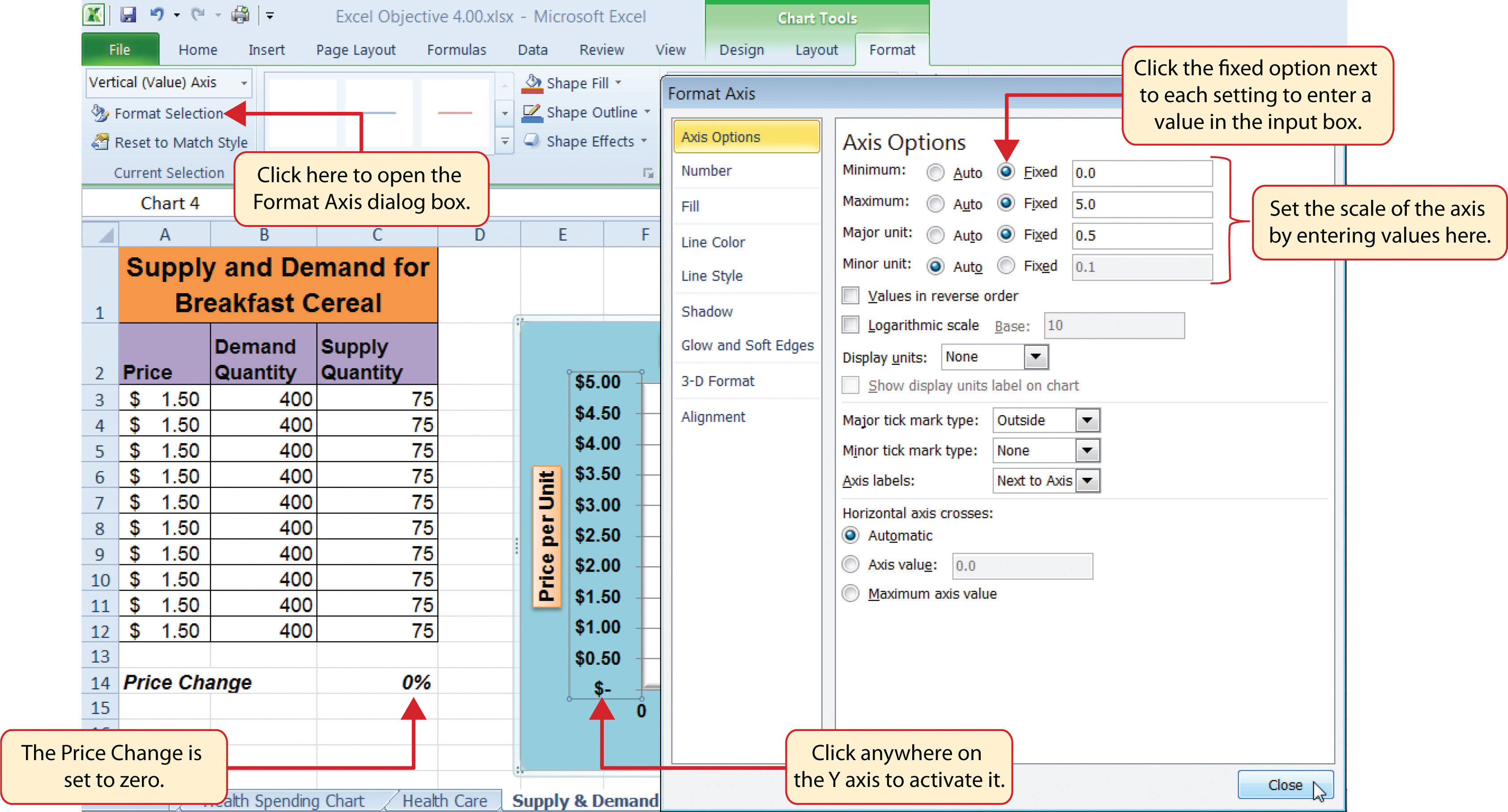
For all the charts demonstrated in this chapter, Excel has automatically established the scale for the Y axis. For scatter charts, Excel has also established the scale for the X axis. The axis scaleThe minimum and maximum value that appears on the X or Y axis of a chart. is the minimum and maximum value that appears on an axis. For example, in Figure 4.51 "Scatter Chart with Price Change at 14%", the Y axis scale is set to a minimum value of zero and a maximum value of 6.00. Although this is a very convenient feature of Excel, you may want to change the scale in some instances. If you change the value in cell C14 on the Supply & Demand worksheet, the lines jump or shift on the plot area of the chart. This is because Excel keeps rearranging the scale of both the X and Y axes. When studying the shape of lines, it is best to set the scale so it does not change. The following steps explain how to accomplish this:
- Change the value in cell C14 on the Supply & Demand worksheet to zero.
- Click anywhere on the Y axis of the chart.
- Click the Format Selection button in the Layout tab of the Chart Tools section of the Ribbon. This opens the Format Axis dialog box.
- Click the Fixed option next to the Minimum setting under the Axis Options in the Format Axis dialog box. This ensures that the minimum value for the Y axis will always be zero.
- Click the Fixed option next to the Maximum setting under the Axis Options in the Format Axis dialog box.
- Click in the input box next to the Maximum setting. Remove the 1.6 and enter the number 5.0. We will not be studying the behavior of supply and demand beyond a $5.00 price point, so there is no need to extend the Y axis beyond this point.
- Click the Fixed option next to the Major Unit setting under the Axis Options in the Format Axis dialog box.
- Click in the input box next to the Major Unit setting and change the value from 0.2 to 0.5 (see Figure 4.52 "Setting the Y Axis Scale"). This allows us to measure the plot points in $0.50 intervals along the Y axis. When the axis extends to $5.00, $0.20 intervals may place too many values along the Y axis, making it difficult to read.
-
Click the Close button at the bottom of the Format Axis dialog box.
Figure 4.52 Setting the Y Axis Scale
- Click anywhere along the X axis of the chart.
- Click the Format Selection button in the Layout tab of the Chart Tools section of the Ribbon. This opens the Format Axis dialog box for the X axis.
- Click the Fixed option next to the Minimum setting under the Axis Options in the Format Axis dialog box. This ensures that the minimum value for the X axis will always be zero.
- Click the Fixed option next to the Maximum setting under the Axis Options in the Format Axis dialog box.
- Click in the input box next to the Maximum setting. Remove the 500.0 and enter the number 450.0. The number of units supplied or demanded will not exceed 450 based on the price points in our study. There is no need to extend the X axis to 500.
- Click the Fixed option next to the Major Unit setting under the Axis Options in the Format Axis dialog box.
- Click in the input box next to the Major Unit setting and change the value from 100.0 to 50.0. This allows us to measure the plot points in 50-unit intervals along the X axis.
- Click the Close button at the bottom of the Format Axis dialog box.
- Change the value in cell C14 to 2. Then change it to 4 and then to 8. Change the value one more time to 14. As you change the values in cell C14, the lines change but they no longer jump or shift since the scale of both axes is fixed.
Figure 4.53 "Final Appearance of the Scatter Chart" shows the final appearance of the scatter chart after the scale is set for both the X and Y axes. Notice that market equilibrium is achieved at a price of approximately $2.50.
Figure 4.53 Final Appearance of the Scatter Chart
Adding a Trendline and Equation
Follow-along file: Continue with Excel Objective 4.00. (Use file Excel Objective 4.16 if starting here.)
Lesson Video: Trendline and Equation
A trendline can be applied to a chart to estimate or predict where plot points may occur at various points along the X and Y axes. Excel enables you to add a trendline to a chart and also provides the equation you can use to plot additional points. The following steps explain how to accomplish this:
- Set the value in cell C14 on the Supply & Demand worksheet to 14.
- Click anywhere in the chart area of the scatter chart to activate it.
- Click the Trendline button in the Layout tab of the Ribbon. Select the Linear Trendline option from the drop-down list.
-
Select the Demand option from the Add Trendline dialog box and click the OK button. This adds a new line to the plot area of the chart as well as the legend.
Figure 4.54 "Adding a Linear Trendline" shows the scatter chart after adding a linear trendline. Notice that the line goes through only two points on the demand line. This indicates that this trendline may not be a good fit for the line that has been created on the chart.
Figure 4.54 Adding a Linear Trendline
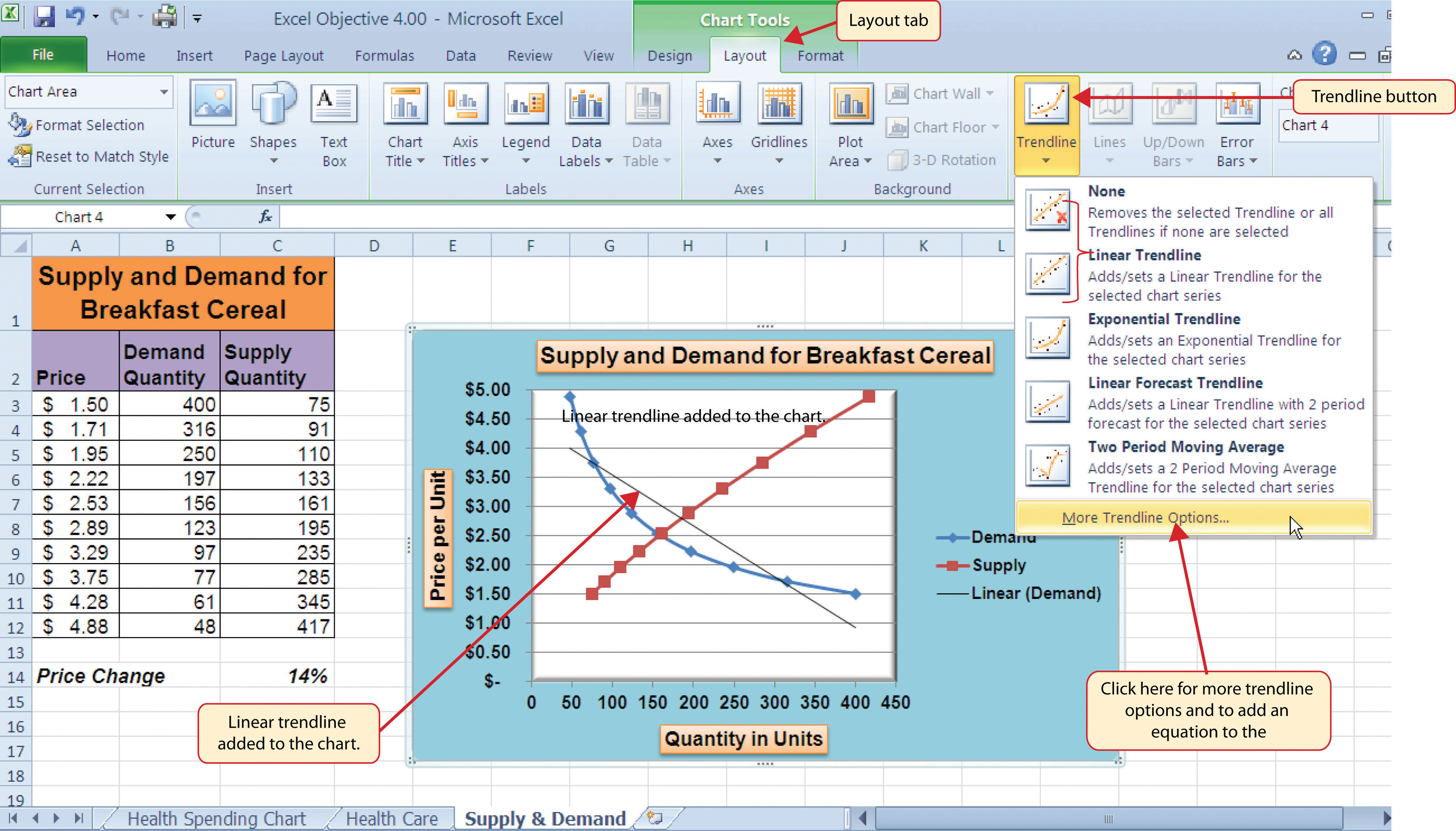
Finding the right shape for a trendline may require trying a few different options. As shown in Figure 4.54 "Adding a Linear Trendline", the linear trendline is not a good fit for the shape of the demand line. The remaining steps will demonstrate how to remove a trendline and access more trendline options:
- Click the Trendline button in the Layout tab of the Ribbon. Select the None option from the drop-down list. This removes the trendline from the chart.
- Click the Trendline button in the Layout tab of the Ribbon again. This time, select More Trendline Options from the drop-down list.
- Select the Demand option from the Add Trendline dialog box and click OK. This opens the Format Trendline dialog box.
- Select the Power option from the Format Trendline dialog box.
- Click the “Display Equation on chart” option at the bottom of the Format Trendline dialog box (see Figure 4.55 "The Format Trendline Dialog Box").
- Click the Close button at the bottom of the Format Trendline dialog box.
Figure 4.55 The Format Trendline Dialog Box
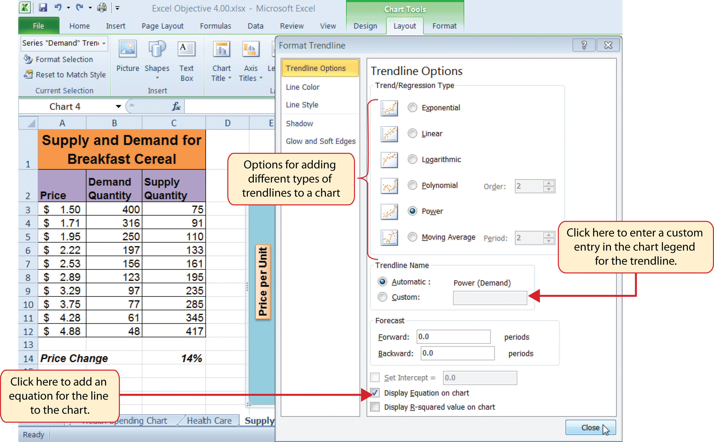
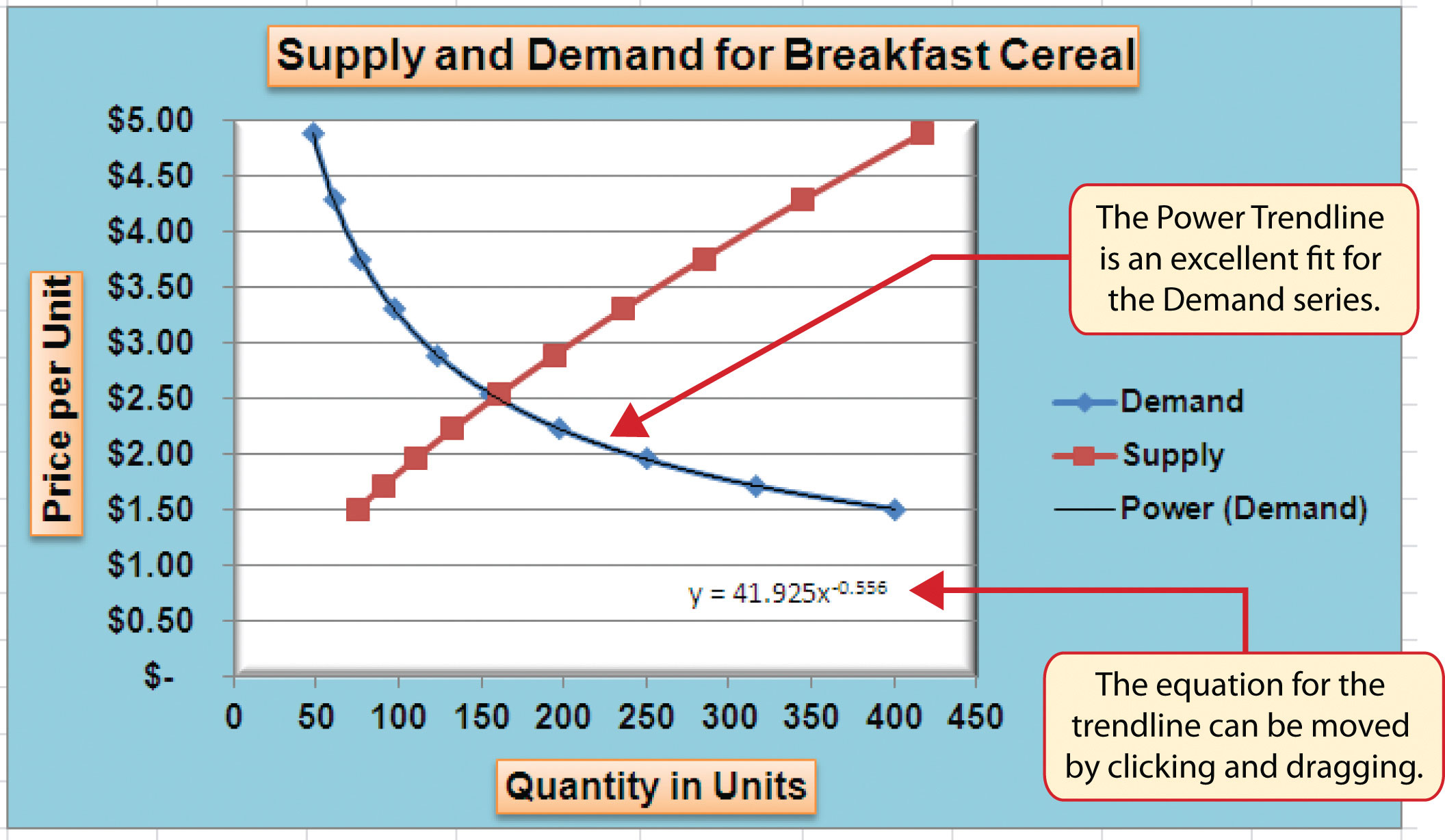
Figure 4.56 "Scatter Chart with a Power Trendline" shows the scatter chart with the Power trendline added for the demand series. Notice that the line fits perfectly over the demand series in the plot area. In fact, it may be difficult to see the line in the figure. This indicates that the trendline is an excellent fit for the demand line. As a result, we can be confident in using this line to predict other demand values along the X and Y axes. You can also see that the equation for this trendline has been added to the plot area of the chart. We can use the equation to calculate the price for each quantity value substituted for X. For example, if the number 150 is substituted for X in the equation, the result is a price of $2.59. Based on the values used to create the chart, this result appears to be accurate.
Figure 4.56 Scatter Chart with a Power Trendline
Skill Refresher: Adding a Trendline
- Click anywhere on the chart area.
- Click the Layout tab of the Ribbon.
- Click the Trendline button.
- Select one of the preset trendline options from the drop-down list or select More Trendline Options to open the Add Trendline dialog box.
- Select a data series in the Add Trendline dialog box and click the OK button.
- Select the “Display Equation on chart” option from the Format Trendline dialog box to add the trendline equation to the chart.
- Click the Close button at the bottom of the dialog box.
Key Takeaways
- When creating a scatter chart, it is best to start with a blank chart and add each data series individually. The highlight and click method is less reliable since numeric values are assigned to both the X and Y axes. As a result, Excel often guesses incorrectly which values are assigned to the X and Y axes.
- Finding the best fit for a trendline is often a matter of trial and error. You may have to try a few different trendlines to determine which form is the best fit for your data series.
- You must open the Format Trendline dialog box to add the line equation to the plot area of the chart.
Exercises
-
Which of the following is the best chart type to use if you need to create a line chart where both the X and Y axes contain numeric values?
- line chart
- scatter chart
- either a line chart or a scatter chart
- area chart
-
Which of the following methods allows you to set the scale of the Y axis?
- Activate the Y axis and click the Scale button in the Page Layout tab of the Ribbon.
- Activate the Y axis and click the Format Selection button in the Layout tab of the Ribbon.
- Activate the Y axis and click the Axes button in the Layout tab of the Ribbon; select the Primary Vertical Axis option and then select More Primary Vertical Axis Options.
- Both B and C are correct.