This is “Cartographic Design”, section 9.3 from the book Geographic Information System Basics (v. 1.0). For details on it (including licensing), click here.
For more information on the source of this book, or why it is available for free, please see the project's home page. You can browse or download additional books there. To download a .zip file containing this book to use offline, simply click here.


9.3 Cartographic Design
Learning Objective
- The objective of this section is to familiarize cartographers with the basic cartographic principles that contribute to effective map design.
In addition to effective use of colors and symbols, a map that is well designed will greatly enhance its ability to relate pertinent spatial information to the viewer. Judicious use of map elements, typography/labels, and design principles will result in maps that minimize confusion and maximize interpretability. Furthermore, the use of these components must be guided by a keen understanding of the map’s purpose, intended audience, topic, scale, and production/reproduction method.
Map Elements
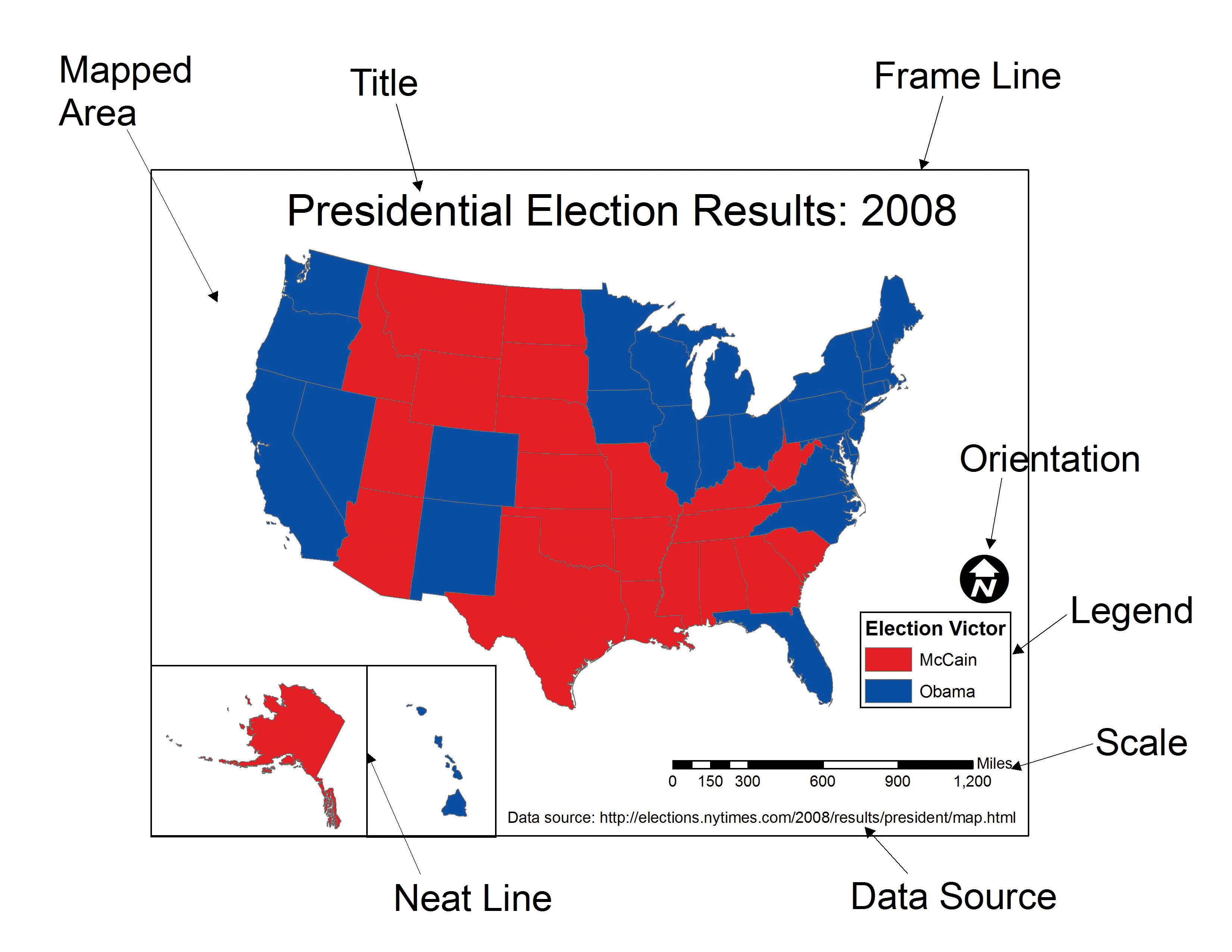
Chapter 9 "Cartographic Principles", Section 9.1 "Color" and Section 9.2 "Symbology" discussed visual variables specific to the spatial features of a map. However, a map is composed of many more elements than just the spatial features, each of which contributes immensely to the interpretability and flow of the overall map. This section outlines the basic map elements that should be incorporated into a “complete” map. Following Slocum et al. (2005),Slocum, T., R. McMaster, F. Kessler, and H. Howard. 2005. Thematic Cartography and Geographic Visualization. 2nd ed. Upper Saddle River, NJ: Pearson Prentice Hall. these elements are listed in the logical order in which they should be placed into the map (Figure 9.16 "A US Map Showing Various Map Elements").
The first feature that should be placed into the map layout is the frame lineA bounding line that surrounds all the elements in the map.. This line is essentially a bordering box that surrounds all the map elements described hereafter. All of these map elements should be balanced within the frame line. To balance a map, ensure that neither large blank spaces nor jumbled masses of information are present within the map. Similar to frame lines are neat linesA bounding line that surrounds a single map element.. Neat lines are border boxes that are placed around individual map elements. By definition, neat lines must occur within the frame line. Both frame lines and neat lines are typically thin, black-lined boxes, but they can be altered to match the specific aesthetics of an individual map.
The mapped areaThe primary geographic component of the overall map. is the primary geographic component of the overall map. The mapped area contains all of the features and symbols used to represent the spatial phenomena being displayed. The mapped area is typically bordered with a neat line.
InsetsA map within a map. can be thought of as secondary map areas, each encased within their own neat line. These neat lines should be of different thickness or type than other line features on the map to adequately demarcate them from other map features. Insets often display the primary mapped area in relation to a larger area. For example, if the primary map shows the locales of national parks with a county, an inset displaying the location of that county within the larger state boundary may be included. Conversely, insets are also used to display areas related to the primary map but that occur at some far off locale. This type of inset is often used with maps of the United States whereby Alaska and Hawaii are placed as insets to a map of the contiguous United States. Finally, insets can be used to clarify areas where features would otherwise be overcrowded if restricted to the primary mapping area. If the county map of national parks contained four small, adjacent parks, an inset could be used to expand that jumbled portion of the map to show the exact spatial extent of each of the four parks. This type of inset is frequently seen when showing the small northeastern states on a map of the entire United States.
All maps should have a titleA map header that provides an overall descriptor of the map’s purpose.. The title is one of the first map elements to catch the viewer’s eye, so care should be taken to most effectively represent the intent of the map with this leading text. The title should clearly and concisely explain the purpose of the map and should specifically target the intended viewing audience. When overly verbose or cryptically abbreviated, a poor title will detract immensely from the interpretability of the cartographic end-product. The title should contain the largest type on the map and be limited to one line, if possible. It should be placed at the top-center of the map unless there is a specific reason otherwise. An alternate locale for the title is directly above the legend.
The legendA map element that describes the colors and symbols found on the map. provides a self-explanatory definition for all symbols used within the mapped area. Care must be taken when developing this map element, as a multitude of features within a dataset can lead to an overly complex legend. Although placement of the legend is variable, it should be placed within the white space of the map and not in such a way that it masks any other map elements. Atop the legend box is the optional legend header. The legend header should not simply repeat the information from the title, nor should it include extraneous, non-legend-specific information. The symbols representing mapped features should be to the left of the explanatory text. Placing a neat line around the legend will help to bring attention to the element and is recommended but not required. Be careful not to take up too much of the map with the legend, while also not making the legend so small that it becomes difficult to read or that symbols become cluttered. Removing information related to base map features (e.g., state boundaries on a US map) or readily identifiable features (e.g., highway or interstate symbols) is one effective way to minimize legend size. If a large legend is unavoidable, it is acceptable to place this feature outside of the map’s frame line.
Attribution of the data sourceA map element that provides an attribution describing where the data can be found. within the map allows users to assess from where the data are derived. Stylistically, the data source attribution should be hierarchically minimized by using a relatively small, simple font. It is also helpful to preface this map element with “Source:” to avoid confusion with other typographic elements.
An indicator of scaleA map element that describes the map dimensions. is invaluable to provide viewers with the means to properly adjudicate the dimensions of the map. While not as important when mapping large or widely familiar locales such as a country or continent, the scale element allows viewers to measure distances on the map. The three primary representations of scale are the representational fraction, verbal scale, and bar scale (for more, see Chapter 2 "Map Anatomy", Section 2.1 "Maps and Map Types"). The scale indicator should not be prominently displayed within the map as this element is of secondary importance.
Finally, map orientationA map elements that notifies the viewer of the directionality of the map. notifies the viewer of the direction of the map. To assist in clarifying orientation, a graticuleA series of grid lines representing latitude and longitude. can also be included in the mapped area. Most maps are made such that the top of the page points to the north (i.e., a north-up map). If your map is not north-up, there should be a good reason for it. Orientation is most often indicated with a north arrow, of which there are many stylistic options available in current geographic information system (GIS) software packages. One of the most commonly encountered map errors is the use of an overly large or overly ornate north arrow. North arrows should be fairly inconspicuous as they only need to be viewed once by the reader. Ornate north arrows can be used on small scale maps, but simple north arrows are preferred on medium to large-scale maps so as to not detract from the presumably more important information appearing elsewhere.
Taken together, these map elements should work together to achieve the goal of a clear, ordered, balanced, and unified map product. Since modern GIS packages allow users to add and remove these graphic elements with little effort, care must be taken to avoid the inclination to employ these components with as little forethought as it takes to create them. The following sections provide further guidance on composing these elements on the page to honor and balance the mapped area.
Figure 9.16 A US Map Showing Various Map Elements
Typography and Label Placement
Type is found throughout all the elements of a map. Type is similar to map symbols in many senses. Coloring effects alter typographic hierarchy as lighter type fades into the background and dark type jumps to the fore. Using all uppercase letters and/or bolded letters will result in more pronounced textual effects. Larger font sizes increase the hierarchical weight of the type, so ensure that the size of the type corresponds with the importance of the map feature. Use decorative fonts, bold, and italics sparingly. These fonts, as well as overly small fonts, can be difficult to read if overused. Most importantly, always spell check your final cartographic product. After spell checking, spell check again. Yu wont reegrett teh ecstra efort.
Other typographic options for altering text include the use of serifA typeface in which each character has small strokes at the ends of the lines that form it. Serifs are found in typestyles such as Times New Roman, Palatino, Garamond, and Baskerville., sans serif, and display fonts. While the use of serif fonts are preferred in written documents to provide horizontal guidelines, either is acceptable in a mapping application (Slocum 2005).Slocum, T., R. McMaster, F. Kessler, and H. Howard. 2005. Thematic Cartography and Geographic Visualization. 2nd ed. Upper Saddle River, NJ: Pearson Prentice Hall. Sans serif fonts, on the other hand, are preferred for maps that are viewed over the Internet.
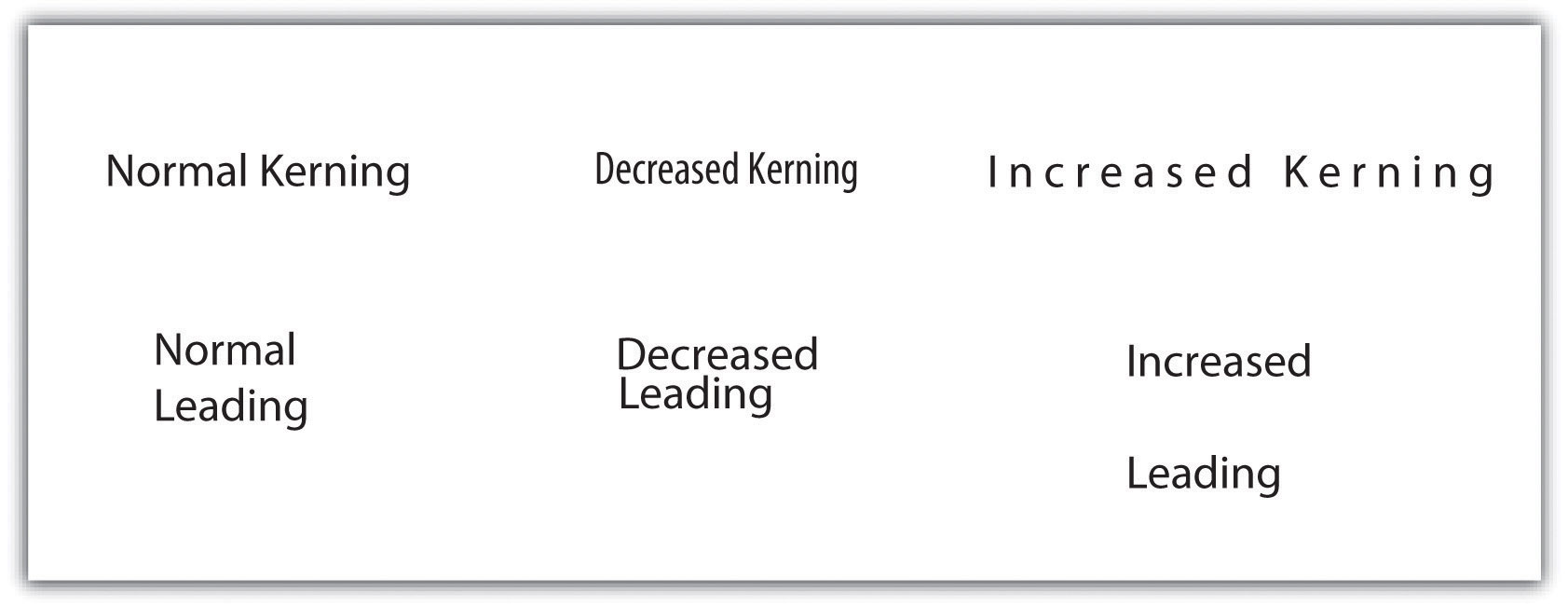
KerningA typographic effect that alters the space between adjacent letters in a word. is an effective typographic effect that alters the space between adjacent letters in a word. Decreasing the kerning of a typeset is useful if the text is too large for the space given. Alternatively, increasing the kerning is an effective way to label large map areas, particularly in conjunction with all-uppercase lettering. Like kerning, changes in leadingA typographic effect that alters the vertical distance between lines of text. (pronounced “led-ing”) alter the vertical distance between lines of text. Leading should not be so cramped that lines of text begin to overwrite each other, nor should it be so wide that lines of text appear unrelated. Other common typographic effects include masks, callouts, shadows, and halos (Figure 9.17 "Typographic Effects"). All of these effects serve to increase the visibility and importance of the text to which they are applied.
Figure 9.17 Typographic Effects
In addition to the general typographic guidelines discussed earlier, there are specific typographic suggestions for feature labelsText on a map that describes and defines mapped features.. Obviously, labels must be placed proximal to their symbols so they are directly and readily associated with the features they describe. Labels should maintain a consistent orientation throughout so the reader does not have to rubberneck about to read various entries. Also, avoid overprinting labels on top of other graphics or typographic features. If that is not possible, consider using a halo, mask, callout, or shadow to help the text stand out from the background. In the case of maps with many symbols, be sure that no features intervene between a symbol and its label.
Some typographic guidelines are specific to labels for point, line, and polygon features. Point labels, for example, should not employ exaggerated kerning or leading. If leader linesA thin line that ties a label to the symbol it describes. are used, they should not touch the point symbol nor should they include arrow heads. Leader lines should always be represented with consistent color and line thickness throughout the map extent. Lastly, point labels should be placed within the larger polygon in which they reside. For example, if the cities of Illinois were being mapped as points atop a state polygon layer, the label for the Chicago point symbol should occur entirely over land, and not reach into Lake Michigan. As this feature is located entirely on land, so should its label.
Line labels should be placed above their associated features but should not touch them. If the linear feature is complex and meandering, the label should follow the general trend of the feature and not attempt to match the alignment of each twist and turn. If the linear feature is particularly long, the feature can be labeled multiple times across its length. Line labels should always read from left to right.
Polygon labels should be placed within the center of the feature whenever possible. If increased emphasis is desired, all-uppercase letters can be effective. If all-uppercase letters are used, exaggerated kerning and leading is also appropriate to increase the hierarchical importance of the feature. If the polygon feature is too small to include text, label the feature as if it were a point symbol. Unlike point labels, however, leader lines should just enter into the feature.
Map Design
Map design is a complex process that provides many variables and choices to the cartographer. The British Cartographic Society Design Group presented five “Principles of Cartographic Design” on their listserv on November 26, 1999. These principles, and a brief summary of each, are as follows:
- Concept before compilation. A basic understanding of the concept and purpose of the map must be secured before the actual mapping exercise begins. Furthermore, there is no way to determine what information to include in a map without having first determined who the end-user is and in what manner the map will be used. A map without a purpose is of no use to anyone.
- Hierarchy with harmony. Important map features must appear prominent on the map. The less important features should fade into the background. Creating harmony between the primary and secondary representations on the map will lead to a quality product that will best suit the needs for which it was developed.
- Simplicity from sacrifice. Upon creating a map, it is tempting to add as much information into the graphic view as can possibly fit. In reality, it is best to leave some stones unturned. Just as the key to good communication is brevity, it can be said that the key to good mapping is simplicity. A map can be considered complete when no other features can be removed. Less, in this instance, is more.
- Maximum information at minimum cost. The purpose of a map is to convey the greatest amount of information with the least amount of interpretive effort by the user. Map design should allow complex spatial relationships to be understood at a glance.
- Engage the emotion to engage the understanding. Well-constructed maps are basically works of art. All of the artistic and aesthetic rules outlined in this chapter serve to engage the emotive center of the viewer. If the viewer does not formulate some basic, emotional response to the map, the message will be lost.
It should become increasingly clear that the cartographic choices made during the mapping process have as much influence on the interpretation of a map as does the data being mapped. Borrowing liberally from the popularized Mark Twain quote, it could be said that, “There are three kinds of lies: lies, damned lies, and maps.” Mapmakers, indeed, have the ability to use (or misuse) cartographic principles to represent (or misrepresent) the spatial data at their disposal. It is now up to you, the cartographer, to master the tools presented in this book to harness the power of maps to elucidate and address the spatial issues with which you are confronted.
Key Takeaways
- Commonly used map elements include the neat line, frame line, mapped area, inset, title, legend, data source, scale, and orientation.
- Like symbology, typography and labeling choices have a major impact on the interpretability of your map.
- Map design is essentially an artistic endeavor based around a handful of cartographic principles. Knowledge of these principles will allow you create maps worth viewing.
Exercises
- Go online and find a map that employs all the map elements described in this chapter.
- Go online and find two maps that violate at least two different “Principles of Cartographic Design.” Explain how you would improve these maps.