This is “Combining Fonts and Effects”, section 1.2 (from appendix 1) from the book Designing Business Information Systems: Apps, Websites, and More (v. 1.0). For details on it (including licensing), click here.
For more information on the source of this book, or why it is available for free, please see the project's home page. You can browse or download additional books there. To download a .zip file containing this book to use offline, simply click here.
19.2 Combining Fonts and Effects
Combining fonts and effects can also be used to create different looks for fonts.
Normally, this is done to create contrast and visual interest.
The rule for combining fonts is very simple—you may combine fonts in a document as long as each font comes from a different category. For example any of the combinations on the opposing page will work.
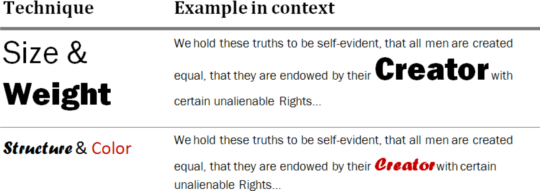
Want even more drama? Contrasting techniques may also be used in combination for dramatic effect. See examples on opposite page.
Examples of Combining Fonts

Examples of Combining Contrasting Techniques


