This is “Template for the Report”, section 11.3 from the book Designing Business Information Systems: Apps, Websites, and More (v. 1.0). For details on it (including licensing), click here.
For more information on the source of this book, or why it is available for free, please see the project's home page. You can browse or download additional books there. To download a .zip file containing this book to use offline, simply click here.
11.3 Template for the Report
Learning Objectives
- Choose an appropriate template for a schematic report
- Modify the master page to change the look and feel of the report
- Choose an appropriate layout for each page of the report
The Pitchbook Template
While you could custom design a template for your schematic report, it is far easier to begin with a template and then modify it to fit your needs. We recommend the Pitchbook template. In spite of its name, the template is fairly reserved in its appearance. We recommend Pitchbook, because of its fonts, layouts, and table of contents.
The font in Pitchbook is Calibri, a Microsoft font designed to be read well on screen and in print. The body text size is 11 point. Curiously, minor section headings within a slide are set even smaller at 10 point, though they still stand out since there are set in white text on a colored background. The only disproportionate font is found in the major section headings that run down the right hand side of the page. These are set in 22 point white text on a large colored background. Why would we want the most prominent visual element on the screen to be the section that we happen to be in? Is navigation within say a hundred page report so onerous? To put this in perspective, consider that most textbooks bury the section name inconspicuously in a discreet footer—and usually set the footer in a smaller font than the body text. However, this defect can be remedied by modifying the slide master to reduce both the font size and background size of the major section headings.
The layouts that Pitchbook provides are versatile and have a consistent look and feel. Each slide can have a layout appropriate to its content—whether that is section title, heading only, or 1 up, 2 up, 3 up, 4 up, or 5 up. No matter which layout is chosen the heading and body text styles remain the same.
The table of contents in Pitchbook is just another layout called Agenda. Note how this name gives away the intention of presenting rather than reading the Pitchbook. We mention table of contents separately because though it may seem like a minor thing, a table of contents is often missing in reports.

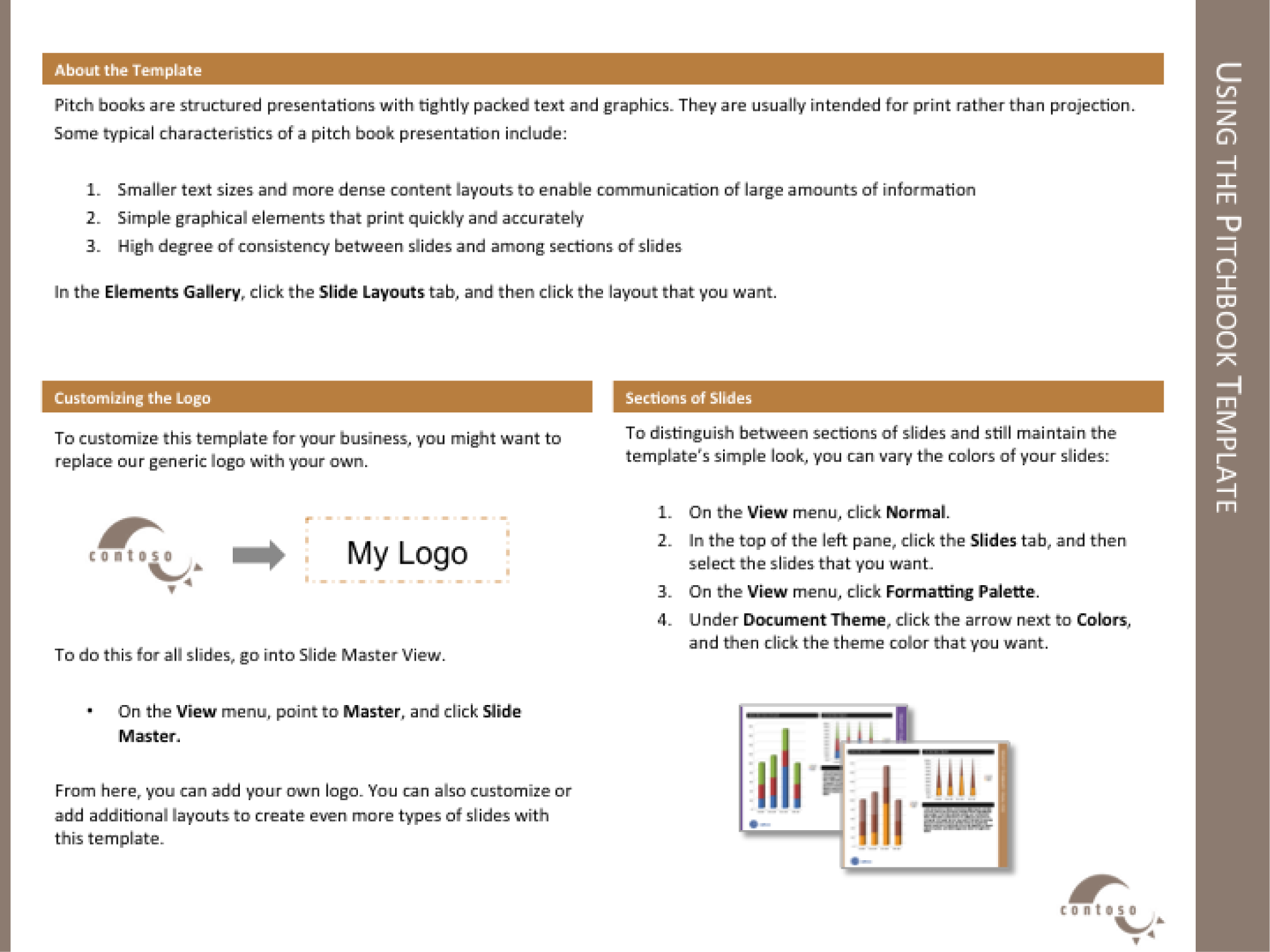
The Pitchbook template includes a slide with instructions on how to customize the template.
Templates, Themes, Layouts, Masters
Every deck is based on a theme. The themeDefines a set of background elements, colors, and fonts as well as a set of slide layouts. specifies a coherent set of colors, fonts, backgrounds, and slide layoutsThe organization of items on a page. For example, a 2up layout consists of two blocks of images and/or text.. Even the blank white background with which PowerPoint starts up is a theme called Office. Best practice is to choose a theme ahead of adding content to your presentation. That way you can ensure that the content fits well within the structure of a particular theme.
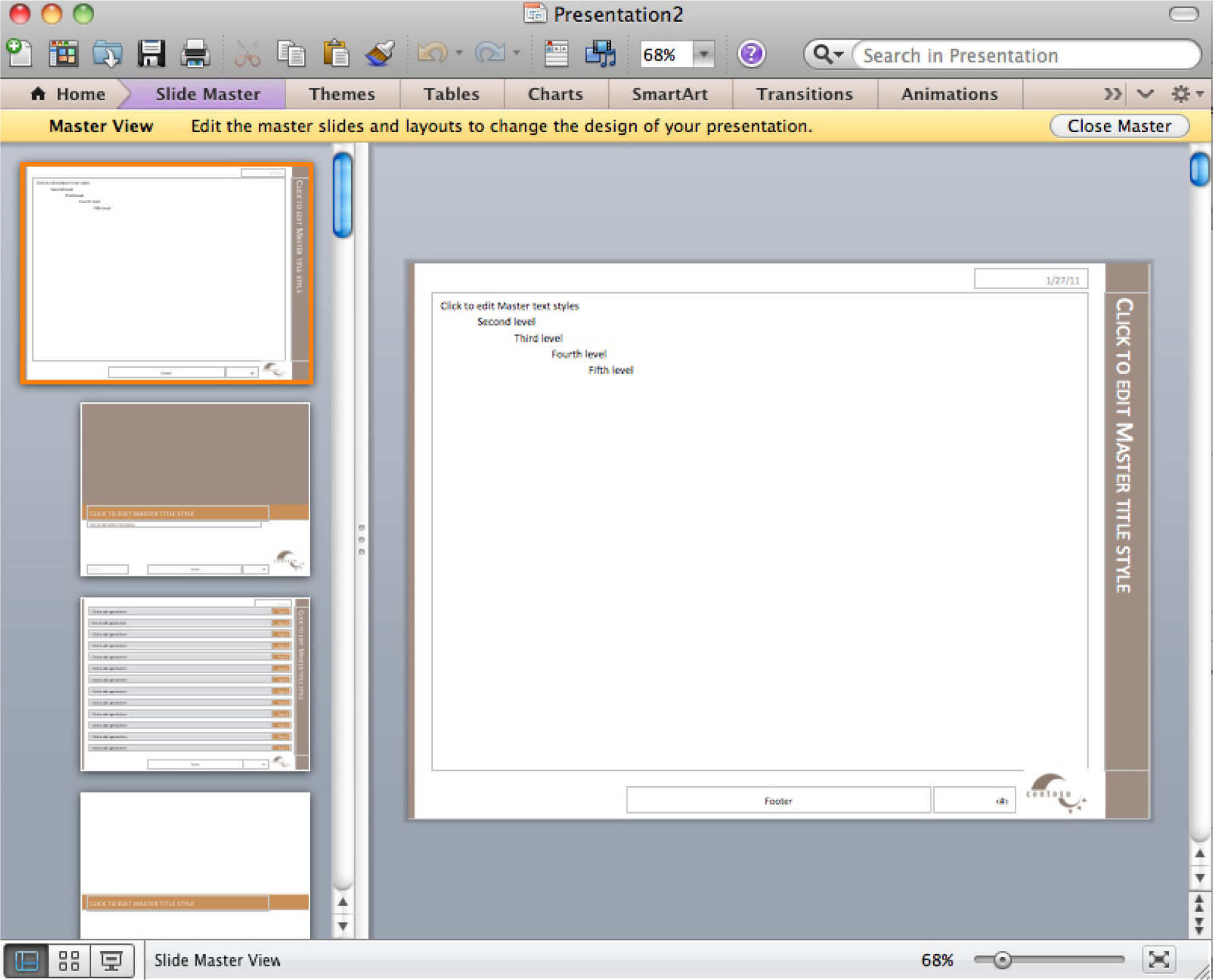
Every theme is defined by a slide masterModel slides that define the theme elements. The slide master defines the background elements, colors, and fonts. The layout masters provide a menu of possible layouts to apply to a slide.. The master is a series of model slides that define the theme and its layouts. Any change to the slide master affects every slide in the presentation. If you want to modify the theme, for example by changing the text size on the section heading, then you should do so on the slide master.
The slide master consists of a large master slide and smaller layout masters. The master slide is where most of the background elements, fonts, and colors are defined. The layout masters define the placement of items on each slide. Every slide can have a different layout and yet still look like it belongs to the presentation. For example 1 up, 2 up, 3 up, 4 up, and so forth are all different slide layouts. Furthermore, 2 up in one theme may have different spacing than 2 up in another. These differences are part of the reason that it is so critical to choose the theme in advance.
A templateA model report in which the theme is predefined. In some templates even some of the slides are already created. For example, the Pitchbook template includes a title slide, a table of contents slide, and a section heading slide. takes this process one step further. A template is a theme with content slides already preloaded. Templates help ensure that the content appears in a particular order.
For our purposes we begin with the Pitchbook template because of its theme. The theme specifies small fonts and clear section headings. That Pitchbook has slides already made is of no consequence to us and in fact we will replace those slides with our own content. What we want is the theme with its layouts.
First we will customize the Pitchbook template to correct its minor flaws.
Key Takeaways
- Templates, themes, layouts, and slide masters facilitate the graphic design of a PowerPoint deck.
- For a written report done in PowerPoint it is important to have uniform font sizes on each page.
Questions and Exercises
- Why does PowerPoint have a slide master in addition to the individual layout masters? Explain.

Slide master (top) with layout masters below it.
L3 Assignment: Create a Schematic Report
Setup
Start MS PowerPoint.
Choose a template. We recommend using the PowerPoint Pitchbook template. You may opt for a different template or even create your own but these designs should be cleared in advance.
(File > New > Presentations > Business > Pitchbook)
Content and Style
- Title page with author.
- Executive summary: A summary analysis of the report with the key facts, issues, and conclusions. An executive should be able to get the gist of your entire report just by reading the executive summary.
- Table of contents—with page numbers identifying section and second level headings only. Do this last as PowerPoint does not automatically generate or update a table of contents. Also, you would be wise to avoid the table of contents slide in Pitchbook—it is overly decorated and difficult to work with. If you add or move sections after the fact, the table of contents is a chore to update. A bulleted list on a blank slide is just fine and very easy to update.
- Introduction.
- Body: that includes the analysis and recommendations (most of your report). To provide continuity the evidence should point back to the main argument.
- Conclusion.
- Apply all graphic design principles
- Each slide should have 25 to 50% text. Obviously, there will be exceptions. Some slides may be all graphics, while other slides may be all text, e.g. the executive summary.
- Make all text left justified. Avoid centered text or text justified to both margins.
-
Customize Pitchbook as follows:
- Select View > Master > Slide Master.
- Reduce the major section headings from 22 point to 12 point. Reduce the size of the text background to match.
- Replace the logo with your own. Because the logo appears in a slightly different position on different slides, you will need to replace the logo in three places: the large Slide Master, the Title layout, and the Section Header layout.
- Change the theme colors to match colors for your app. Format > Theme Colors and modify accents #4 and #6.
- Activate the page numbers with Insert > Header & Footer > then check page numbers.
- The Pitchbook master has multiple layouts—1 up, 2 up, 3 up, and so forth. Use these as appropriate.
Deliverables
Electronic submission: Post your PowerPoint file.
Paper submission: Create a printout of each slide of your report. Print two slides per page.

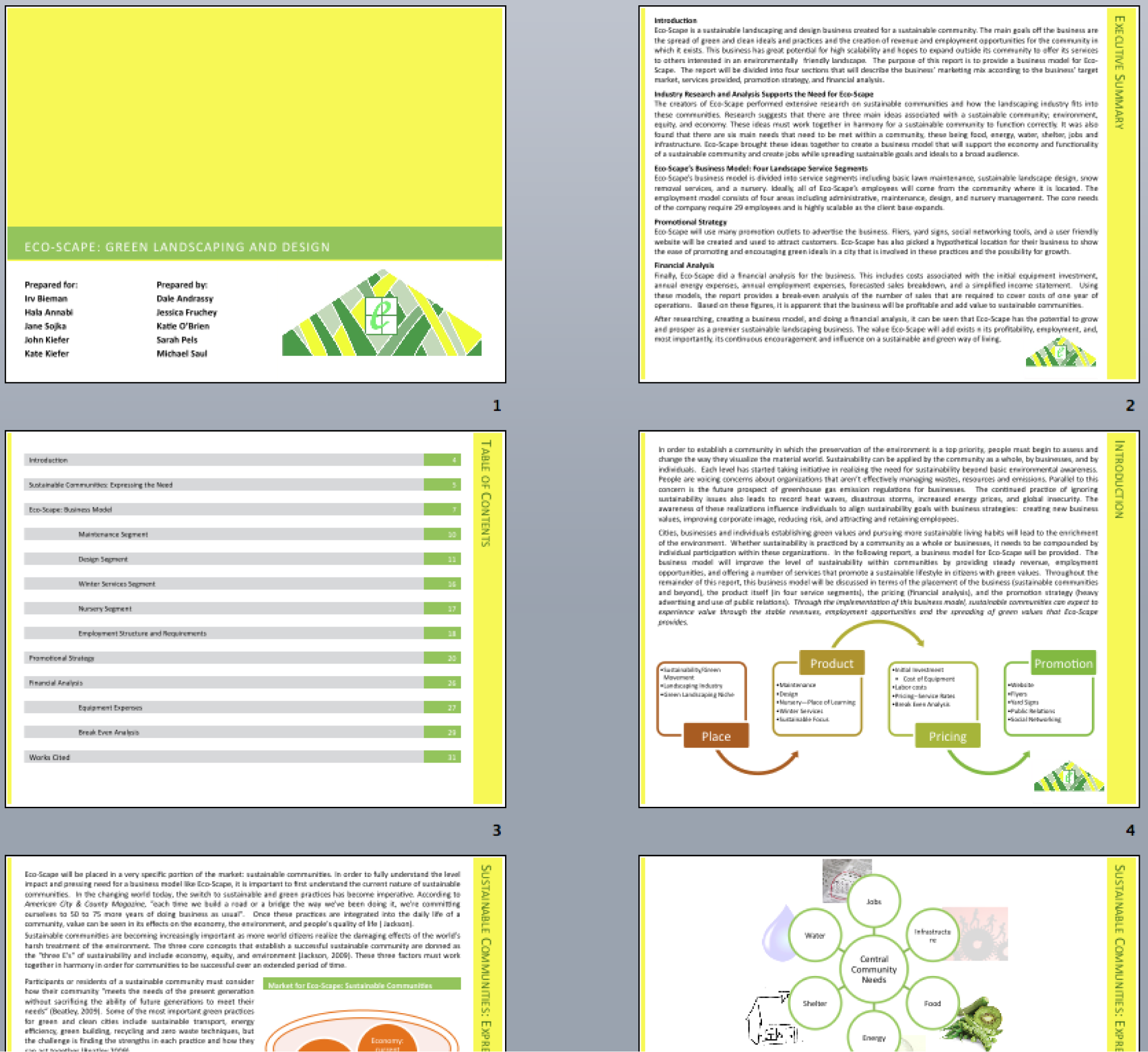
Sample pages from a schematic report. Note that the colors have been changed to match the brand.


