This is “Representing Industry Information Using Graphs”, section 9.2 from the book Designing Business Information Systems: Apps, Websites, and More (v. 1.0). For details on it (including licensing), click here.
For more information on the source of this book, or why it is available for free, please see the project's home page. You can browse or download additional books there. To download a .zip file containing this book to use offline, simply click here.


9.2 Representing Industry Information Using Graphs
Learning Objectives
- Show market growth and opportunities using tables and graphs
- Use spreadsheets and graphs to help analyze an industry
- Graphically demonstrate market growth and opportunities
- Integrate words, numbers, and images in order to create a graph that can serve as the effective basis for making a decision
- Describe when each type of graph (line, bar, scatterplot, and pie) should be used
- Apply graphic design principles to create spreadsheets and graphs
Introduction
Graphs are regularly used for presentations in corporate board rooms. The most prevalent use of corporate graphs is to show trends over time, such as sales per quarter. These graphs are especially popular when the trend is on the rise.
A problem with graphs that show trends over time is that they show the changes in trend patterns, but they fail to show the reasons for these changes. One solution is to annotate a time series graph to point out the causal event.
Sometimes a picture is worth a thousand words. The Oscar winning film, An Inconvenient Truth, warns of the dangers of global warming. The film uses many illustrations and graphs, similar to the ones you will create in this course. Many of them show before and after comparisons. At one moment in the film, Al Gore, dramatically ascends, using an hydraulic lift, to point on a giant screen to high projected levels of carbon dioxide in the atmosphere. The message is far clearer than numbers alone would ever show. In the entire history of the earth, the red line (carbon dioxide) spikes disturbingly when man began burning fossil fuels with the advent the industrial revolution. And the situation is quickly getting worse.
Watch the movie trailer for An Inconvenient Truth at:
http://www.apple.com/trailers/paramount_classics/aninconvenienttruth/
Other business uses of graphs are to show relative amounts visually. This is especially helpful when the numbers are large and hard to relate to. David McCandless has produced a series of fascinating graphs that help to explain trends. You can see some of his work at:
Analytical Design
There are sound principles for the display of quantitative information. Perhaps the greatest theorist in the quantitative arena is Edward Tufte. He has written a number of books and articles on the subject and draws huge audiences world wide when he speaks.
Tufte virtually founded the field of analytical design—the field that studies how best to represent information—especially quantitative information. He has developed a number of principles over the years. However, in his latest book, Beautiful Evidence, Graphics Press, 2006, he organized the principles under six major headings:
- Show comparisons, contrasts, differences. Comparisons inform and invite reflection by the reader. For example, showing the growth rate of platforms using the Mac iOS vs. other smartphone operating systems helps show if the market is growing or shrinking.
- Show causality, mechanism, explanation, systematic structure. Sometimes the data clearly suggest a cause or lack of a cause. For example, many predicted a drop in iPhone 4 sales after news that the antenna dropped calls when held in a certain way. But the predicted sales drop was not borne out by the data and the product launch was wildly successful.
- Show multivariate data. That is show more than one or two variables. The more variables graphed, the greater the chance of providing a clear causal explanation. For example, better to show sales of paid apps and free apps per platform.
- Completely integrate, words, numbers, images, diagrams. Tufte sometimes calls this “whatever it takes.” Annotate your graph if that helps explain the data. For example on a time series label key events.
- Thoroughly describe the evidence. Provide a detailed title, indicate the authors and sponsors, document the data sources, show complete measurement scales, point out relevant issues. For example, always show your data sources and list your name as a author. If the data only holds under certain conditions, then state what those are.
- Analytical presentations ultimately stand or fall depending on the quality, relevance, and integrity of their content. This may be the most important principle of all. If your content is bad then nothing will save it. Try to tell the truth at all costs.
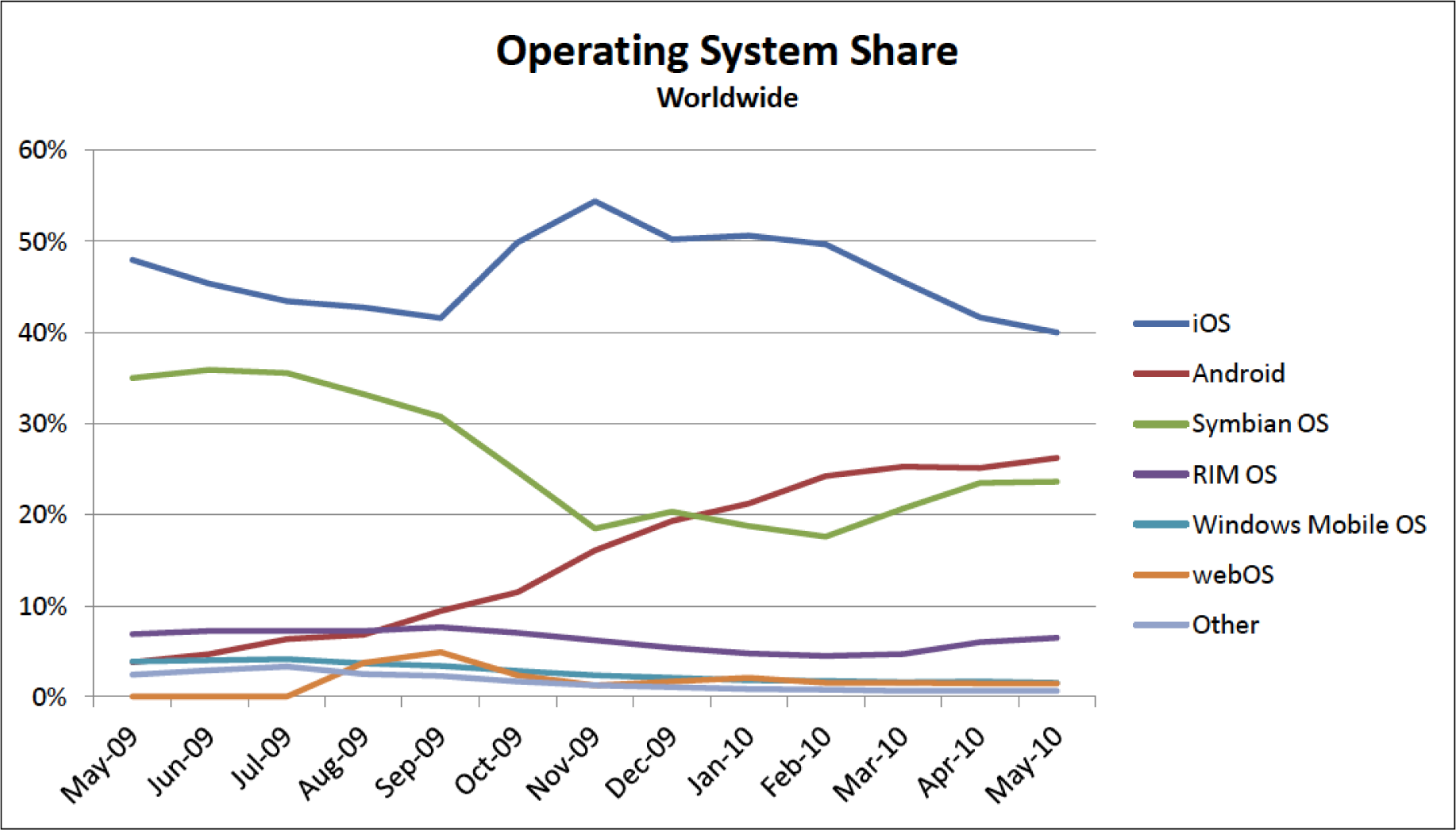
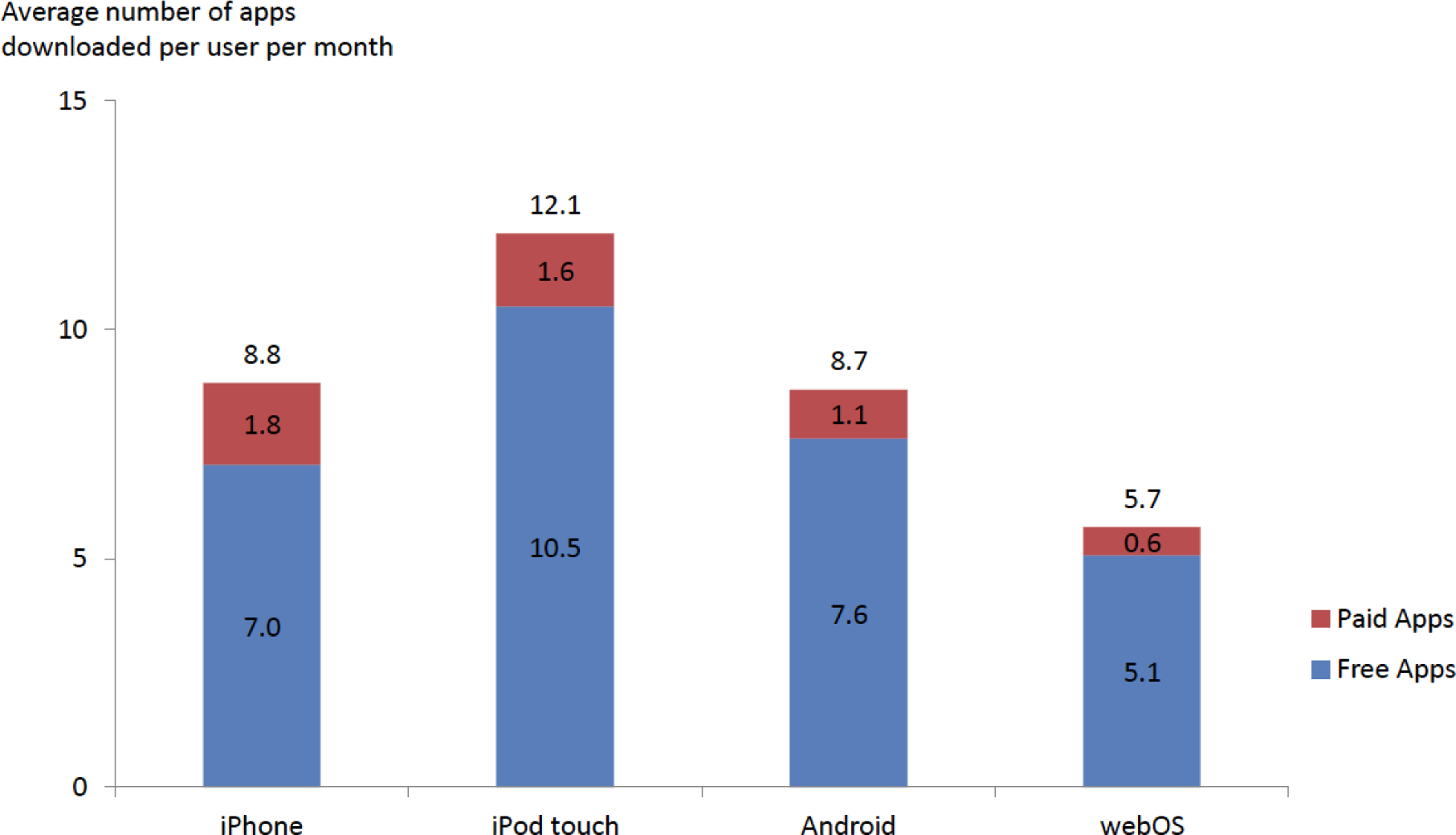
Analytical design in action. In the graph above, 96 data points are easily represented showing the market share for smartphone operating systems. From this, one can see the rapid rise of the Android OS. Below only twelve data points are graphed. The data shows that free apps are downloaded far more frequently than paid apps. However, the greatest market for paid apps is on the Apple iPhone and iPod Touch platforms. Both graphs would be improved if their legends were eliminated and the data series were instead labeled directly. Source for both graphs is Admob.com.
Graph Design Principles
Notice the graphs on the following page. The “after” graph has six design improvements over the first. They deal specifically with formatting the graph to maximize information transfer to the reader. Most of the graph design guidelines come from Edward Tufte’s principles of analytical design. These principles require refining the graph after Excel has applied its default settings. The exercises in this chapter provide instructions on how to carry out these refinements.
Though the design of a graph is important, the content is even more crucial to the delivery of information. Graphs can have good design, but if the data or content is flawed, the graph has no purpose. The data on the X and Y axis of a graph should always have some correlation, or some relationship that can be demonstrated.
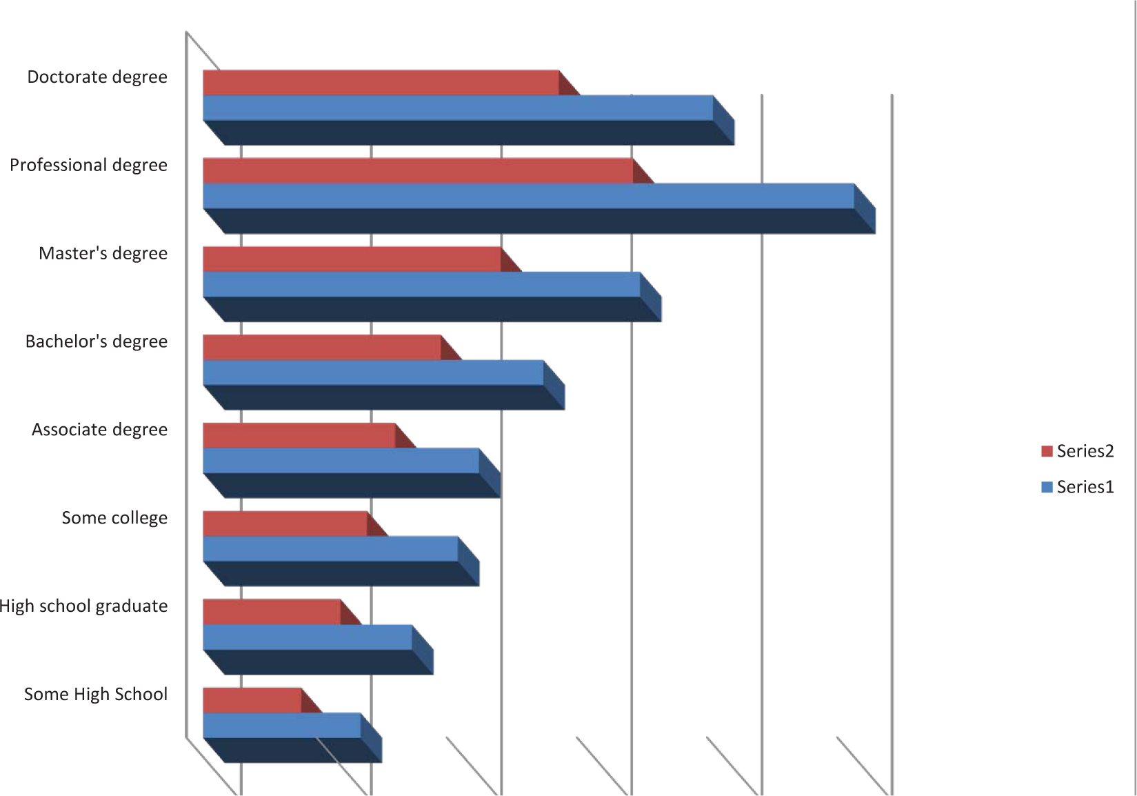
Before—while this graph looks cool, there is no scale. What quantities do the bars represent?
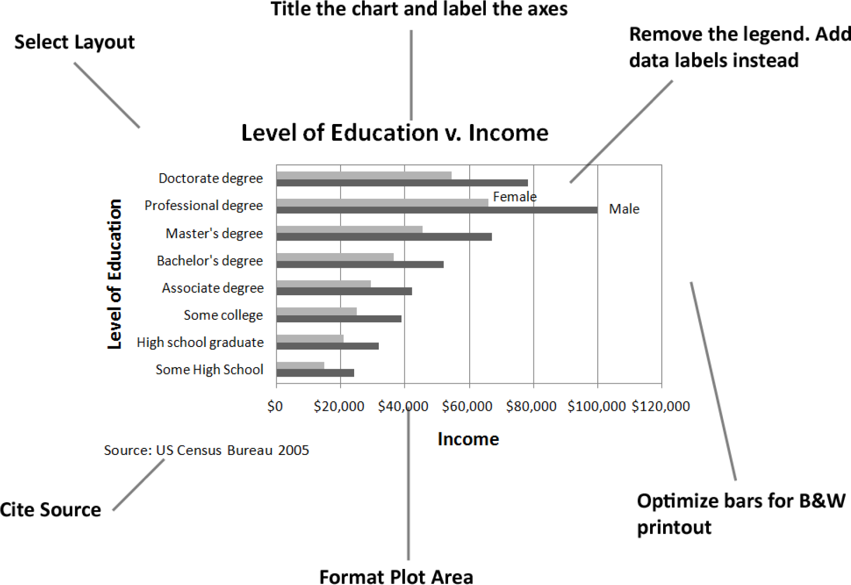
After—even though this graph is somewhat dull, it conveys information far more effectively.
Matching Graph to Data Type
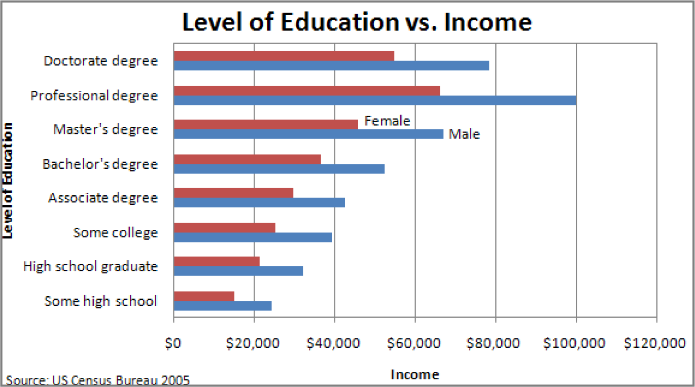
After you establish the integrity and relevance of the content, you will next need to focus on the type of graph you will use to display the information. Most business graphs (bar graphs, line graphs, and pie charts) compare categories on a quantitative dimension. For example, comparing salaries for persons of different education levels.
Bar graphCompares discrete (distinct) categories on a common measure.. Bar graphs are used to compare discrete categories on a common measure. In other words, the measure is quantitative and the categories are qualitative. For example, compare sales figures (quantitative) in different geographic regions (qualitative).
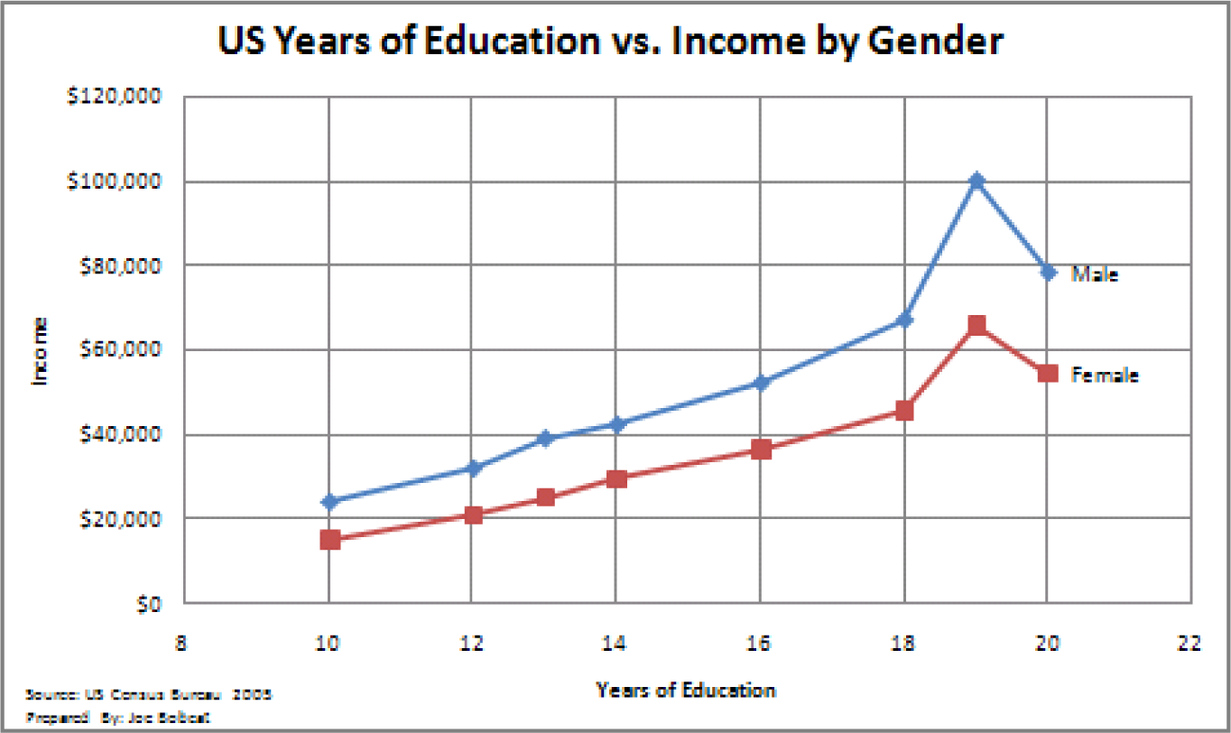
Line graphCompares continuous categories such as time on a common measure.. Line graphs compare continuous categories on a common measure. They are often seen in business, especially to show trends over time. The time appears on the X axis, and the quantitative data to be measured appears on the Y axis. Examples are sales, stock market trends, or mortgage rates over time. A text box is often placed near these graphs to explain the reasoning behind changes in trends.
Pie chartCompares discrete categories on a common measure.. Much like a bar graph, a pie chart compares discrete categories on a common measure. Unlike a bar graph, a pie chart can only show one series of data. Although pie charts are commonly used in the media, a bar graph is a better way to convey the same information in a way that allows for much easier comparisons between categories. The relative height of bars is easier to compare than pie slices that must be mentally rotated and aligned for comparison. Bar graphs also allow for multiple data series to be compared on the same graph, but pie charts are limited to one data series. Overall, pie charts should be avoided.
ScatterplotsSuggests causality by plotting independent and dependent variables on the same graph.. Scatterplots do the best job of adhering to Tufte’s principles of showing multivariate data and causal relationships. In a scatterplot, both sets of data are quantitative. The cause (independent variable) appears on the X axis, and the effect (dependent variable) appears on the Y axis. For example, in economics, scatterplots can be used to show trends in price versus demand. Greater demand for a product or service (independent variable) leads to higher price (dependent variable). In spite of their explanatory power, scatterplots are rarely found in business.
Bar Graph - Compares categories
Line Graph - Shows trends
Scatterplot - shows causal relationships
Challenger Disaster: A good graph may improve decision making
The Space Shuttle Program had its first successful launch in 1981. From the beginning NASA made “caution” a buzzword in the program. As just one example, five separate computers were onboard performing identical tasks. A pre-launch failure of even one computer would delay a launch. The Challenger launch had already been postponed twice due first to a malfunctioning door and then due to high winds. The media ridiculed NASA’s inability to launch on schedule. The night of January 28, President Reagan was scheduled to go on national TV to deliver his State of the Union Address. He was expected to mention the launch of the first civilian into space, a school teacher from Vermont named Christa McAuliffe.
The shuttles are launched from Cape Canaveral, Florida. Normally temperatures at the Cape are very moderate. Even in January the mean temperature is 60° F. However, a blast of Arctic air occasionally extends down to northern Florida. Such was the case on January 28, 1986, the launch date of the Space Shuttle Challenger. Temperatures on the morning of the launch were forecasted to be between 26 and 28° F, far below the prior coldest launch temperature of 53° F.
The temperature at launch is significant because it can potentially affect the performance of rubber parts on the shuttle. During the night preceding the launch, there was an eleventh-hour debate on the wisdom of launching between NASA and Morton Thiokol. Thiokol was the contractor for the two solid fuel rocket boosters that help propel the shuttle into orbit. The boosters are made in segments that interlock. At the point the segments meet, two rubber O-rings help seal the joint. The prior coldest launch and, indeed, every launch under 66° F had experienced some amount of compromise to the O-rings. However, there were also cases, though few, of O-ring damage at warmer temperatures. Thiokol engineers feared that the rubber would harden in the cold weather, thereby compromising its ability to seal the joint. The engineers were correct but not persuasive. Unable to substantiate their claim with data, the engineers caved under pressure from NASA and signed off on the launch.
The Challenger and its seven-member crew were lost 73 seconds after launch when the O-ring failure caused the booster rocket to explode.
On the eve of the launch engineers tried to explain the problem with a diagram. Their concern was that escaping hot gases would erode or eat away at the rubber O-ring seal. Sufficient erosion would release a flood of hot gases, sort of like a break in a dam. That was what happened to Challenger and it was catastrophic.
There were 24 successful launches prior to Challenger. However, the entire discussion centered around only two previous launches, SRM 15 and SRM 22. SRM stands for Solid Rocket Motor. SRM 15 was a cold weather launch with erosion. SRM 22 was a warm weather launch with blow by (soot but no erosion). Unfortunately, in the debate, erosion and blow by were put on equal footing, leading one engineer to conclude, “We had blow by on the hottest motor and blow by on the coldest motor.”
You will note that when the engineers reversed their no launch recommendation, it was not because they had new evidence, but rather because their existing evidence was too limited to be conclusive. The moral of the story is to always look at the entire data set.
What does the entire data set show? Damage rarely occurs at warm temperatures, but damage always occurs below 66°F and worsens the colder the temperature.
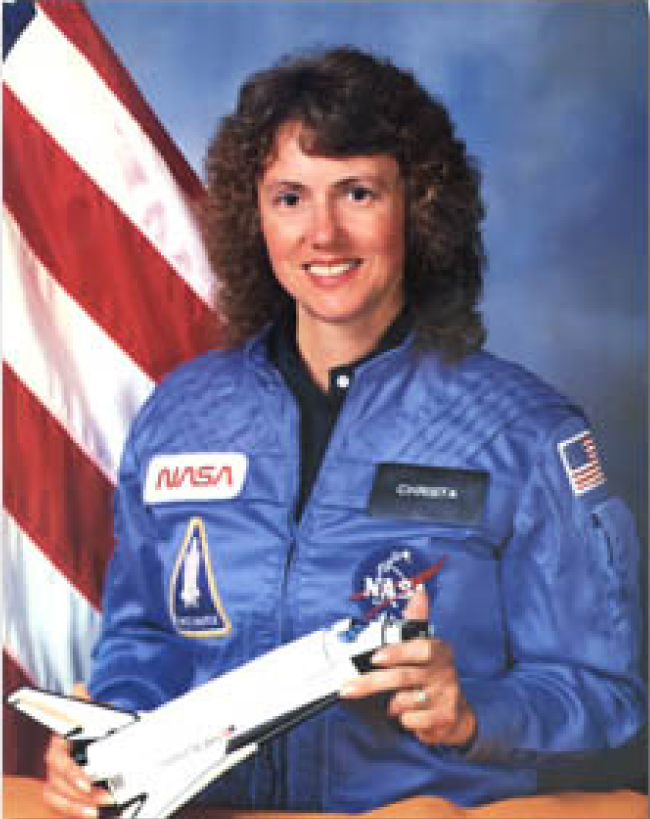
Christa McAuliffe, school teacher, was chosen by President Reagan to be the first civilian in space. Here she is being tested for weightlessness tolerance before the launch. Image reprinted from www.nasa.gov.
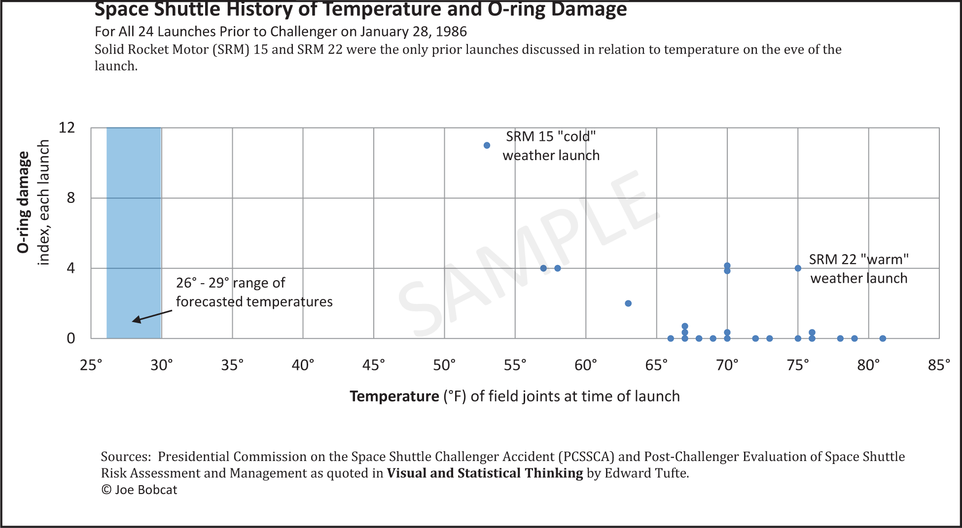
Tufte recommends showing ALL the data when making a decision—but showing it in a meaningful way relating cause and effect. He feels that the this graph, had it been made, would have stopped the launch.
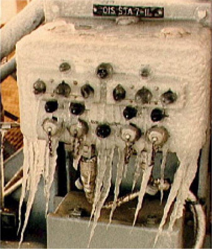
Frigid launch pad on the morning of launch. Image reprinted from NASA Johnson Space Center.
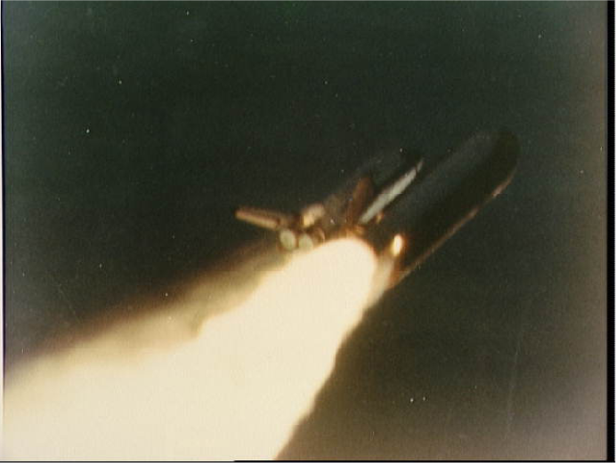
Frozen O-ring fails to seal-fire burns through. Image reprinted from NASA Johnson Space Center.
Key Takeaways
- The more data points you have, the more useful it is to graph the data. Graphs can easily show thousands of data points.
- In the same way that there are rules of graphic design, there are also analytical design rules governing how to display information—especially quantitative information. We will only scratch the surface of these rules.
- Always choose a graph appropriate for the data.
- Presenting data well can make a difference. Better presentation of data might have saved the Space Shuttle Challenger.
Questions and Exercises
- Find a graph in print and evaluate it according to the analytical design principles.
Techniques
The following techniques, found in the software reference, may be useful in completing the assignments for this chapter: PowerPoint: Insert Table; Excel: Best practice formatting-Scatterplot
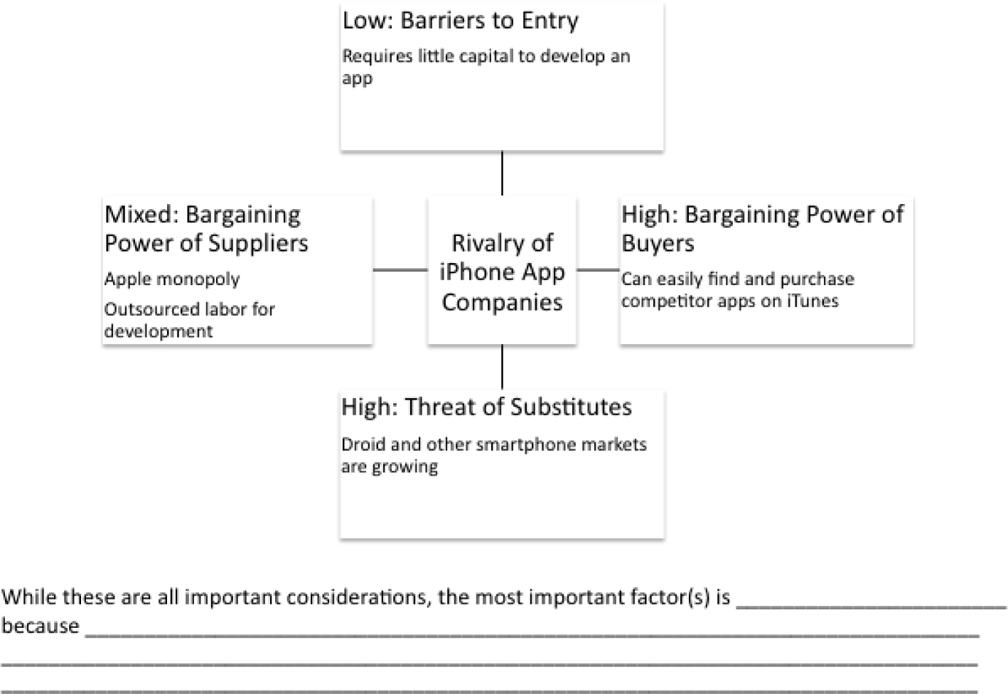
L1 Assignment: S.W.O.T. and Porter’s
As part of your industry analysis create S.W.O.T. and Porter’s five forces analyses of the iPhone industry
Setup
Start up PowerPoint.
Content and Style
- Follow all best practice formatting and design techniques.
- Use a PowerPoint table for the S.W.O.T. analysis. Merge cells and control text formatting to match the example.
- If you choose to use colored backgrounds, make sure that they have sufficient contrast with the text.
- Use appropriate PowerPoint smart art for the Porter’s analysis.
- Create one slide for each diagram.
- No matter how good a diagram, it needs explanation. Save enough room on each slide to include a paragraph that tells the reader what message should we get from the diagram. Draw conclusions—do not just summarize the slide.
- Add copyright and your name to each slide.
Deliverables
Electronic submission: Submit the PowerPoint file electronically.
Paper submission: Please print out the slides.
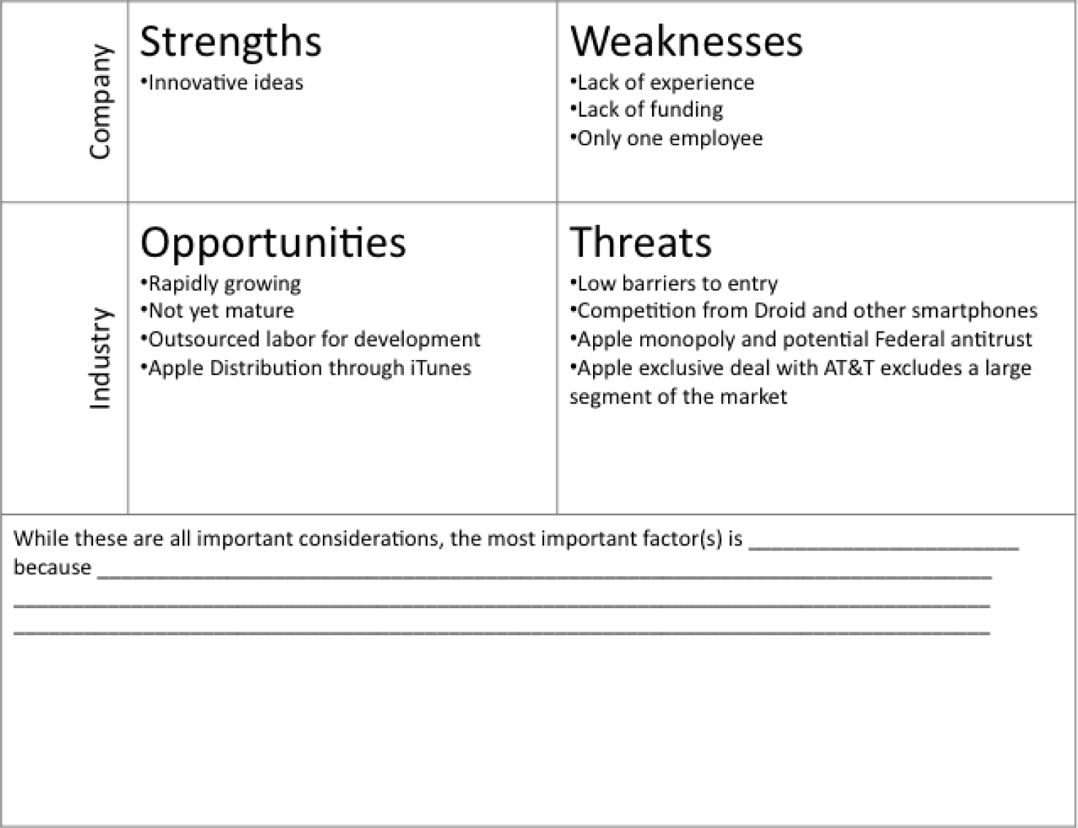
Sample templates for the S.W.O.T. assignment (above) and Porter’s assignment (following).
L2 Assignment: Show App Trends
As part of your industry analysis create a graph from iPhone app sales data.
Setup
Download the iPhone App Sales Data and create a time series line graph.
Content and Style
- Follow all best practice formatting and design techniques.
- Adjust scales to match the graph.
- Add text boxes, rectangle and arrow where required.
- Add copyright and your name under the source.
- Do not recreate the word “sample.”
Deliverables
Electronic submission: Submit the Excel workbook electronically.
Paper submission: Please print out the graph in landscape orientation.
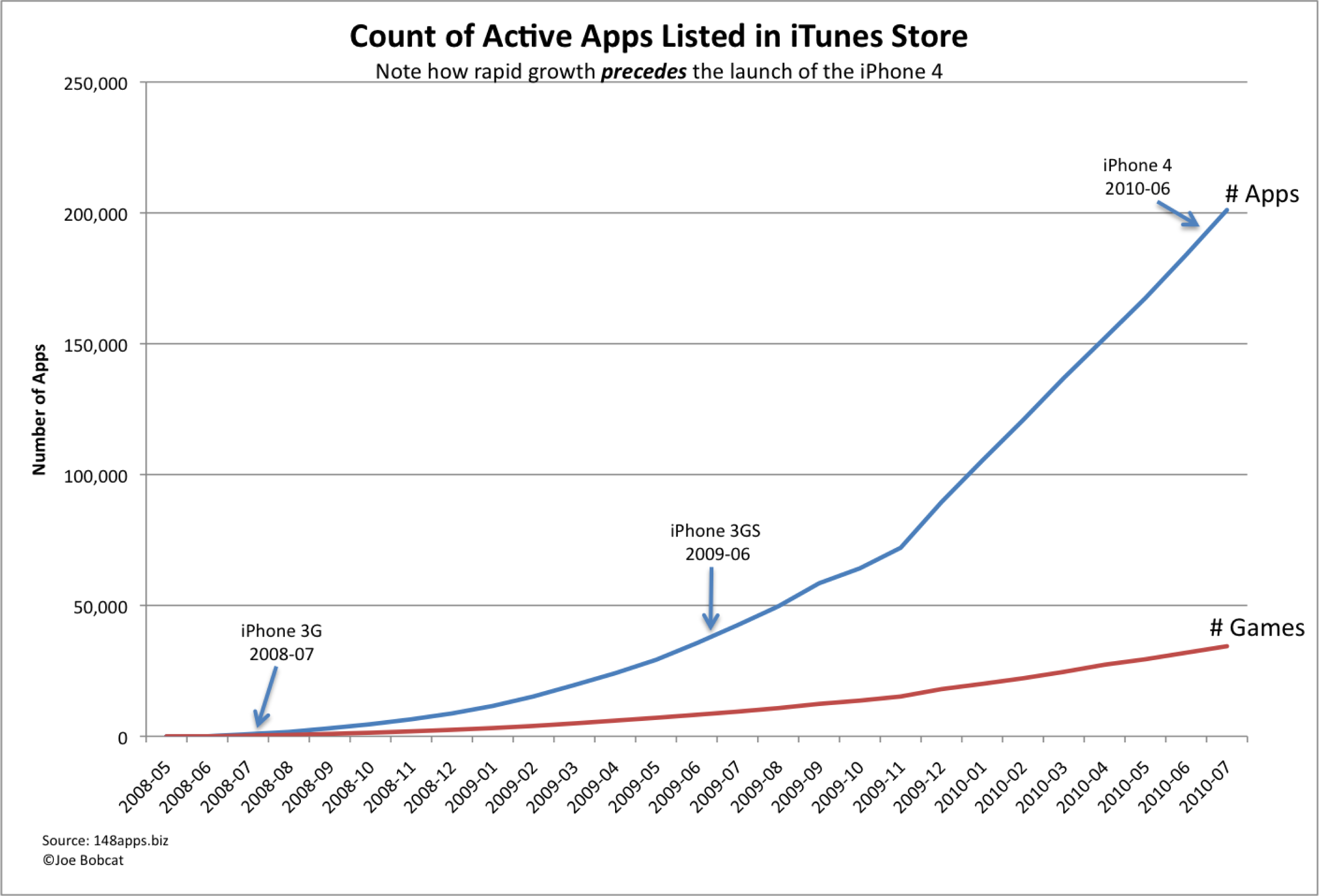
Sample graph for the Show App Trends assignment.