This is “Professionalism in Deliverables: Principles of Graphic Design”, chapter 3 from the book Designing Business Information Systems: Apps, Websites, and More (v. 1.0). For details on it (including licensing), click here.
For more information on the source of this book, or why it is available for free, please see the project's home page. You can browse or download additional books there. To download a .zip file containing this book to use offline, simply click here.
Chapter 3 Professionalism in Deliverables: Principles of Graphic Design
“We are all inherently visual communicators. Consider kindergarten: crayons, finger paints, and clay propelled our expression, not word processors or spreadsheets…”
“Unfortunately, somewhere, at some time, someone probably told you that you weren’t very good at drawing. And, after looking around and comparing yourself to other kids in the classroom, you probably consented, threw in the towel, and decided that piano lessons or football might prove a better bet for primary education glory.”
“Now, as an adult, you may not try anymore—at least in the visual realm. This is ironic considering that your employers and colleagues assess you by how well you communicate—a skill that is reflected in annual reviews, pay increases, promotions, and even your popularity. Effective communication is a job requirement now, whether you’re trying to beat competitors, communicate vision, demonstrate thought leadership, raise capital, or otherwise change the world. And like it or not, your profession likely requires you to communicate using a visual tool, regardless of your proficiency or training in this medium. Business schools in particular drill their students in management, accounting, and technology, but few offer anything approaching Design 101—the one thing that combines creative thinking, analytics, data assimilation, and the inherent ability to express oneself visually.”Duarte, Nancy, Slide:ology: the Art and Science of Creating Great Presentations, O’Reilly Media, Inc. 2008, p2.
Nancy Duarte
3.1 C.R.A.P. Principles of Graphic Design
Learning Objectives
- Compare and contrast artwork using graphic design principles—contrast, repetition, alignment, proximity (C.R.A.P.)
- Compare and contrast artwork using ad design principles (picture, headline, text, logo)
- Compare and contrast artwork using type design principles (font, size, weight, color, form, direction)
- Distinguish between layouts that conflict versus layouts that go well together
- Categorize fonts based on visual inspection
- Manipulate images and text to re-create a best practice advertisement in PowerPoint
- Choose and successfully employ PowerPoint techniques to solve a complex task
Introduction
How much graphic design do you need in business? Considering the heavy emphasis that is currently placed on “the look” of deliverables, the answer might be a lot. We don’t pretend that you will become a master of graphic design after just one chapter. However, there are some survivor principles of graphic design laid out by Robin Williams. Those principles are contrast, repetition, alignment, and proximity (C.R.A.P.).
You will learn to see the world in a new way. For years, you have looked at magazine layouts, ads, banners, flyers, etc. Some have caught your eye and some have not. Unless you have been trained in graphic design, it would most likely be hard for you to vocalize what it is about a layout that appeals to you.
The principles of graphic design, ad design, and type design will be repeated throughout the text when designing the following deliverables:
- Ads
- Websites
- Resumes
- Term papers
- PowerPoint presentations
- Spreadsheets
- Graphs
Everything that you design in this course will have a professional feel to it. Our goal is to make your work indistinguishable from the work that appears in publications such as the New York Times and the Wall Street Journal. Realizing that goal will also help make you a valuable contributor in the workforce. Others will value your work as professional, polished and communicative. You will also be able to give guidance to others on how to improve the look of their deliverables.
Robin Williams Robin Williams is the author of the Non-Designer’s Design Book. This is an essential reference used even in graphic design programs.
Where Are We in the Life Cycle?
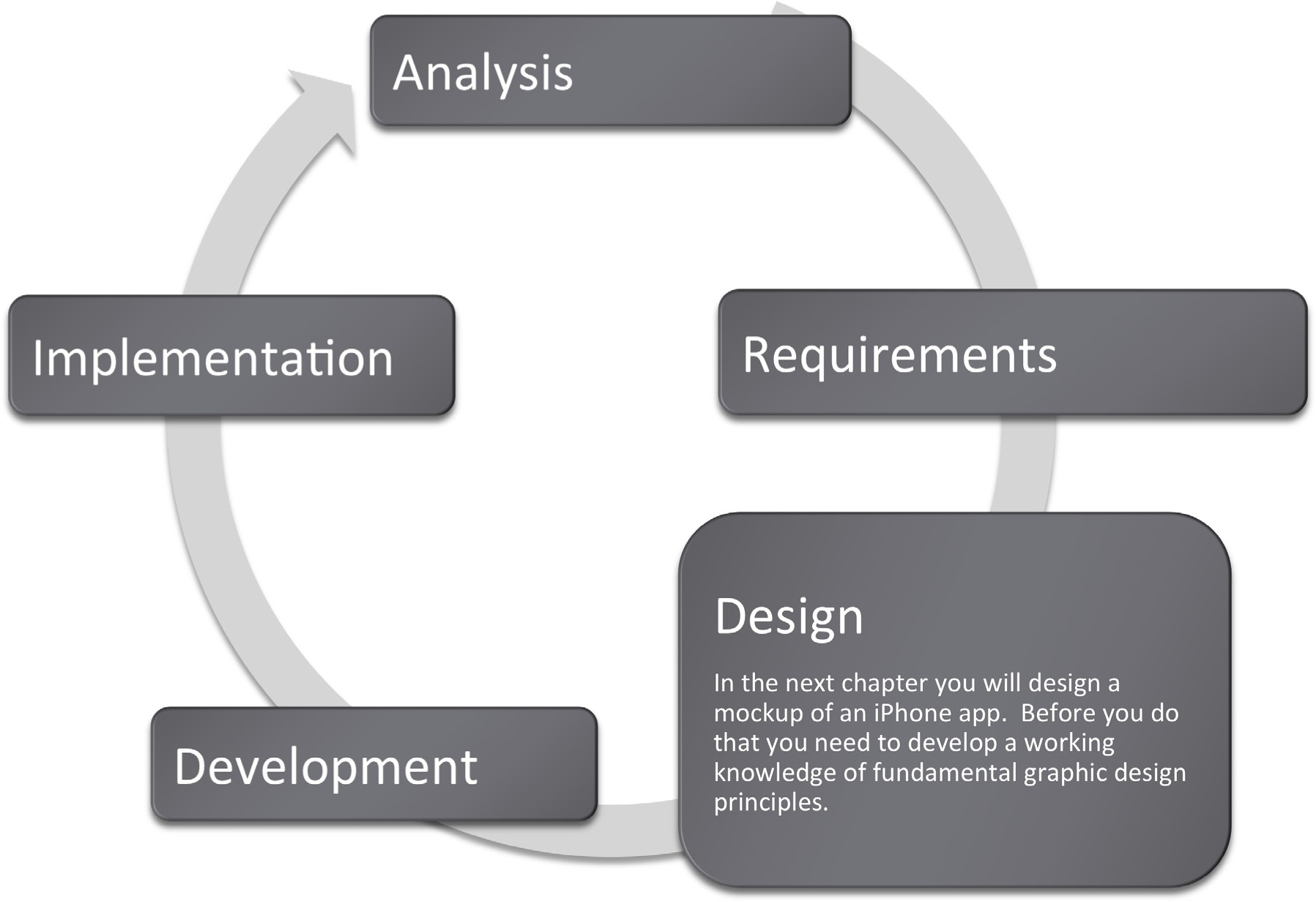
Many information systems projects are conceived of in a life cycle that progresses in stages from analysis to implementation. The diagram below shows the stages that we touch in the current chapter:
Contrast
ContrastThe use of type, color, weight, and so forth to draw attention to specific elements on the page. focuses our attention and should be used to highlight the most important points that the audience should take away. Designers should use colors, bold type, and size to distinguish parts of text or an image and create contrast. Contrast is used in all aspects of life. For example, jewelers usually display their diamond pieces on a background of black velvet to let the jewels stand out. The page you are reading uses headings to create contrast with the text.
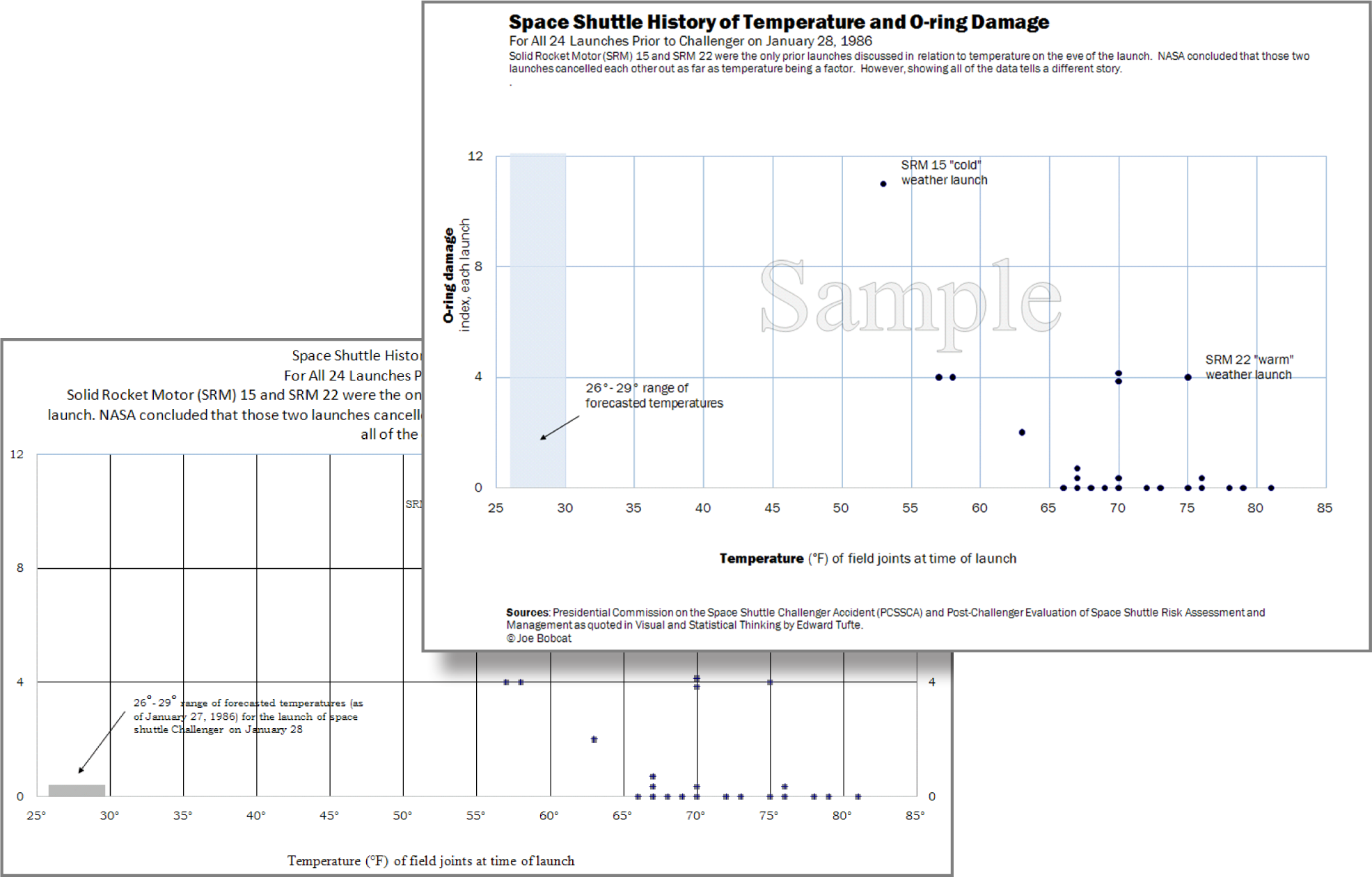
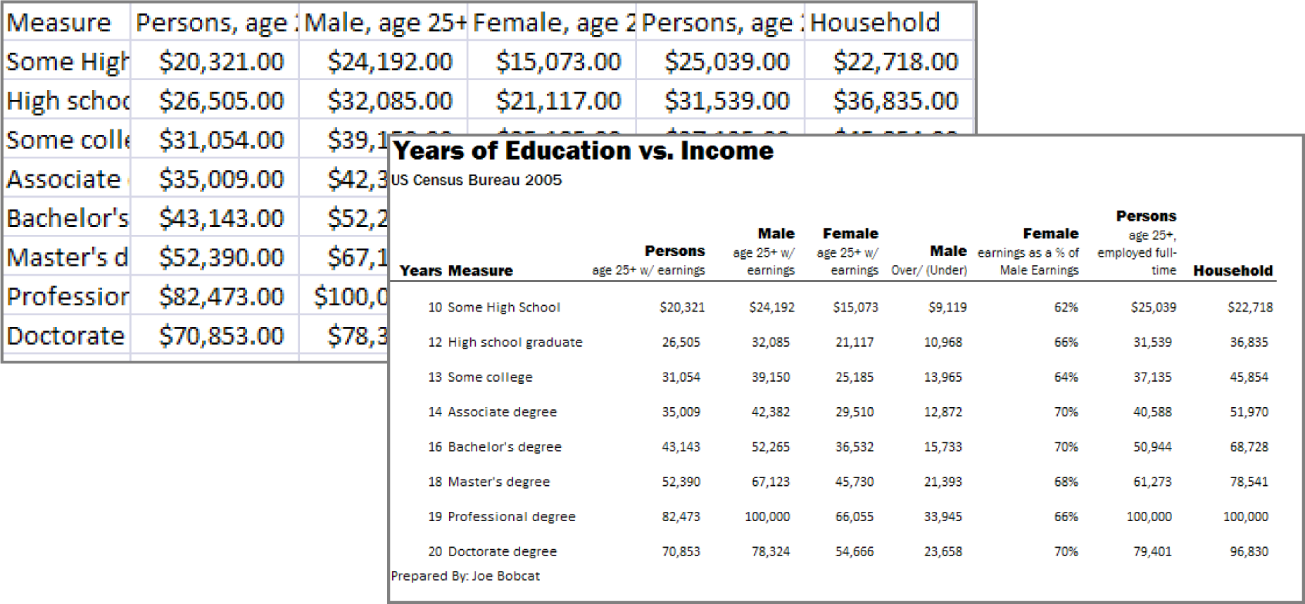
Formatting, including the use of a blue shape, creates contrast, drawing attention to important data points in the Excel graph.

Formatting headings for the title and subtitles creates contrast..
Contrast Through Visual Weight
Another way to create contrast is by using visual weightThe amount of ink dedicated to an element on the page. The more ink, the more contrast that is created.. You create a focal point and then lead the reader’s eye around the page. The main focal point is the picture. The next “heaviest” item on the page is the headline, followed by the date, followed by the logo, followed by the body text. The reader’s eye is led from one item to the next based on these “weights.” The greatest mistake that most students make in flyer design is to make all the text the same size as though it needed to be readable from 20 feet away. As long as the picture and headline capture interest, a reader will move in closer to read the rest of the flyer. Also, if every item is the same size then nothing stands out and it looks unprofessional. Variation of font sizes and weights is critical to focus attention.
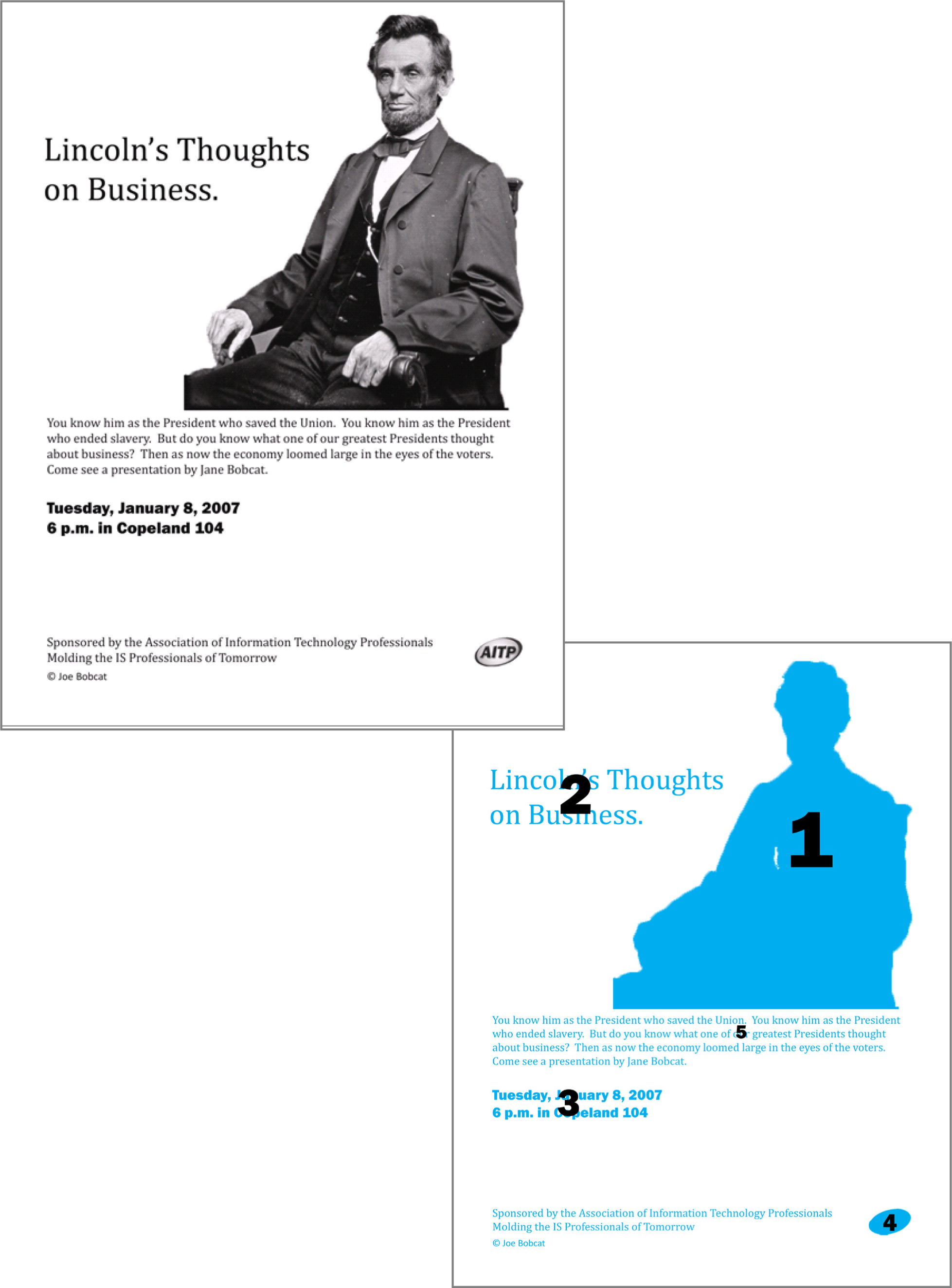
Visual weight in action. Note how your eye travels around this flyer in the numbered sequence depicted.
Contrast with Fonts: Type Design
When working with type, aim for a contrasting layout. Contrasting layouts create visual interest and energy. For example, when you wear clothes of contrasting colors, such as red on navy blue, the outfit can be quite eye catching. Our examples will follow the conventions Robin Williams sets out in her book.Williams’ book, The Non-Designers Design Book discusses design principles for the novice designer.
The opposite of contrast is affinityThe opposite of contrast. Layouts demonstrating affinity show subtle variations in color or brightness.. Layouts demonstrating affinity show subtle variations in color or brightness. The overall effect is pleasing, though not particularly remarkable. For example, a person wearing a dark suit with a dark tie would be wearing an outfit that shows affinity.
In type design, a layout showing affinity is best for formal documents, such as wedding and graduation invitations. For most other documents, use a contrasting style to make your documents really pop. However, tailor the contrast to suit the audience and the occasion for the document. For example, a business plan prepared for a bank should have less contrast than the layout of this text book. When in doubt, be conservative.
The one type of layout that you must avoid is a conflicting layoutA layout in which type is very similar but different. The effect is disturbing to the eye, as though an error has taken place.. In a conflicting layout the type is very similar but different. For example, never use two different serif fonts on the same page. Think of wearing an outfit that has two different shades of red that are very similar but different. The combination looks like a mistake—as though part of the outfit had faded in the wash. In the same manner two serif fonts side by side will look like a mistake. Fonts should be identical or very different.
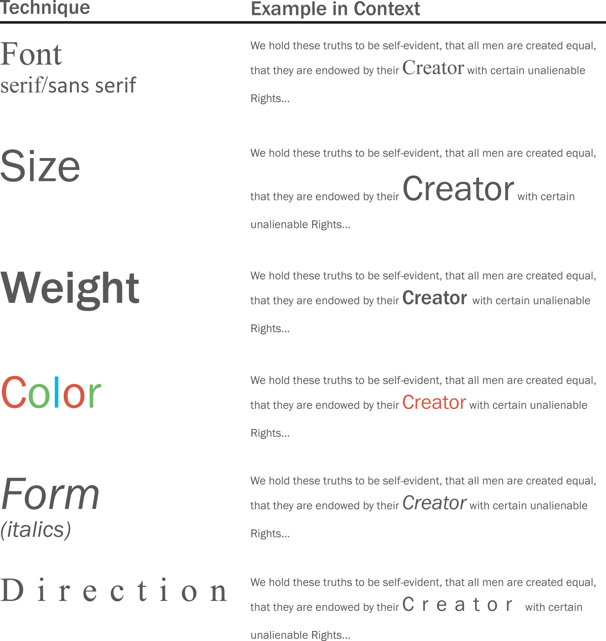
The text on the next page is taken from The United States Declaration of Independence and demonstrates some type contrasting techniques. By increasing the font size and changing the text color, you can highlight certain words or information that you want to stand out. The goal is to make “Creator” stand out as the most important word in the sentence. You can also boldface to dramatize the weight of the text or italicize to accent the text. Direction refers to adding space between letters to make text stand out. Structure, using serif or sans serif fonts, can also differentiate text and will be discussed in the next section.
Contrast with Fonts: Serif/Sans Serif
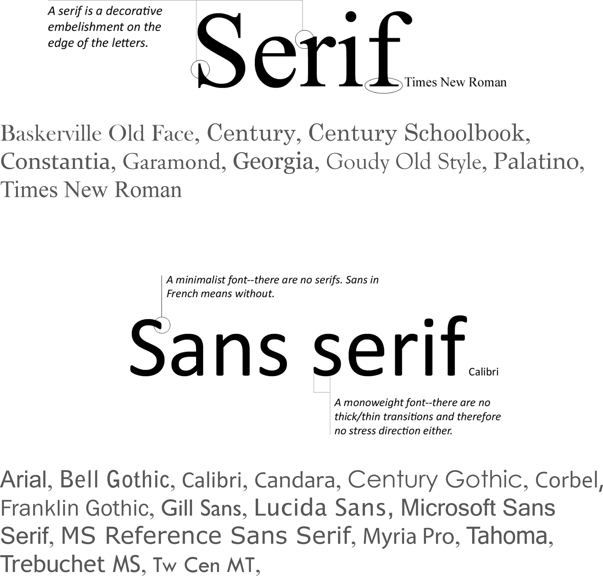
The two main categories of font are serif and sans serif. Serifs are the ornamental strokes at the end of the letters, which all serif fonts have. Sans serif means without serifs, therefore sans serif fonts do not have these decorative additions.
Serif and sans serif fonts can be used together to create contrast within text. Typically sans serif fonts are used for headings while serif fonts are used for body text.
Note that you should avoid combining two fonts that are from the same category. For example, two serif fonts that look similar, such as Georgia and Garamond, should not be used together.
Serif fonts are best used in text heavy books because the serifs quickly guide the reader’s eye from letter to letter. Sans serif fonts are the best choice for online text because serifs can blur in the pixels on a screen. The resolution of most computer screens is not sufficient to precisely draw the serifs in a body of text. The result tends to look blurry. Therefore, most websites use a sans serif font. An exception is sometimes made for the page title, which because of its greater font size, can show serifs much more clearly. To allow for serifs online, Microsoft developed a series of ClearType fonts designed to accurately reproduce serifs.
Though font options are limited online, other techniques such as size, weight, color, form, and direction can be used to create contrast within online material. Color is especially powerful on a website as most viewers have a color monitor.
Please see the Appendix for additional font categories. These include slab serif, modern, script, and decorative.
Contrast with Fills and Outlines
A fill is the color, gradient, or pattern the occupies the inside of a drawn object. An outline is the color, gradient, or pattern that borders the drawn object. PowerPoint has extensive fill and outline options.
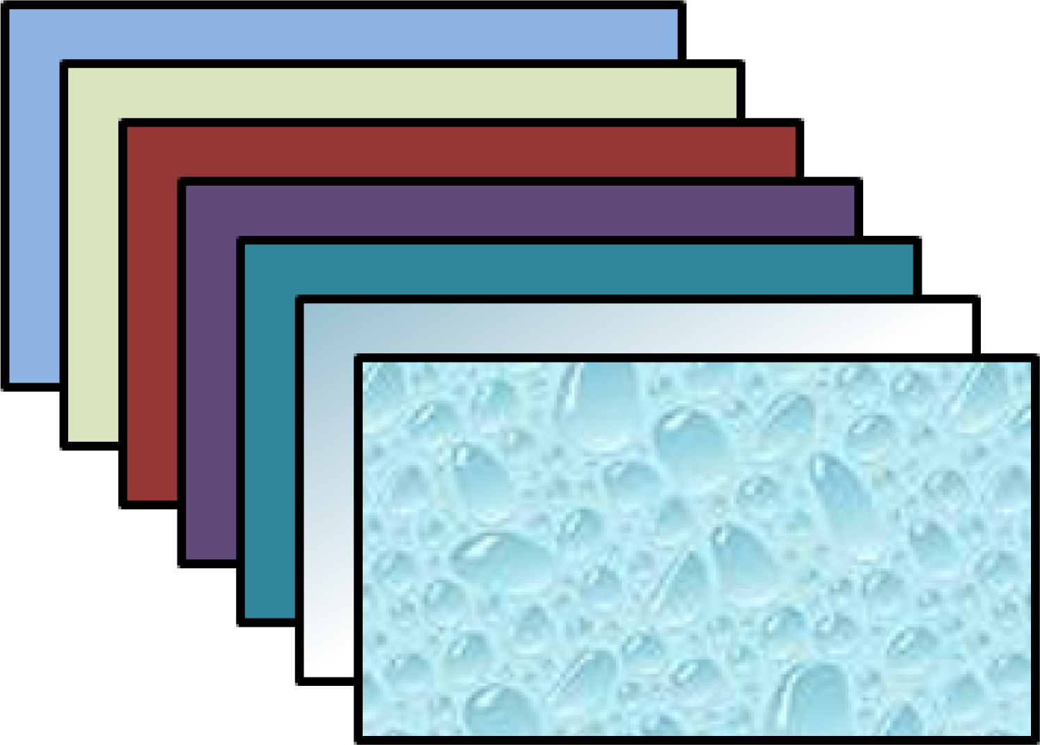
Different fills, same outline
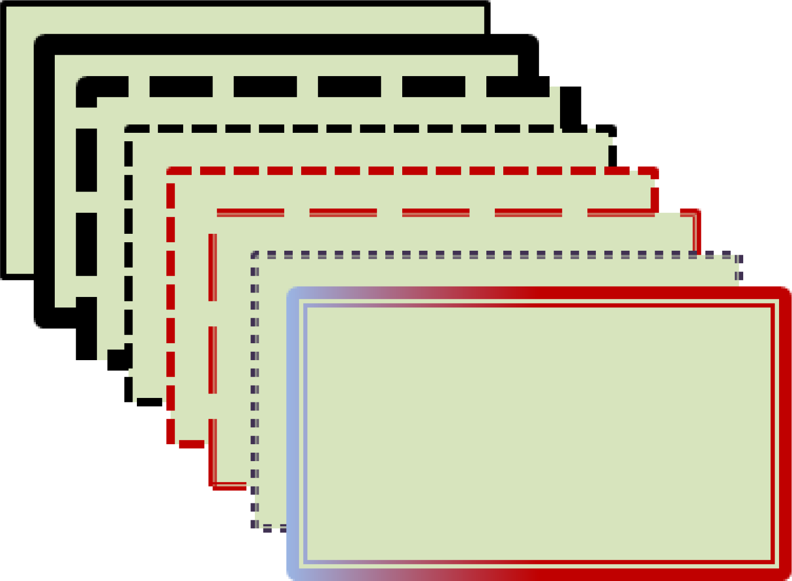
Same fill, Different outlines
Repetition Unifies an Image
RepetitionThe practice of repeating visual elements such as fonts, colors, images, and so forth to unify a composition. ties objects or images together. For instance, we know which football players are on a team because of the repetition of their uniforms. This text uses repetition of fonts, styles, and sizes to unify the design. On the facing page, repetition of graphic elements draws an image together.
The repetition of formatting in the text headings creates a unified professional look.
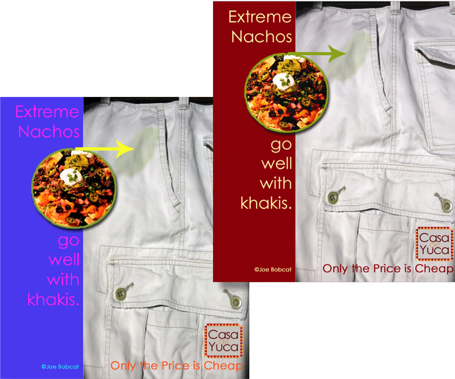
This ad uses repetition with the colors in the text, arrow, stain, and background to reflect the colors in the logo and nachos. Notice how this ad looks more cohesive and professional.Special thanks to Gregg Fouch for designing the Casa de Yuca marketing materials.
Repetition with Color
Adobe has a wonderful free web-based application called Kuler, which helps you choose a color paletteA group of colors used in a composition that harmonize in some way. When colors are used from the palette, they serve to unify the composition. Colors in the palette are normally referenced by their red, green, blue (RGB) numeric values.. One of its most spectacular features is the ability to upload an image and have Kuler automatically generate a color palette from that image. You then use that palette for fonts, fills, and so forth in your composition, and you are virtually guaranteed that the colors will all work well together.
To use the more interesting features of Kuler you must first create an account at: kuler.adobe.com. Now you can save your color palettes. Once saved, you can reveal the numerical values that correspond to your color palette. These numeric values may be imported into PowerPoint (under custom color).
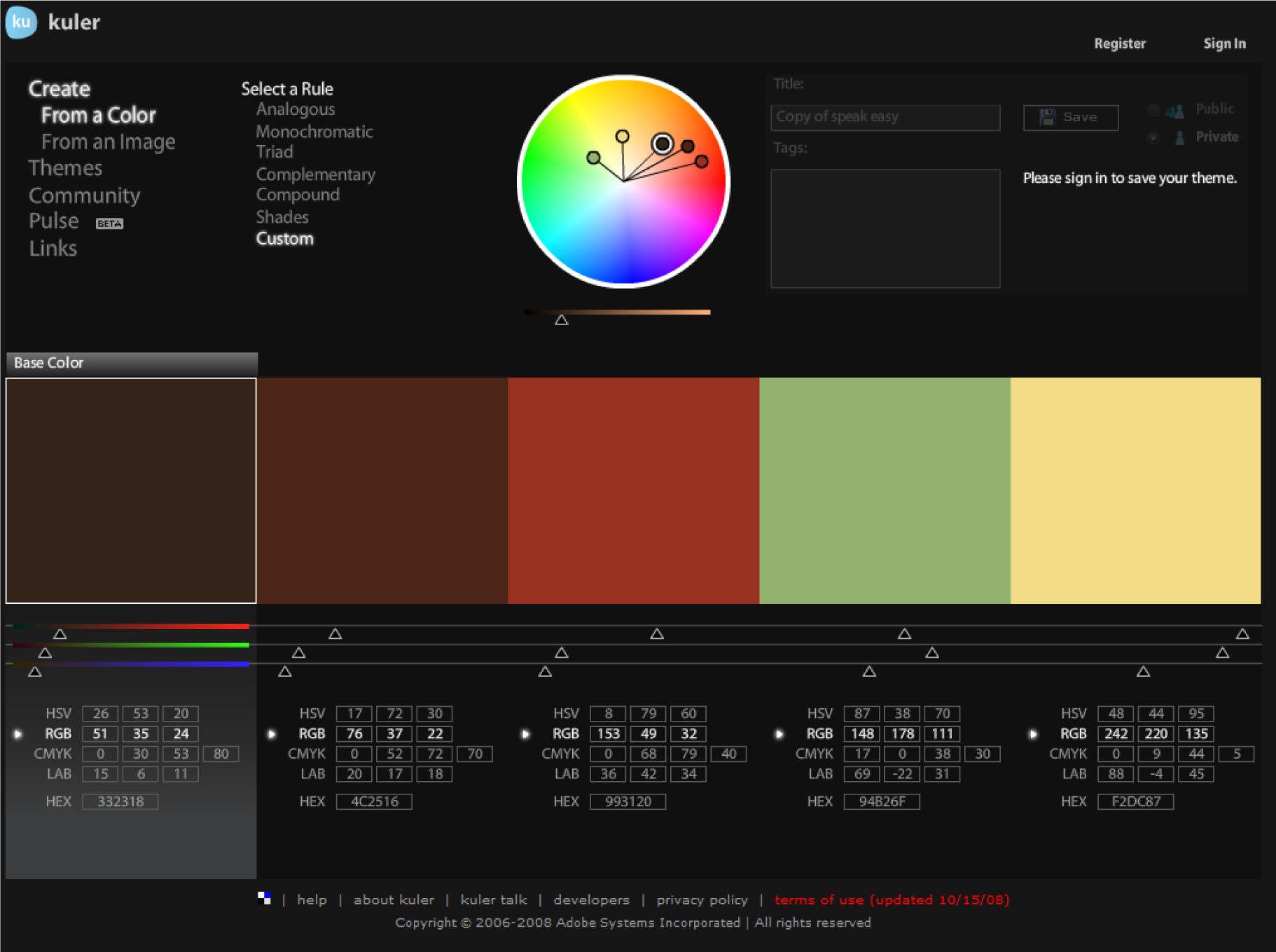
Kuler helps create a color palette. You can create a color palette by uploading a picture. After saving your palette, Kuler will allow you see the RGB values associated with each color. You can then type these values into PowerPoint. Adobe product screenshot reprinted with permission from Adobe Systems Incorporated.
Alignment
AlignmentArranging items on a page so that they touch common imaginary vertical or horizontal lines to convey organization, polish, and strength. indicates organization, polish, and strength. Text on a page is easier to read and understand if it is properly aligned to the margin. Alignment should be applied to every design or page layout to show order. Alignment on this page is created by left aligning all of the text and graphics.
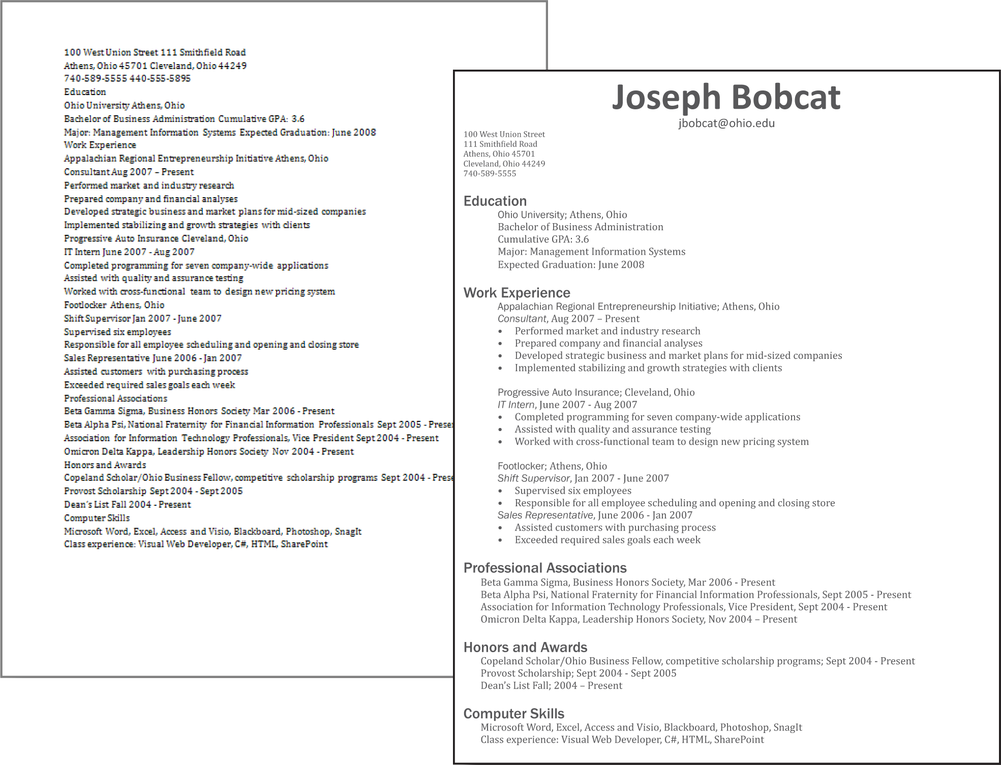
The alignment of text organizes the categories on the resume.
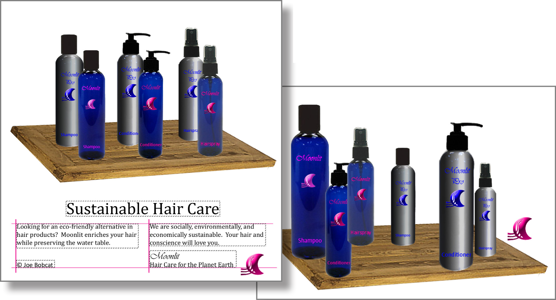
The alignment of text and images in this ad creates a polished and professional look.
Proximity
ProximityArranging items on a page so that similar items are grouped together to establish their relationship. creates relationships within objects in an image. Placing objects close together shows their connectedness and focuses the audience’s attention. For example, captions placed near photos on a page layout show that they describe the photos they are near. The page you are reading places headings next to the text they introduce to signify their relationship.
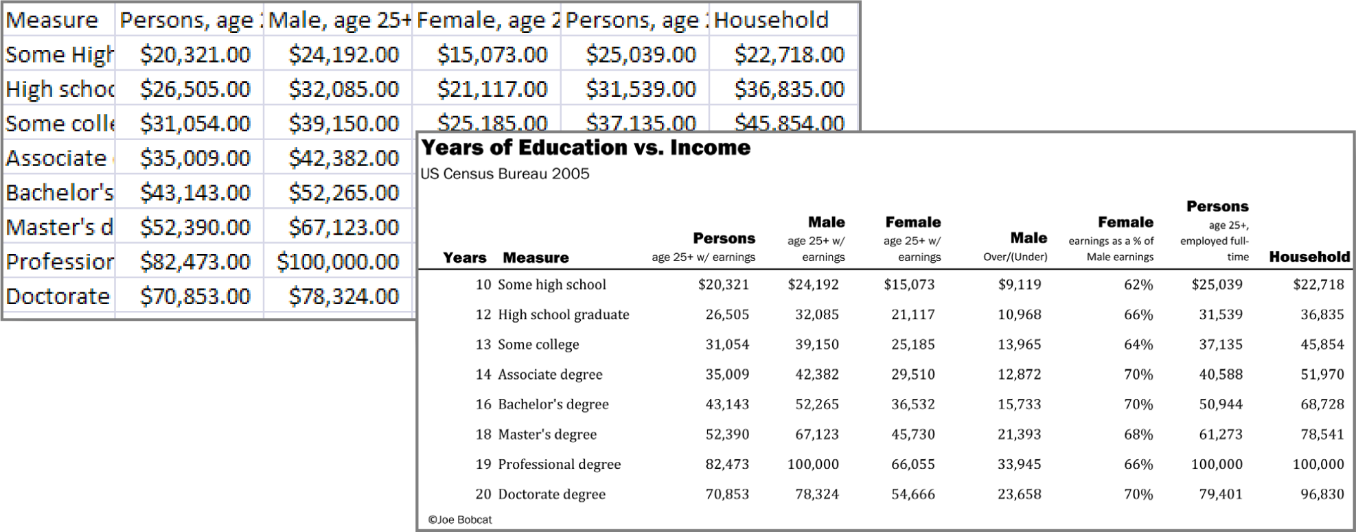
Proximity helps to organize this spreadsheet in Excel. The title and subtitle are separated from the rest of the spreadsheet.
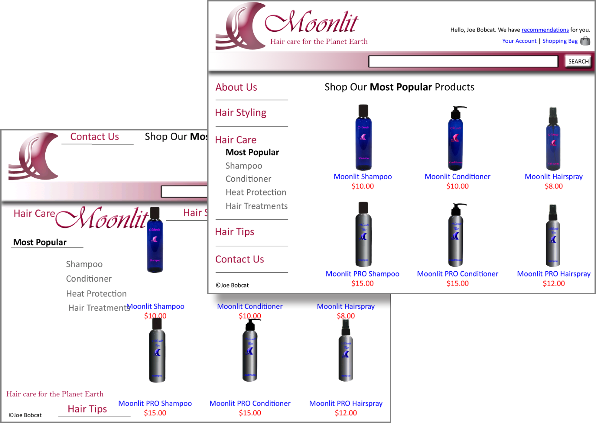
Proximity is used to group the links on the navigation bar. Similarly the image, title, and price of each bottle are grouped together.
Graphic Design Summary
Graphic design is perhaps the most creative aspect of information design. Though design leaves room for originality, there are clearly articulated principles every designer should follow to create clear and effective images. We will adopt four basic principles outlined by Robin Williams. These principles that have been introduced in the previous pages are: contrast, repetition, alignment, and proximity (C.R.A.P.).
Mastering these principles will allow you to produce clear documents and make presentations look more professional. The business cards on the next page demonstrate good and bad examples of each design principle. Please study these principles as they will appear again and again throughout this text.

Good contrast, repetition, alignment, and proximity.

Bland design lacks contrast.

Images lacking repetition look disconnected.

Lack of alignment looks sloppy.
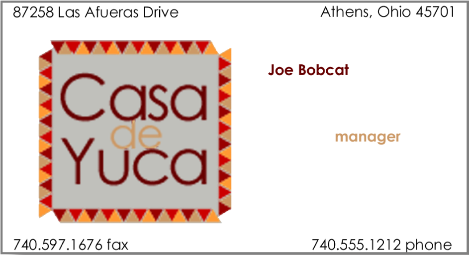
Poor proximity lacks focus.
Ad Design: Picture, Headline, Text, and Logo
The C.R.A.P. graphic design principles are universal. However, most media have additional design principles that should be followed. For example advertisements tend to follow a convention in their composition. These additional principles are described here and serve as the basis for one of the assignments.
An effective ad should position the product in an appealing light to its target audience while also demonstrating the product concept. While there are many ways to design an ad, we will adopt the format advocated by John McWade.John McWade wrote an excellent book called Before & After Page Design. He also maintains a design web site, www.bamagazine.com. The four ad design principles are:
- Picture: Pictures are the focal point of an ad and should occupy a majority of the space. They are used to grab an audience’s attention.
- Headline: The headline of an ad should be concise and illustrated in a clear font. This is one of the few times that centered text works.
- Text: The body of text is used to sell the product. It delivers the message to the audience.
- Logo: Every ad should include a tag line — the company or product motto - and a logo.
Because pictures are the focal point of the ad, they should take center stage. Using a picture in an ad is an opportunity to showcase the product and, therefore, the picture should occupy roughly two-thirds to three-quarters of the available space no matter what the shape of the ad.

Some sample ad layouts. The picture should occupy two-thirds to three quarters of the ad and appear in the space above the white line.
Key Takeaways
- The same graphic design principles apply to computer screens, documents, and presentation graphics.
- The four graphic design principles are contrast, repetition, alignment, and proximity (C.R.A.P.).
- Contrast helps to highlight and focus attention. Contrast may be achieved using color, shades of gray, size, visual weight, and so forth.
- Repetition helps to unite a document so that it looks like a
- coherent whole. Repetition may be achieved by repeating fonts, styles, images, and so forth.
- Alignment helps to organize information to make it clearer and more professional looking. Alignment may be achieved using onscreen guidelines.
- Proximity helps to establish relationships between items. Items in close proximity appear related.
- Type design may be used to reinforce contrast and/or repetition. Font, size, weight, color, form, and direction are all type design attributes.
- Colors should harmonize in a palette. Professional tools such as Kuler help to establish a color palette from an image.
- Fills and outlines can create contrast and/or repetition.
- Every ad should have a picture, headline, text, and logo.
Questions and Exercises
- Identify the Picture, Headline, Text, and Logo in 3 different ads.
- Describe the use of C.R.A.P. principles by your favorite magazine.
- Describe the use of C.R.A.P. principles by your favorite website.
Techniques
The following techniques, found in the software reference, may be useful in completing the assignments for this chapter: PowerPoint: Overview Map of Interface • Image-Crop • Image-Delete Background • Image-Insert • Image-Rotate • Guide Lines-View • Turn Off Snap To Grid; In the Google section of the Cloud Computing software reference: Create an Account • Add a Signature Graphic; and in the Word section of the software reference: Text-Formula
L1 Assignment: Email Signature
Many students wonder how to create eye catching email signatures. A catchy signature helps you to stand out from the crowd. Part of your signature is the font and size that you use to respond to other emails. You will also learn more about cloud computing through Gmail.
Setup
If you don’t have one already, create a Gmail account at www.gmail.com. Sign into your Gmail account and go to Settings to change your signature. The fonts in Gmail are limited as they are trying to show fonts available on all computer platforms—Windows, Mac, and Linux. However, you can type up your signature in Word or PowerPoint and copy/paste it into Gmail with more inventive fonts. To see which fonts are likely to be installed on all systems receiving your messages visit these sites:
http://www.ampsoft.net/webdesign-l/WindowsMacFonts.html
http://www.codestyle.org/css/font-family/sampler-CombinedResults.shtml
Content and Style
- Create a readable, interesting, and professional email signature using text and [optionally] graphics.
- Specify the font you will use to respond to messages.
- Apply and follow all graphic design principles.
- [Optionally] Create graphics for the signature in PowerPoint using drawing tools. Save the slide as a PNG image in your public Dropbox folder. Then right click on the file in Dropbox to copy its URL. If you want to change the signature, just update the PowerPoint file and re—save as a PNG file to replace the prior version. In Gmail click on settings and insert an image in the signature editor. It will ask for a URL. Paste the URL from the file in your public Dropbox folder.
- Send an email to yourself with at least one line of text to test the signature. Save your test email with the signature as a PDF file or take a screen shot of the file using the Windows Snipping Tool (Mac users can use Cmd+Shift+4).
Deliverable
Electronic submission: Submit the PDF or screenshot from your Gmail test message to the course management system as proof of completing the assignment.
Paper submission: Create a printout of your Gmail test message.
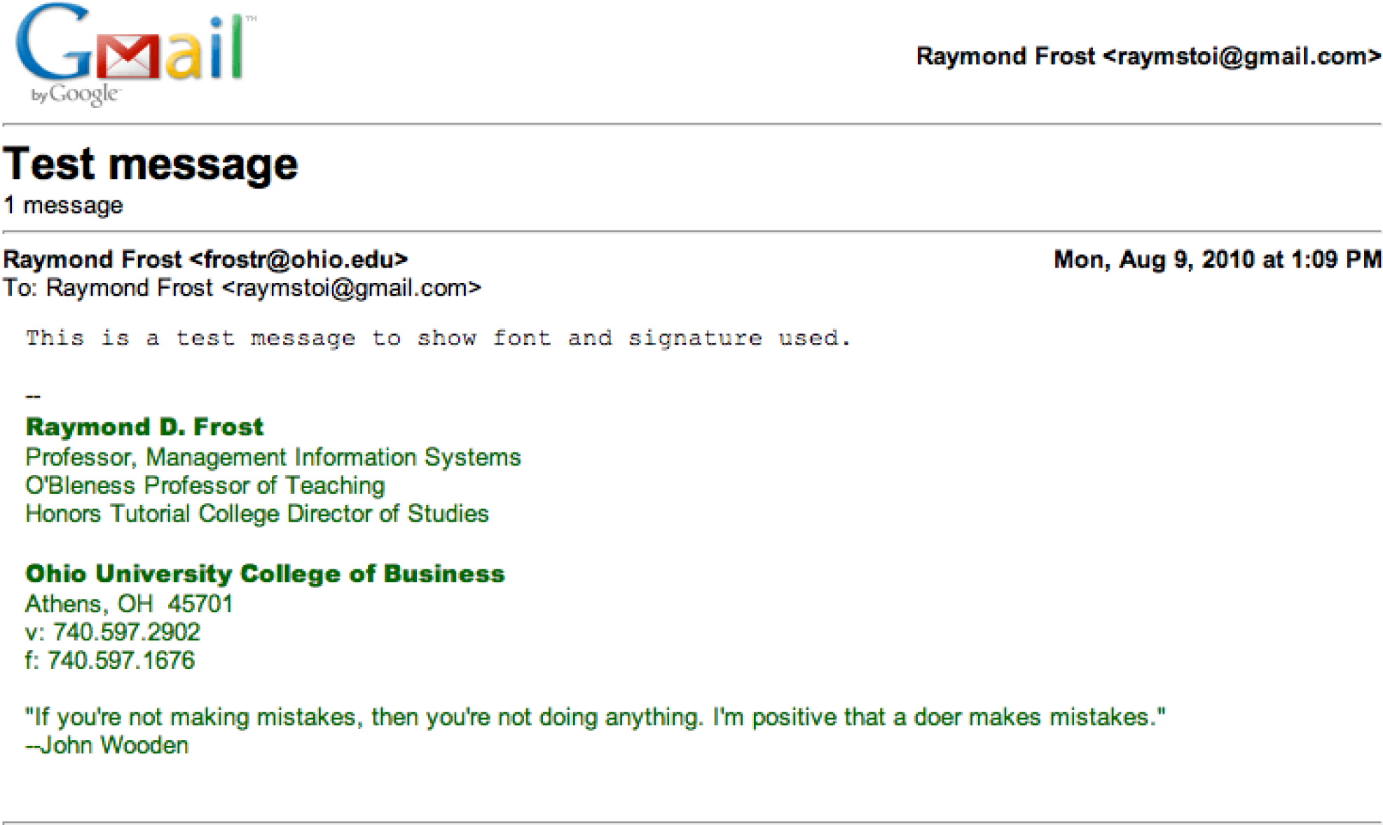
Sample test message for email signature assignment.
L2 Assignment: Laptop Hotspot Ad
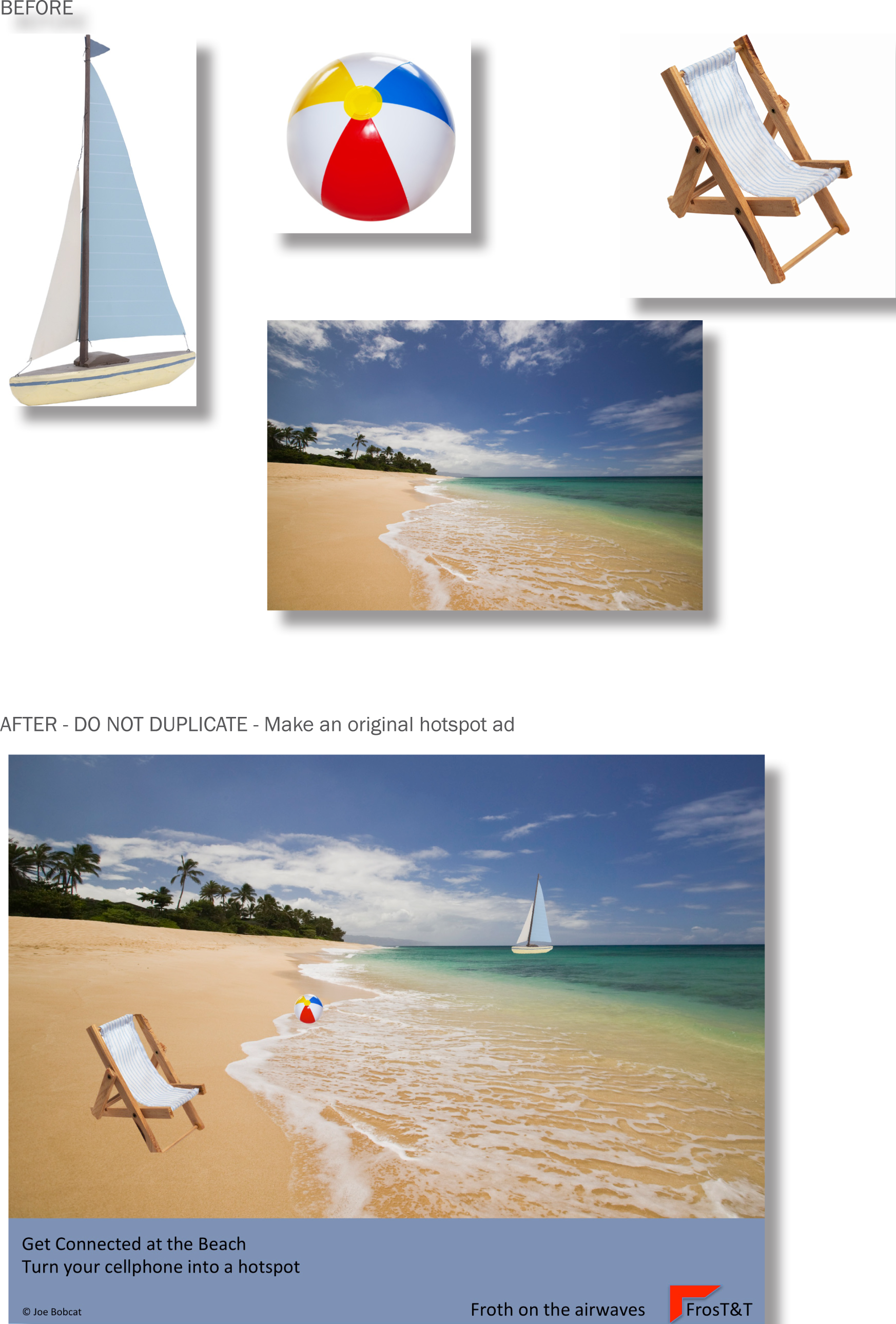
PowerPoint allows you to alter images to create a composition that does not really exist. Compositions like this should be done with caution. You don’t want to misrepresent anything to a potential client. In this case we are not selling the beach, just the idea of working from the beach, so no harm done. However, this would not be appropriate to advertise a resort. If this were a “photo” for a news article then altering the scene would actually be unethical. The example shown here is an ad for a restaurant, but you will be creating an ad for a cell phone provider—showcasing their ability to use the cell phone as a wifi hotspotYour cell phone becomes a hotspot through a process called tethering. Tethering allows your computer to communicate to the internet by sending and receiving data over your cell phone’s data connection. Tethering is accomplished by creating a Bluetooth connection between your cell phone and your laptop. The laptop then sends/receives over both the Bluetooth connection and your cell phone’s data connection. Response time is faster if your cell phone has a 3G connection to the cell phone tower. so that you can work from your laptop. You pick the provider and then include their logo and appropriate text in the ad.
Setup
Sketch a design on paper then find creative commons images and save them to your folder. Search
http://www.flickr.com/creativecommons.
Content and Style
- Create an original advertisement. You may use some or all of the images given or create a completely different context—e.g. outer space.
- Create an original heading, text, and tagline for this assignment.
- You may have to remove backgrounds from your images using PowerPoint’s background removal tool.
- Apply and follow all graphic and ad design principles.
- Each picture and text box will appear on a separate layer in the selection pane. Name each layer as you create it.
- Make sure that your name and copyright is large enough to be read, but small enough to remain discreet on your document. (Your name replaces “Joe Bobcat”).
- Upload your image to Kuler to find a color for your text background.
- You may choose to include a picture of a laptop, cell phone, and/or person as you deem appropriate to the ad.
Deliverable
Electronic submission: Save your file as a PowerPoint presentation. Submit it electronically.
Paper submission: Create a color printout by printing the slide in color directly out of PowerPoint.
